Next-gen analytics powerhouse
Tools offering robust supply chain analytics and presentations to showcase the FedEx value proposition
The Challenge
Sales professionals need customer-facing reports and presentations to address customer requests and proactively demonstrate the FedEx value proposition. Webalytics, a suite of 14 self-service tools with over 1 million annual usage requests, was created to meet these needs.
Despite its power and versatility, Webalytics has been around for almost a decade and lacks an intuitive user experience that is compliant with the FedEx Digital Design guidelines. Sales users also demand additional functionality as a result of evolving business needs.
As an enterprise-level application, Webalytics serves diverse user groups and business operations. The redesign is not a simple face-lift; it requires deep understanding of the intricate business background and problem areas, adding complexity to the challenge.
The Objective
Webalytics needs a complete redesign to make it better, faster, and more powerful.
Role
Lead UX Designer
Duration
6 months (from initial user research to final product release)
Team
7 core project team members including Designer, PM, SME, Engineers, and Architects
Opportunity Statement
How Might We redesign Webalytics to meet evolving usability challenges, introduce new features, and maintain consistency with the FedEx design ecosystem?
Framing the customer problem
Webalytics offers two main functionalities through 14 self-service tools:
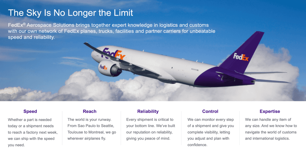
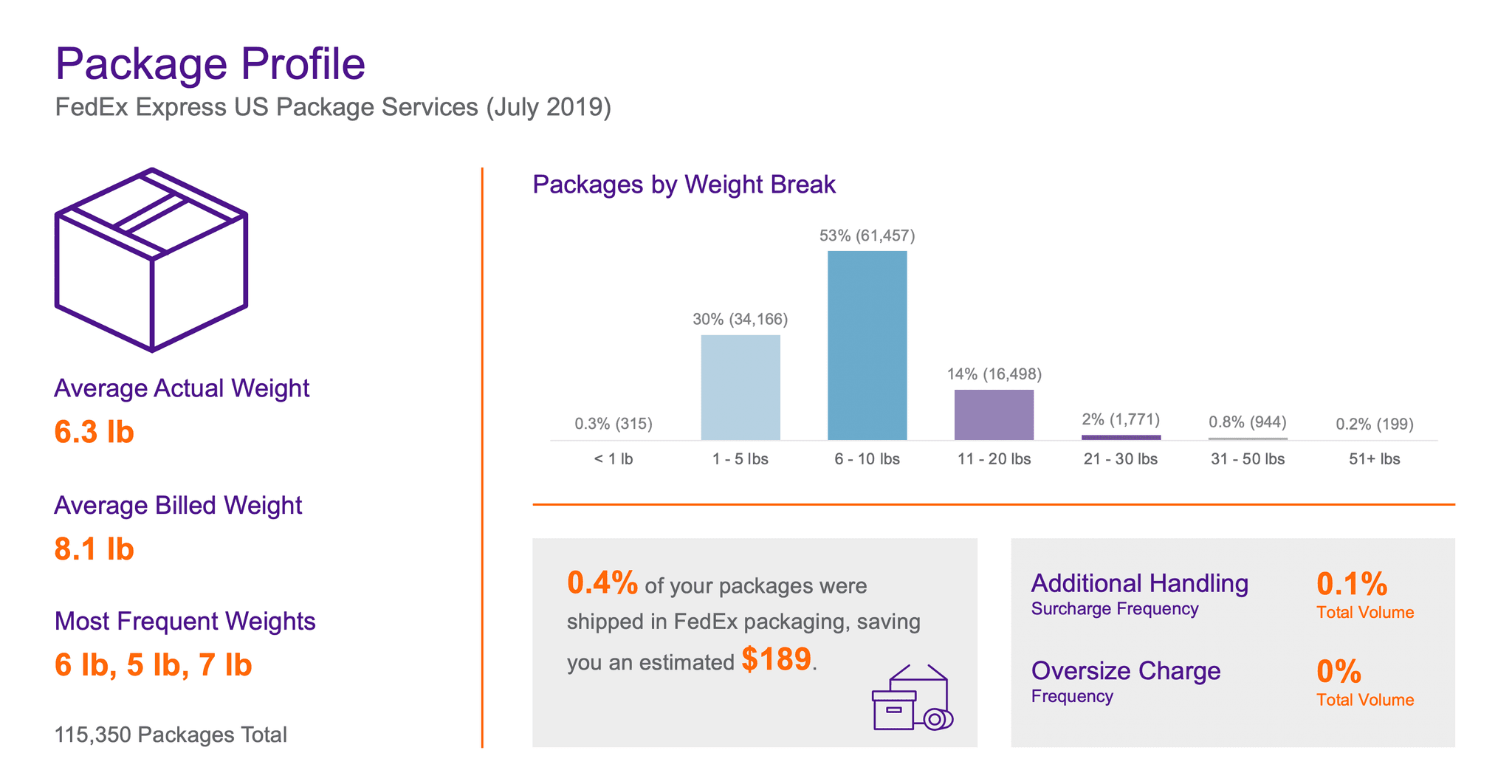
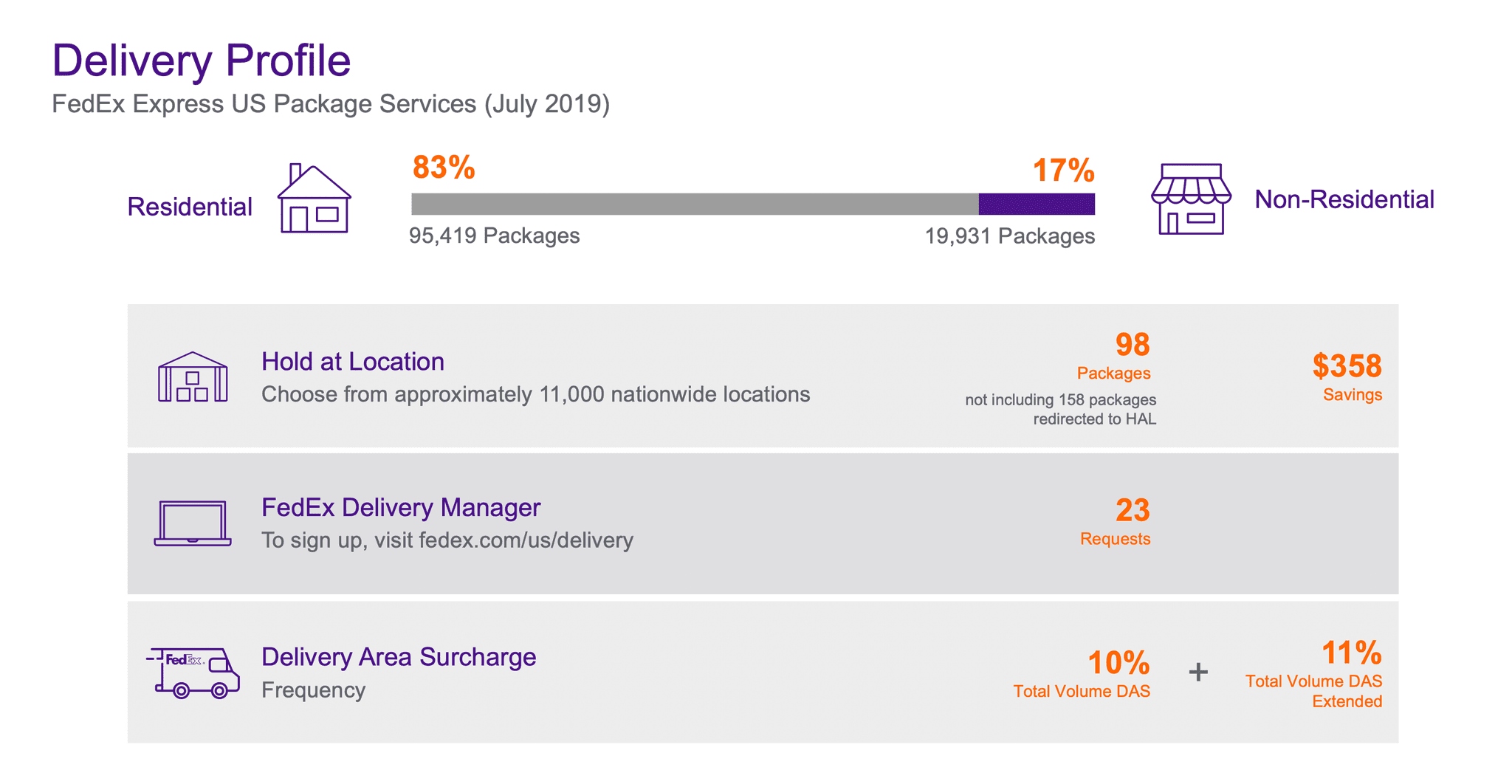
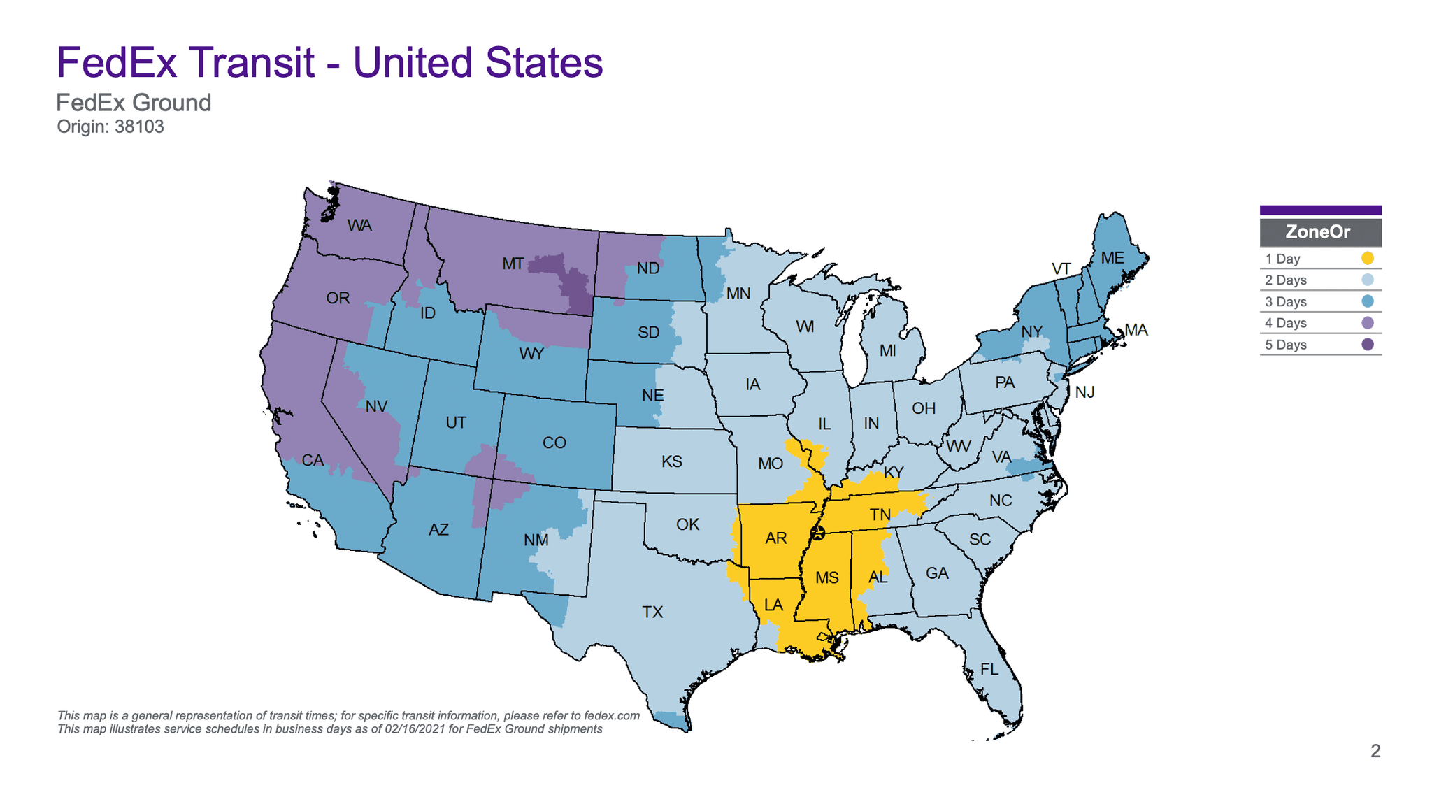
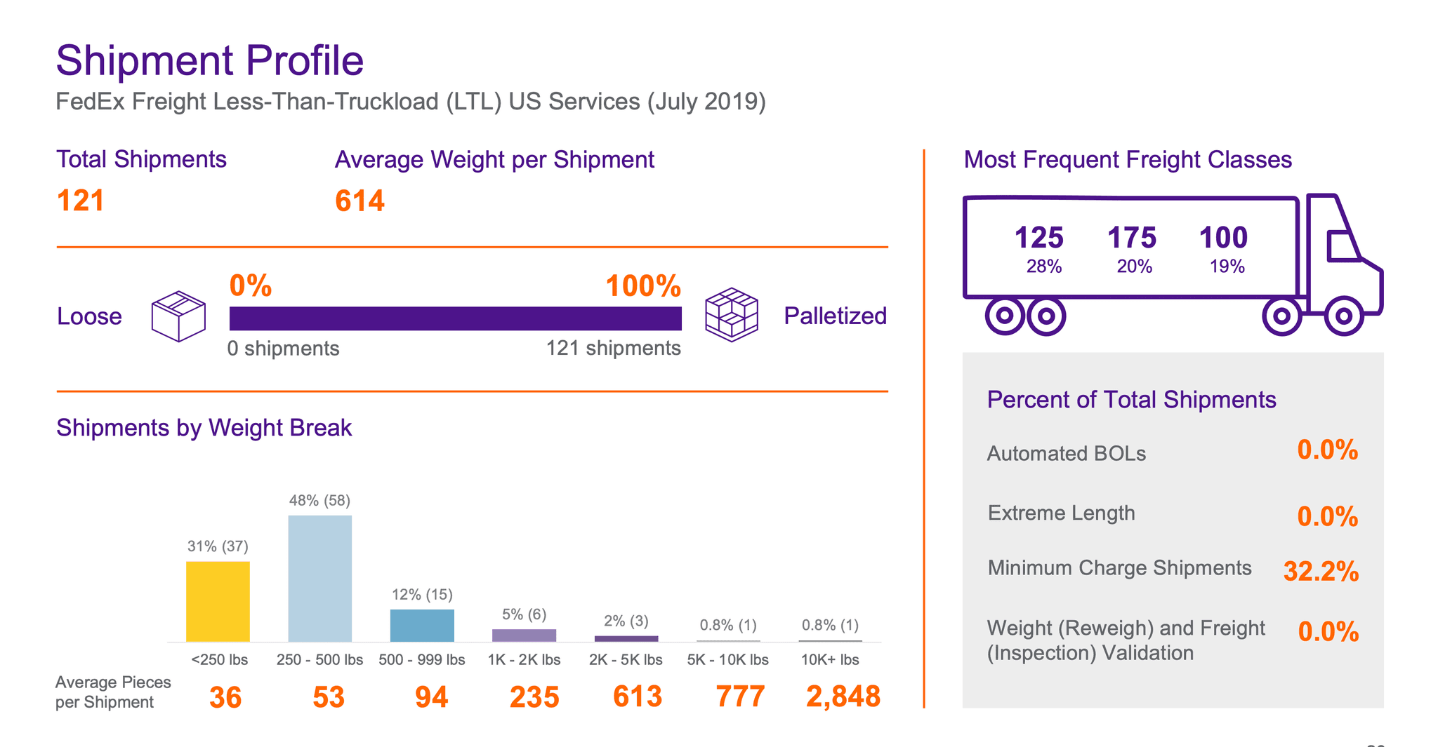
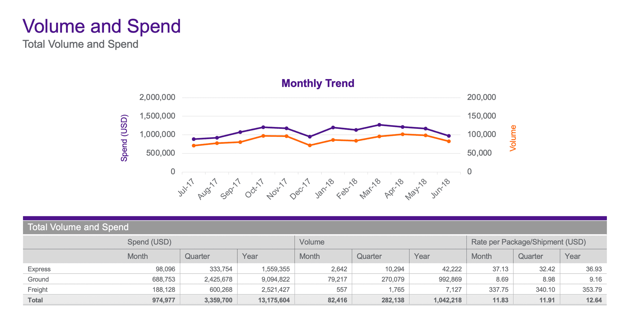
Analytics: Infographics of customer supply chain and shipping metrics, suggesting cost-saving opportunities for customers and highlighting the competitive advantage of FedEx.
Content: Pre-formatted presentation slides, business proposals, and quick answers to customer request for quote (RFQ). This content is legally approved, brand-compliant, crafted by professional analysts and writers, and ready to present to customers.
Below: Example reports and presentations generated by Webalytics

Stakeholder interviews & knowledge transfer
I always start a project with stakeholder interviews to understand the motivation behind it and ensure the team has a cohesive vision of what we're supposed to create. For a major initiative like this, I interviewed the product owners, subject-matter-experts, and the leadership sponsoring the project. I used RACI and Charter to identify key roles and responsibilities.
Project background
Motivation: Why redesign now? How did the problem arise?
Pain Points: What are the biggest pain points today? Was any previous research conducted? Have there been any prior improvements to Webalytics?
Impact: What happens if we solve/don’t solve the problem?
Vision and goals
Success Metrics: What does success mean to you? What is your vision of the ideal state?
Business Results: What are the projected business outcomes when we solve the problem?
Project Goals: What are our goals, and how do they translate into metrics? What is the timeframe for this project?
Deconstructing current experience
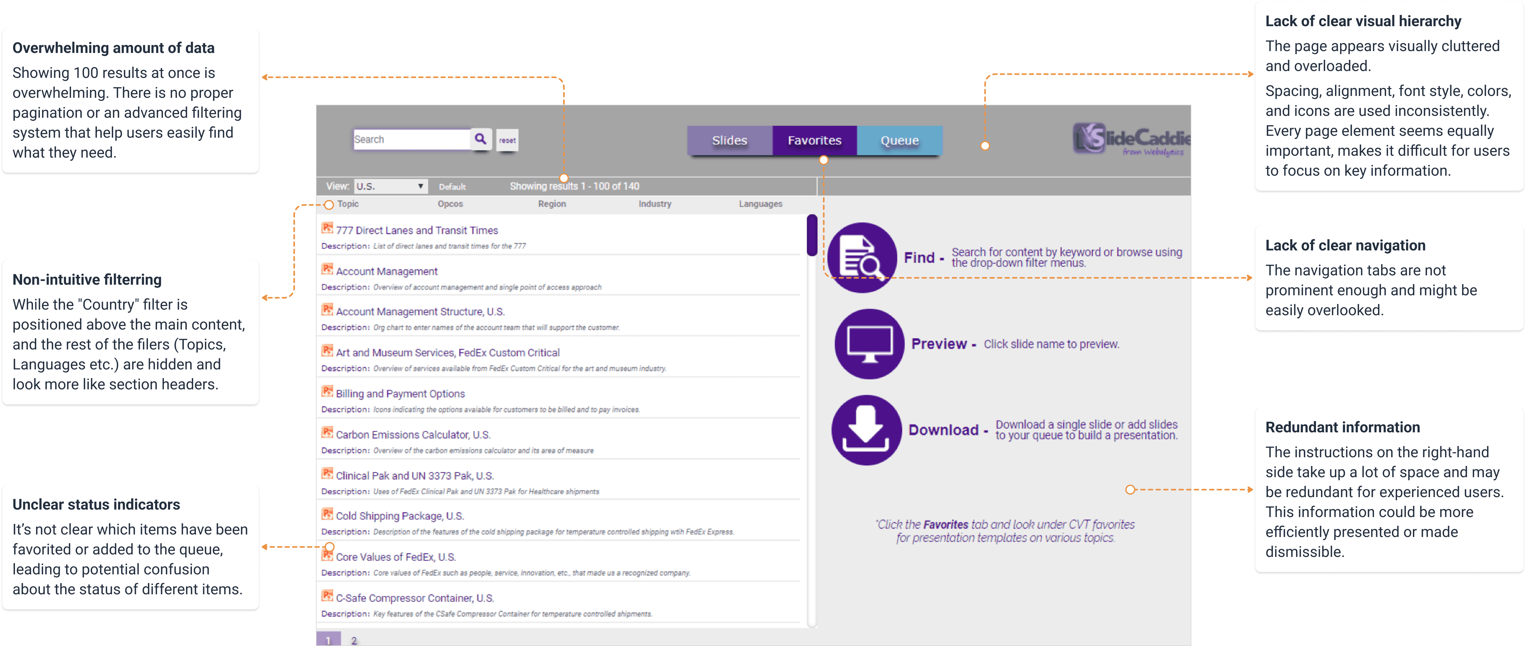
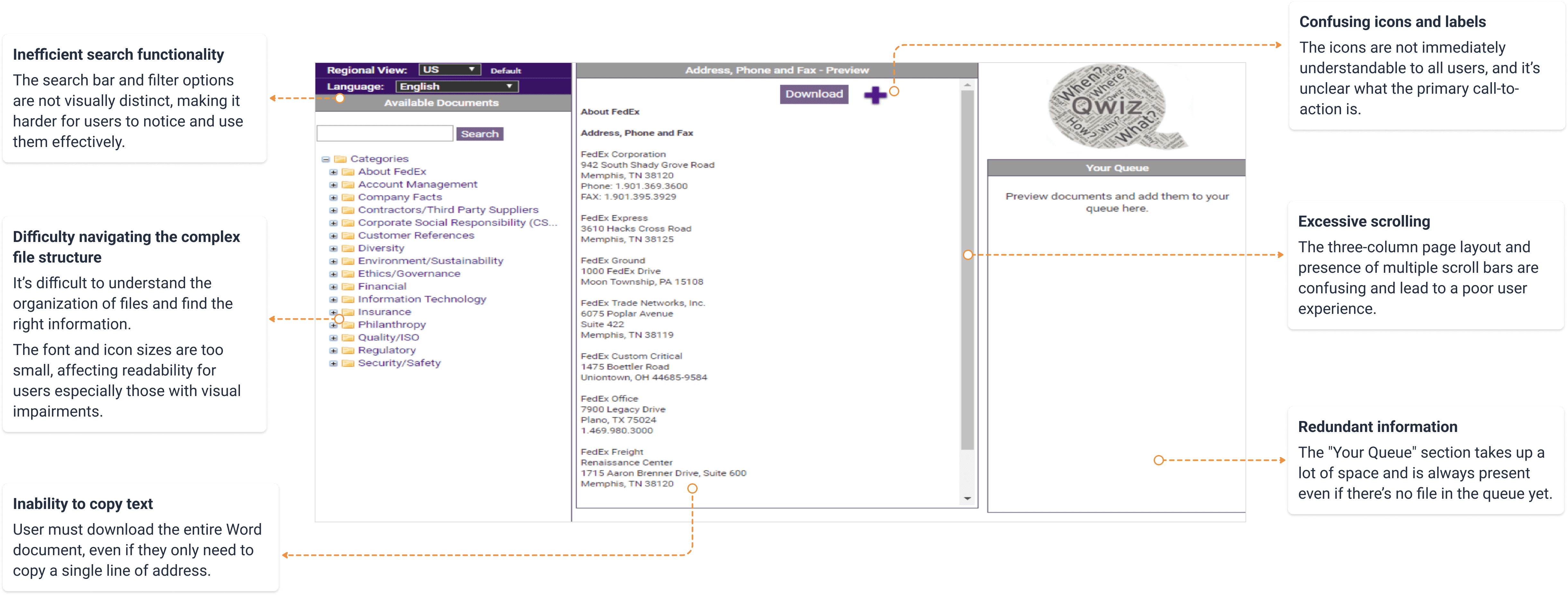
There was a ton of thinking and research that went into the creation of the original solution. I conducted an extensive analysis of the current experience, with the goal to understand its functionality and the intention behind each product decision.
Below: The content tool for downloading customer-facing presentations
Below: The short answer tool for customer request for quote (RFQ)

User research
1:1 in-depth interviews
Early discovery began with 1:1 empathy sessions, where I asked open-ended questions about the current user journey. I also actively involved stakeholders from the cross-functional team in these interviews.
Survey of power users
The in-depth interviews revealed recurring patterns, which informed the design of more targeted survey questions. I surveyed all user groups and received 57 responses.
Usage data analysis
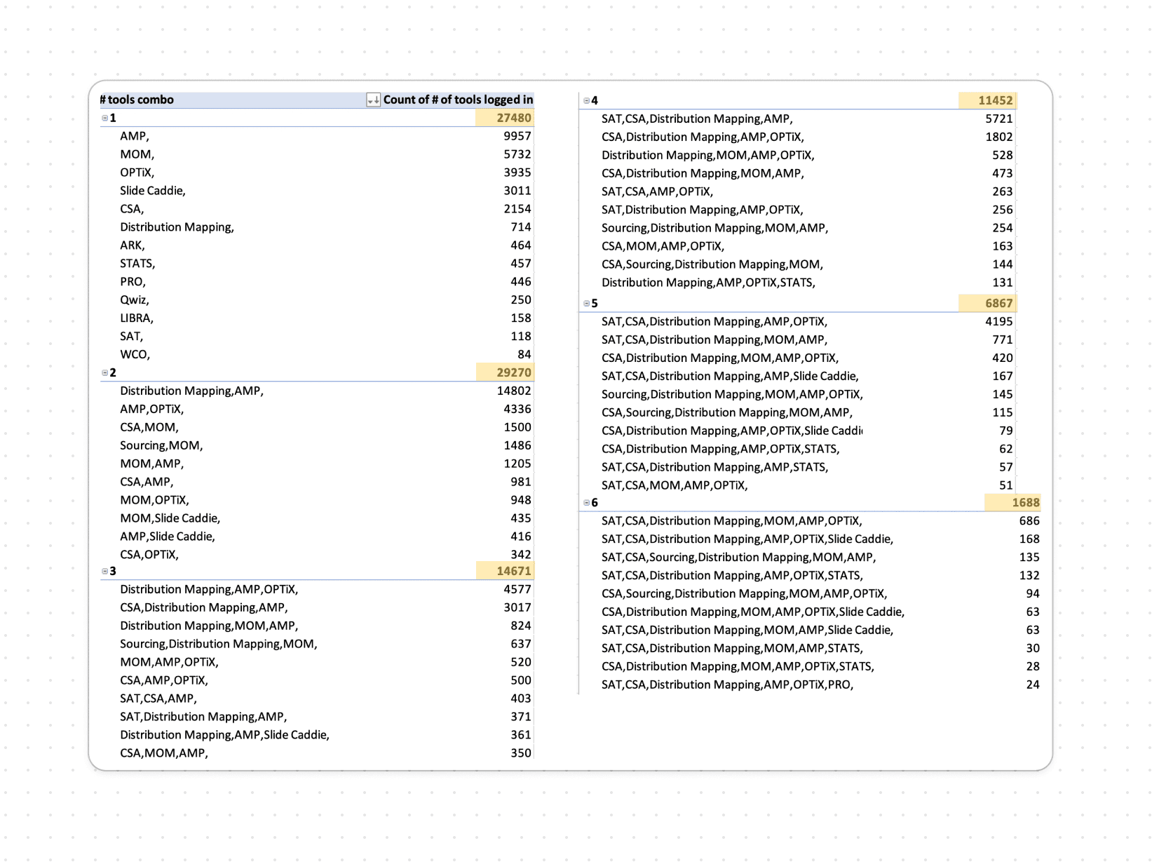
I analyzed past usage patterns, including clickstream data for each tool and feature, frequent tool combinations within user sessions, and top search queries.
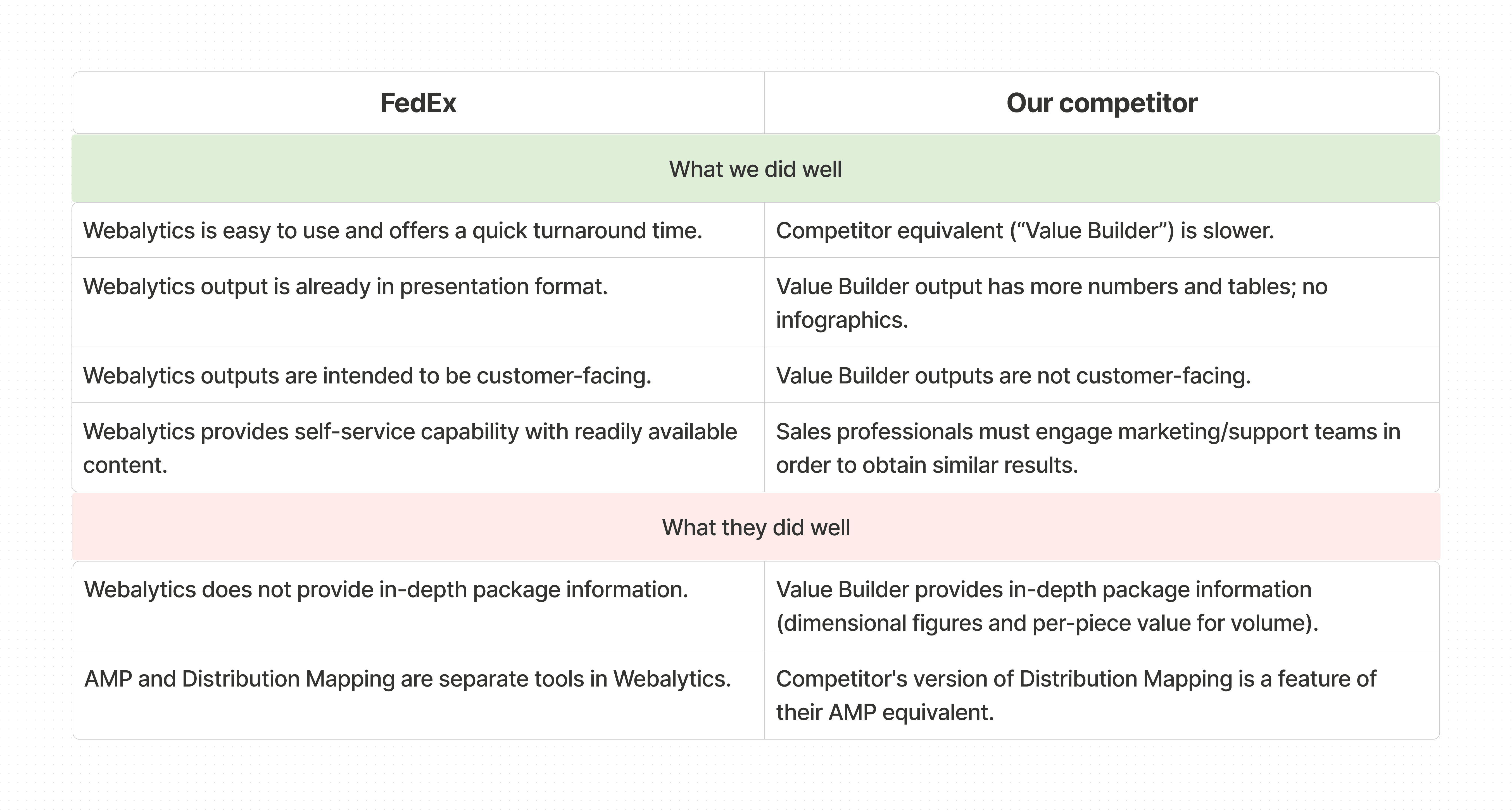
Competitive analysis
Since the product was for internal users, it was difficult to find similar products in the market for benchmarking. I took an unconventional approach and interviewed Sales who had previously worked for competitors and now worked at FedEx.
What are users' pain points and unmet needs?

Users face tedious manual merging of reports.
Users often merge reports from multiple tools to create custom presentations. However, they must download each report separately and manually combine them, requiring extensive editing to get it right.


Users need handy, brand-compliant templates.
Users lack templates for title pages and dividers. Brand-compliant template slides are essential for customizing presentations. Creating these pages from scratch is time-consuming.
What are the usage patterns for report combination?
What can we learn from competitors?
Design ideation
Case study: Simplified homepage and navigation
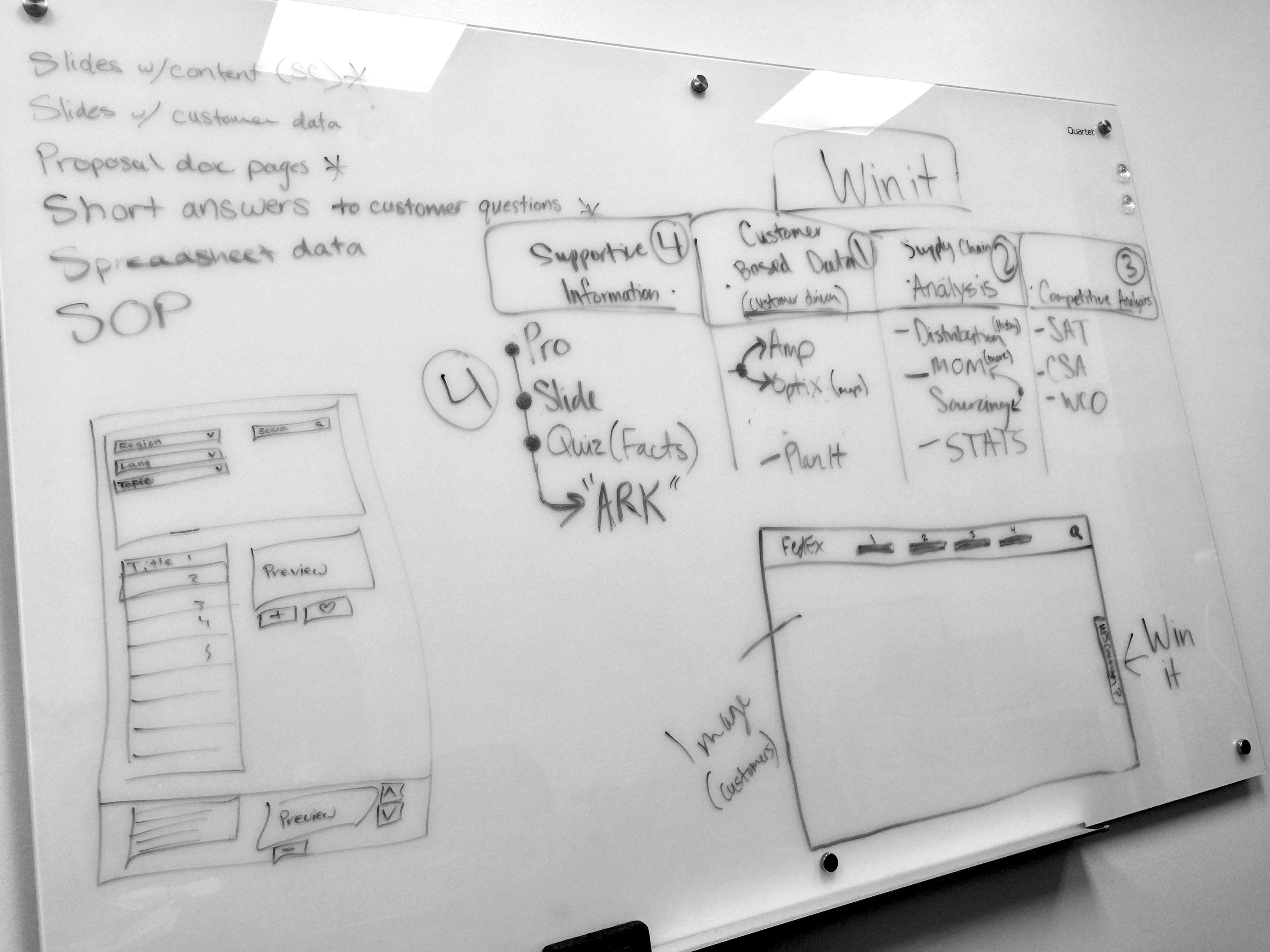
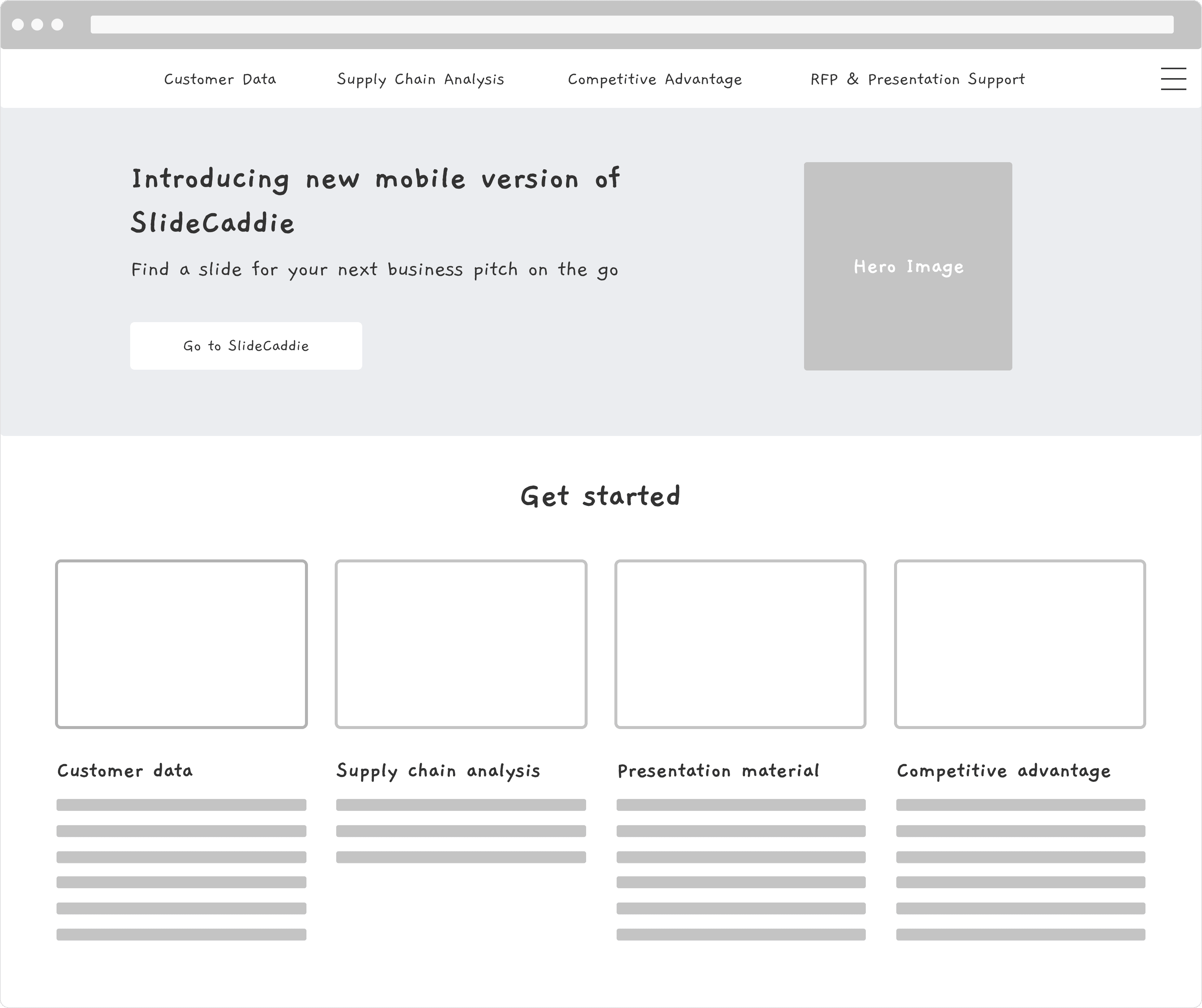
Many users found Webalytics difficult to use due to the large number of tools and the lack of helpful information on the homepage. Inspired by the usage data of tool combinations, I categorized the tools into 4 buckets and implemented this structure as the global navigation to guide users navigate the site.
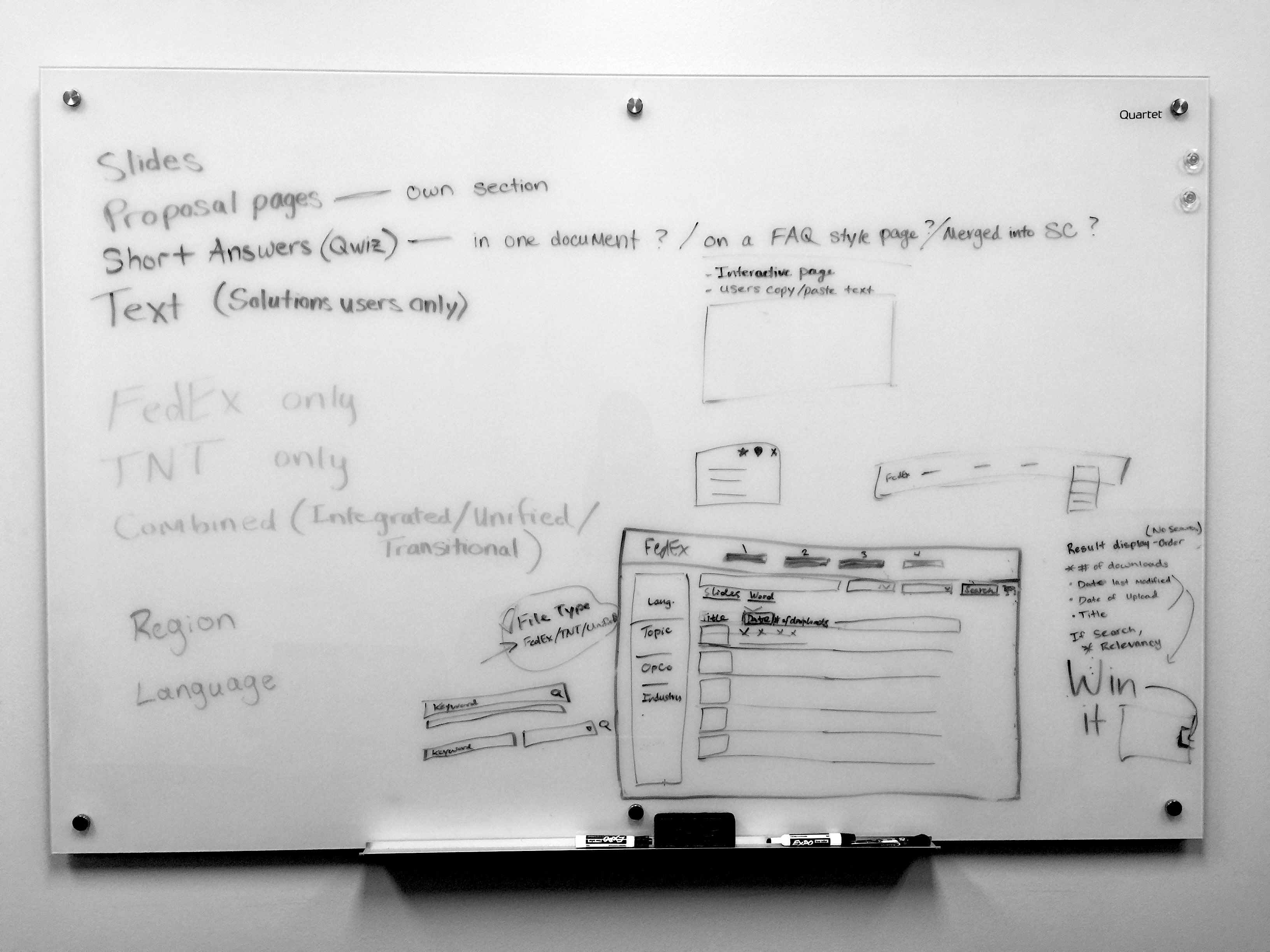
Below: Whiteboarding and low-fidelity wireframes
Case study: The "shopping cart"
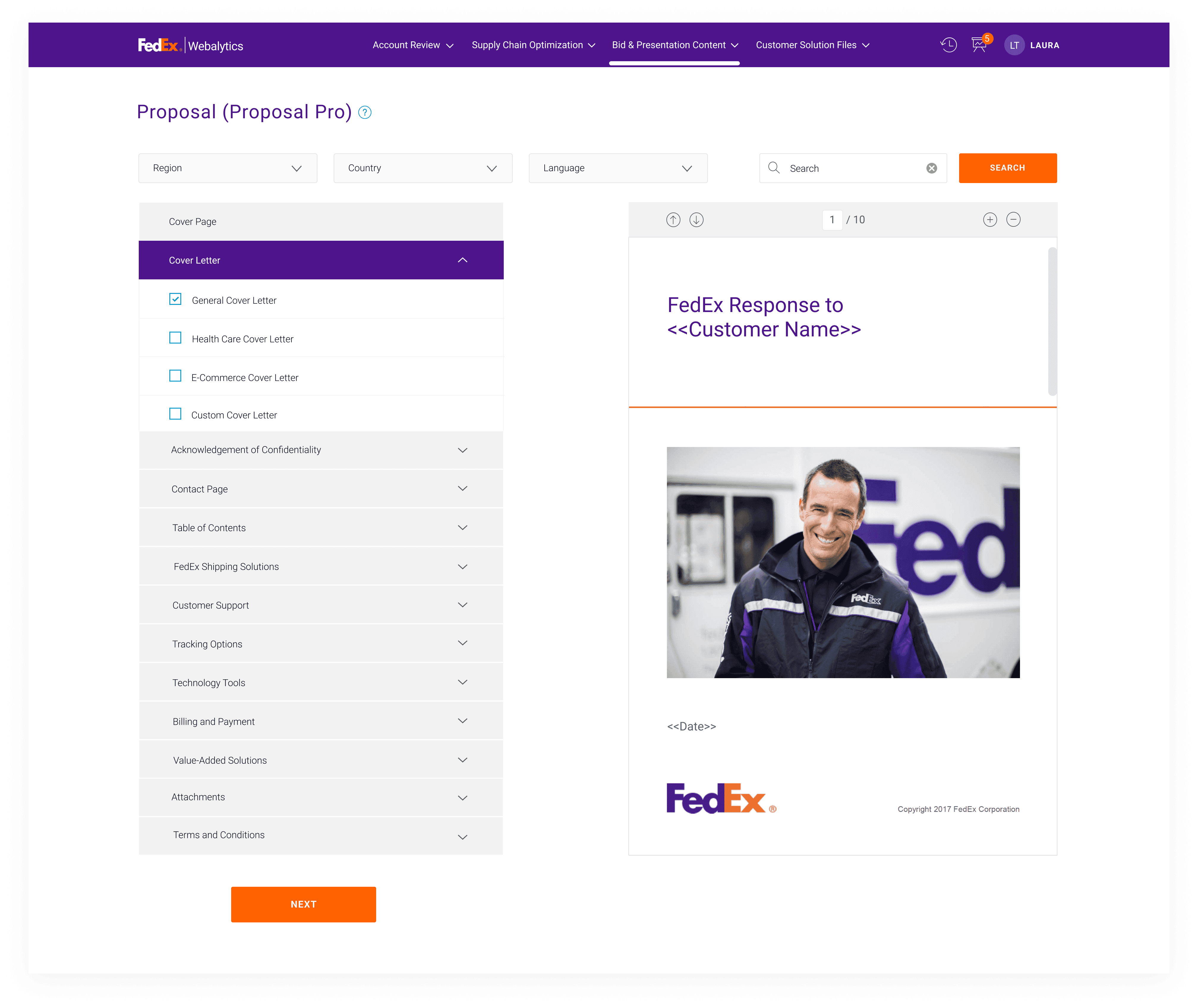
Another highly desired feature was the ability to merge frequently used tools, so users wouldn’t have to download and manually combine each report. However, simply “merging the tools” wasn't technically feasible, and there was no “one-size-fits-all” approach for tool combinations due to varying business needs.
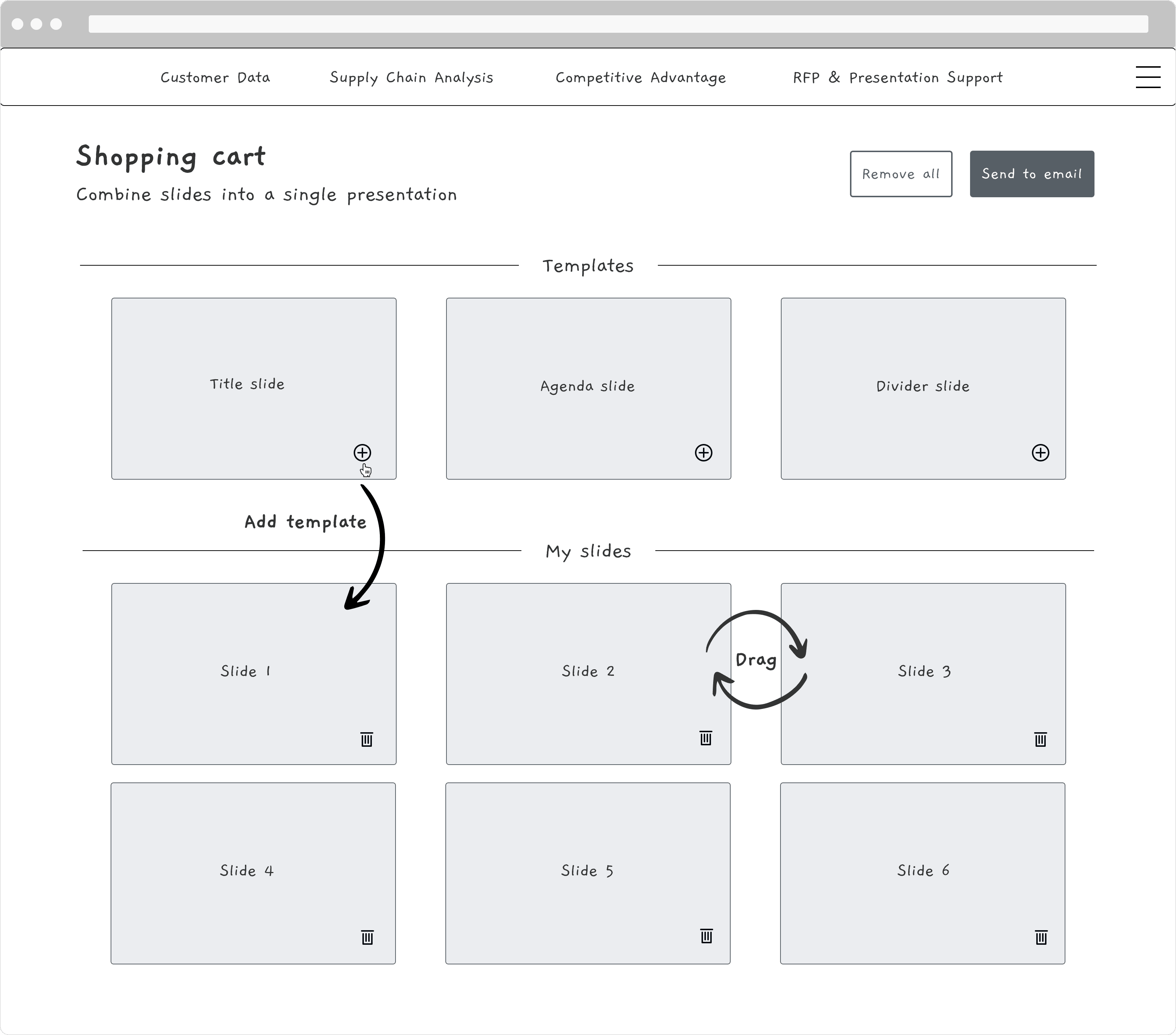
My solution was a "shopping cart" feature that allows users to rearrange and combine multiple reports into one file before exporting it. This provided maximum customization flexibility, without altering the nature of each tool or adding significant development challenges.
Below: Whiteboarding and low-fidelity wireframes
Usability testing: Show, don’t tell

Unmoderated remote usability testing
To get quick results, I provided unique links to interactive prototypes for users to experiment with. They were able to give instant feedback directly on the prototype.
Moderated 1:1 testing sessions
To understand the reasoning behind user behavior, I also conducted 1:1 sessions with 12 users, and observed for roadblocks and confusion points.
The design should speak the users' language
Testing results suggested usability issues and desired features. For example, users didn't realize they could shuffle the items in the shopping cart, and they would like to see file attributes such as number of pages, customer name, account number, and date range.
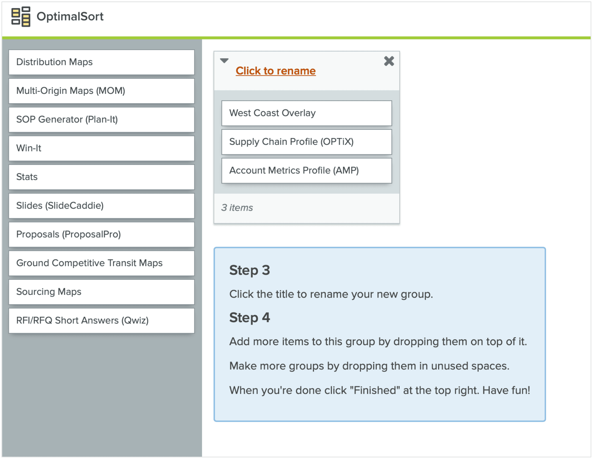
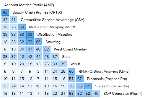
The most thought-provoking feedback was about the categorization of tools. Many users found "Customer Data," "Supply Chain Analysis," and "Competitive Advantage" confusing and didn't understand what went into those buckets.
Below: Card sort study design and the similarity matrix
🌟 Final design handoff
THE HOME PAGE
Streamlined design with intuitive navigation
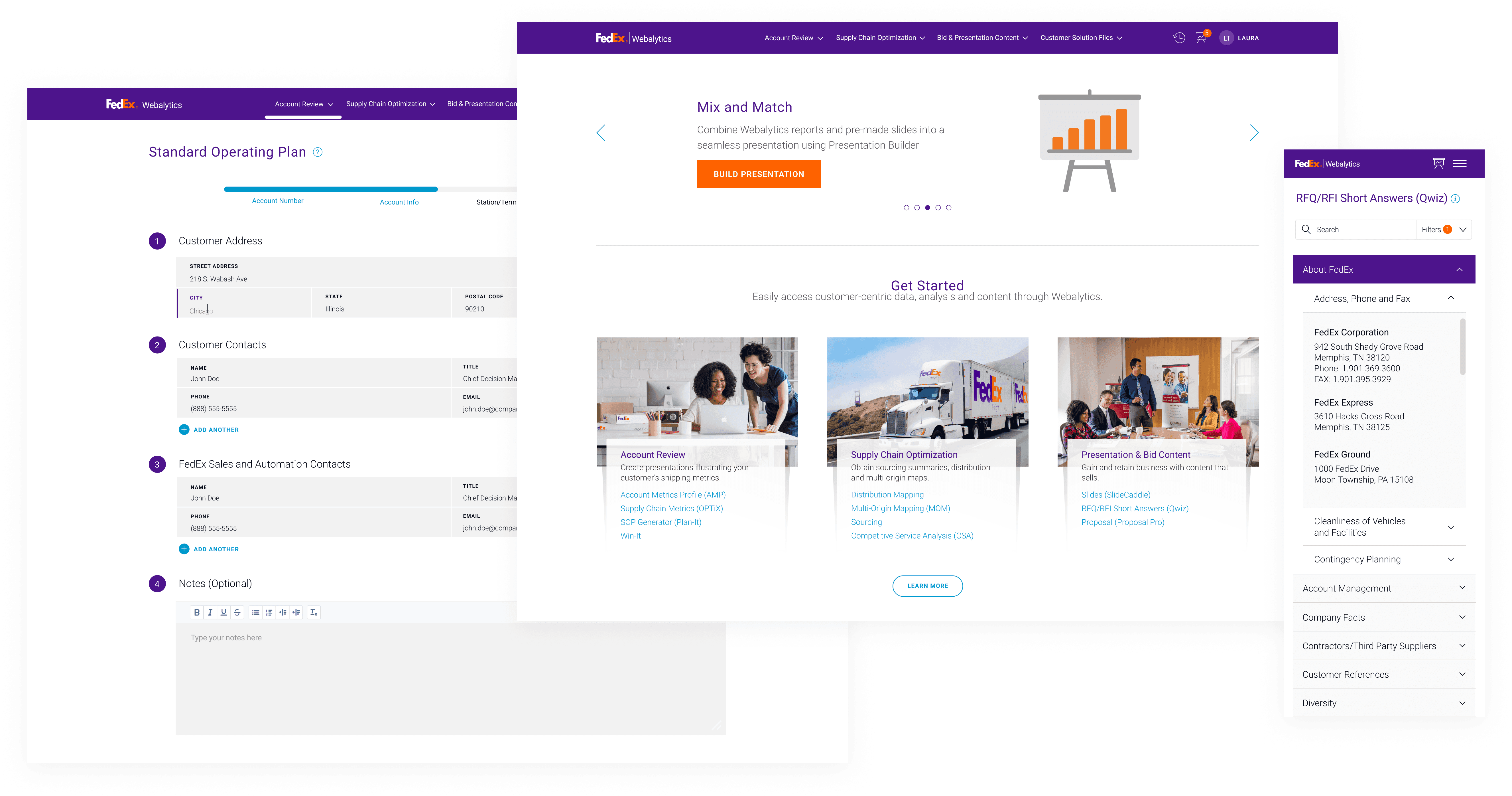
Tools are purposefully categorized and named using descriptive terminologies that resonate with users. The visual hierarchy and grid system provide a fluid experience across screen sizes, directing users' attention by guiding their eyes along an intended path.
CONTENT TOOLS
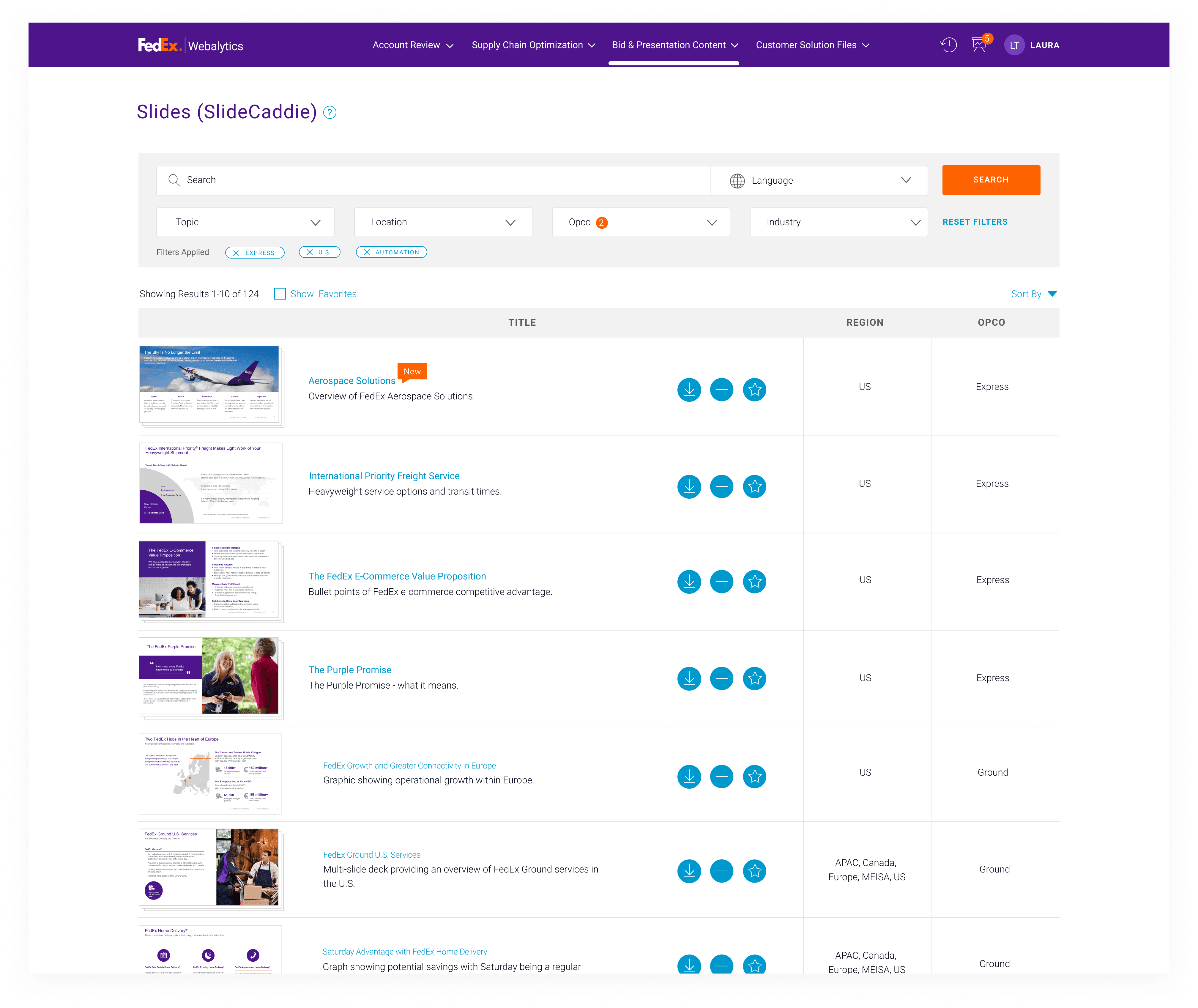
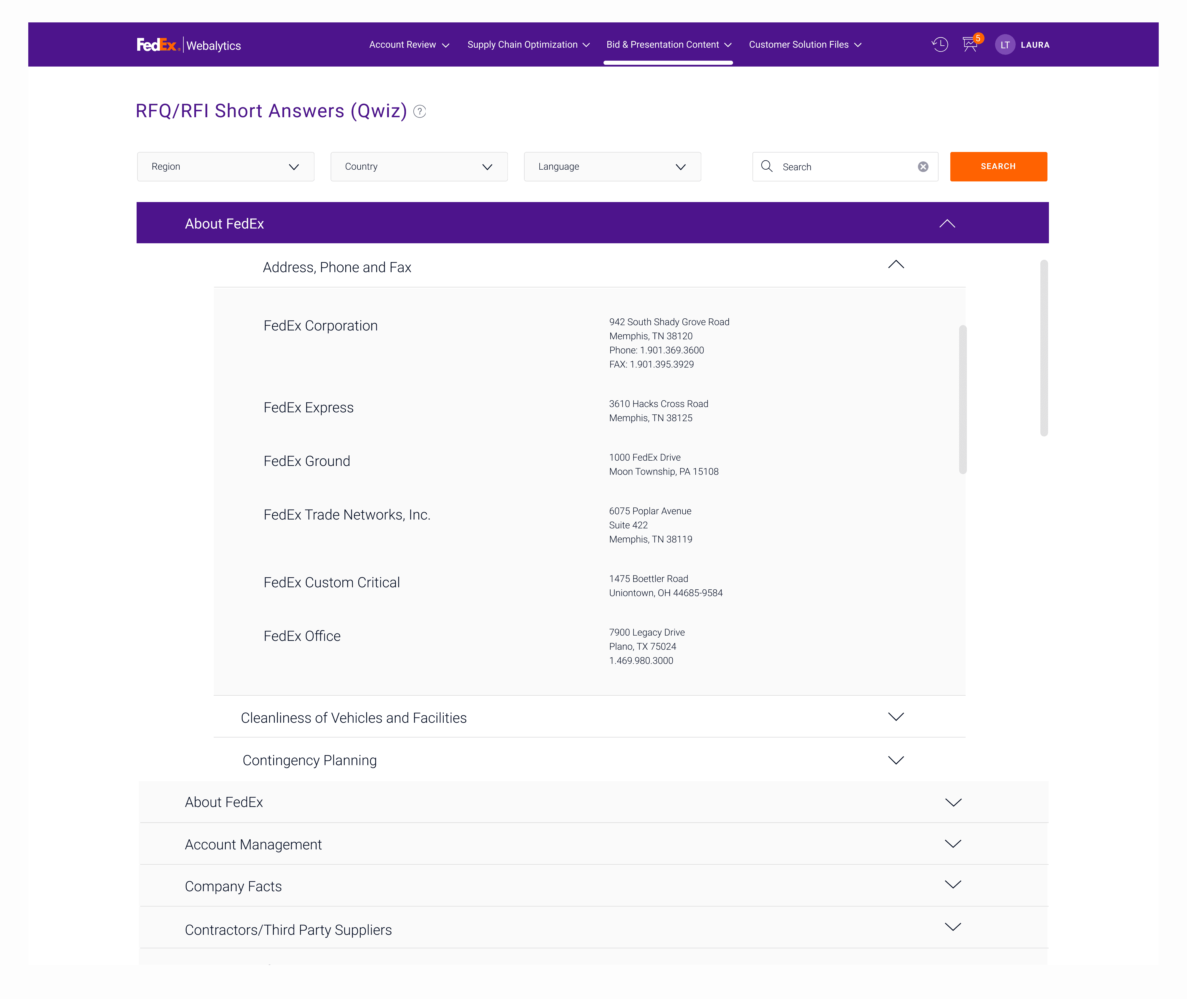
Easily find the right information
The content tools have been redesigned for a consistent look and enhanced usability. Searching and filtering functionalities are optimized for efficiency. Users' pain points have been addressed, such as the ability to easily copy information from the tool without downloading the entire document.

ANALYTICS TOOLS
Simplifying the complexity of reporting tasks
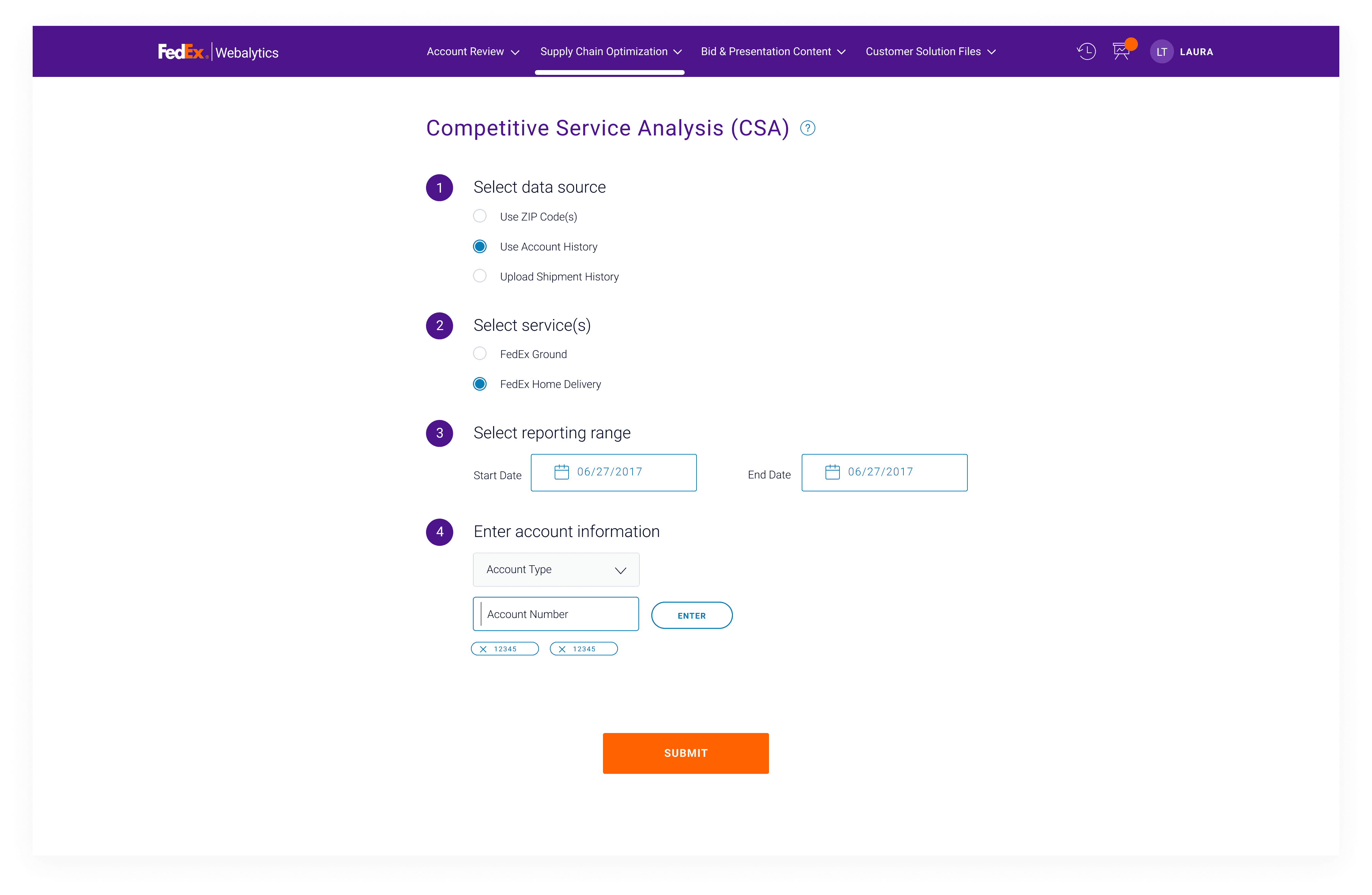
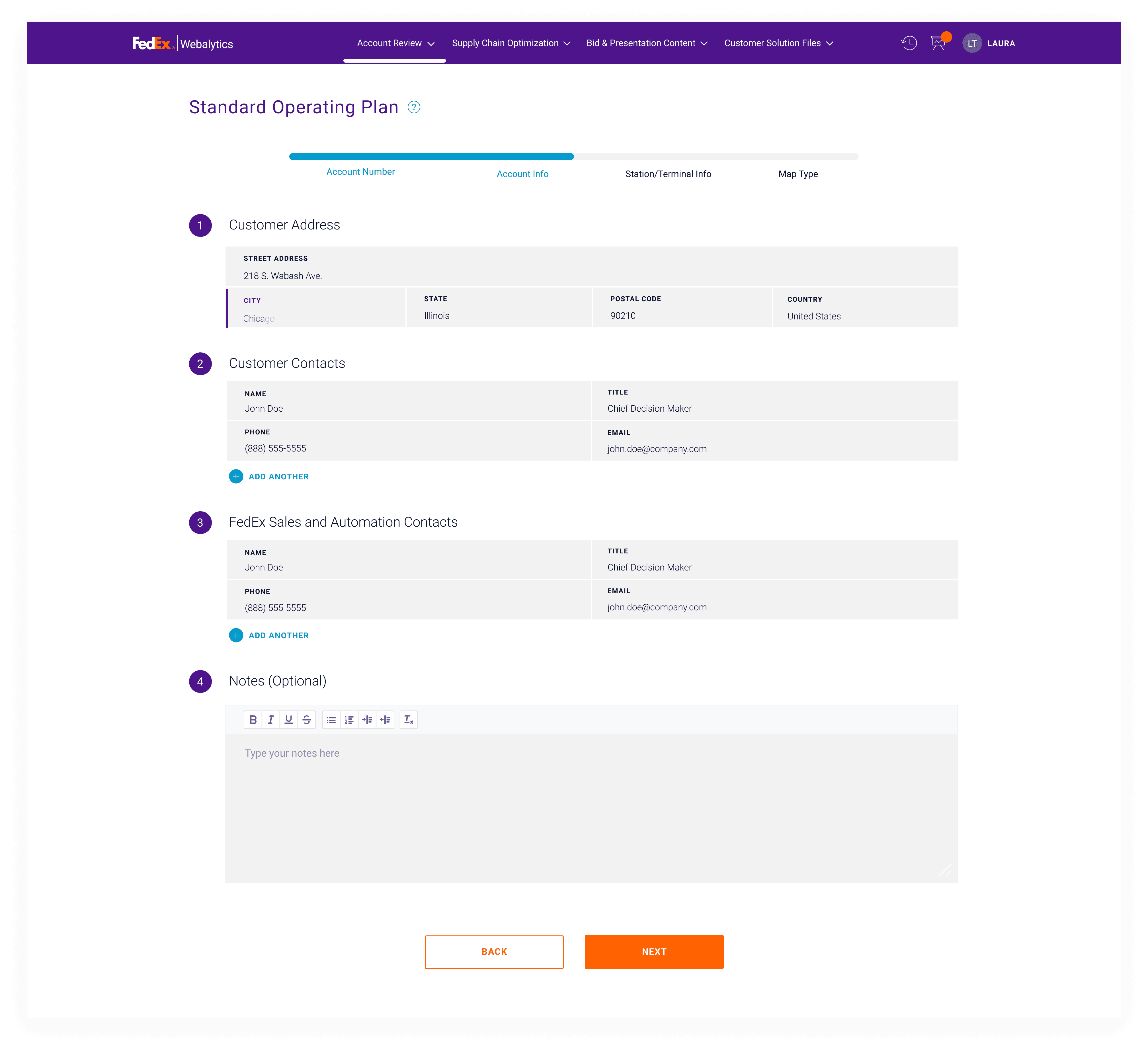
The step-by-step workflow indicates progress and helps users understand the logic along the way. It features minimal data entry for efficiency and tooltips that provide additional information.
ORDER HISTORY
Rerun and refresh
The new Order History allows users to quickly re-generate past reports with the most recent customer data. With enhanced filtering and search functions, locating a report is effortless. The calls-to-action are carefully curated to accommodate various report types and ensure clarity.
PRESENTATION BUILDER
Mix and match
The Presentation Builder enables users to add and rearrange their reports and slides, exporting the entire cart into one document. Optional template slides offer flexibility for custom presentations, while motions and visual indicators prompt drag-and-drop file organization.
EMAIL REDESIGN
A cohesive experience
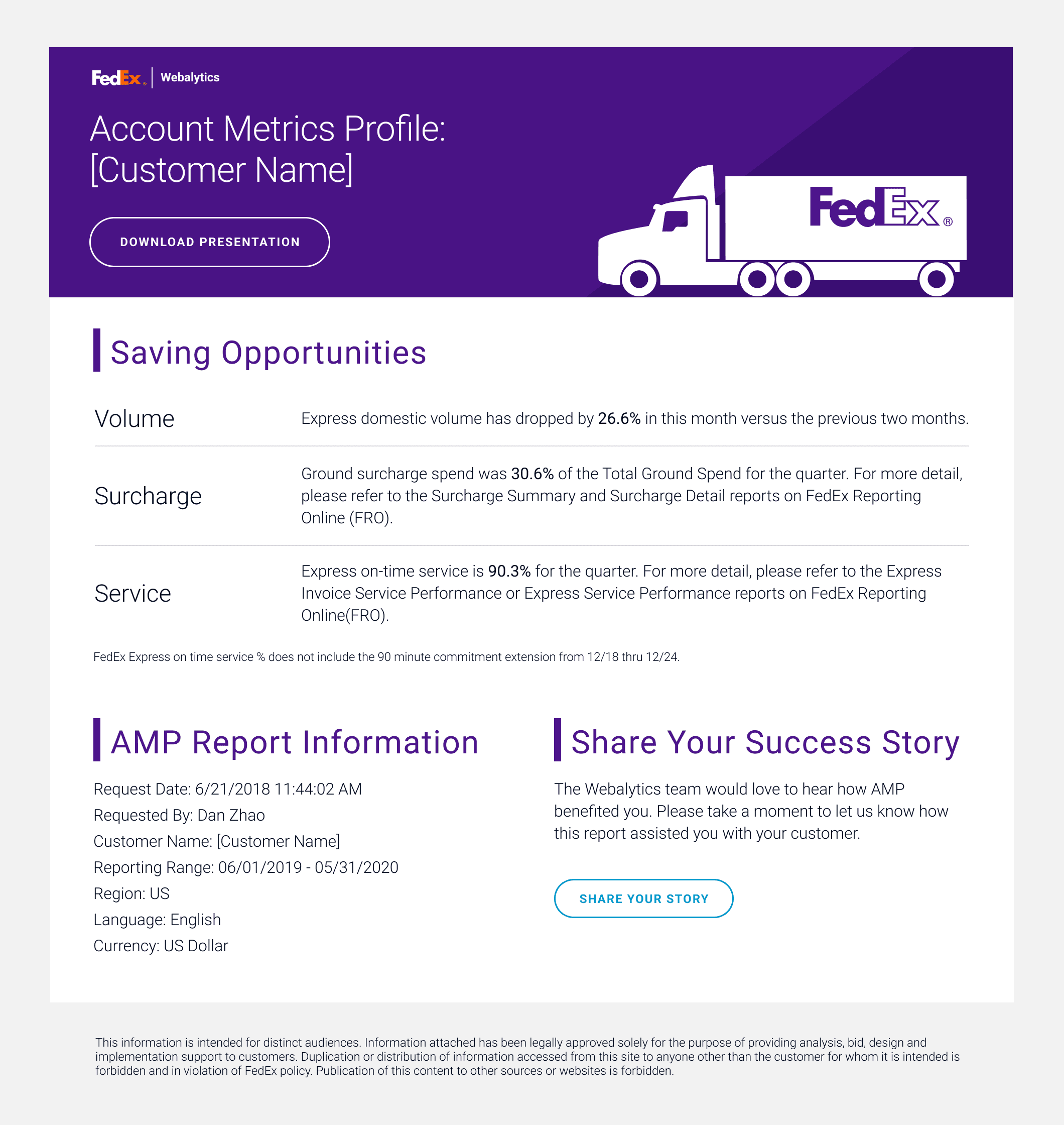
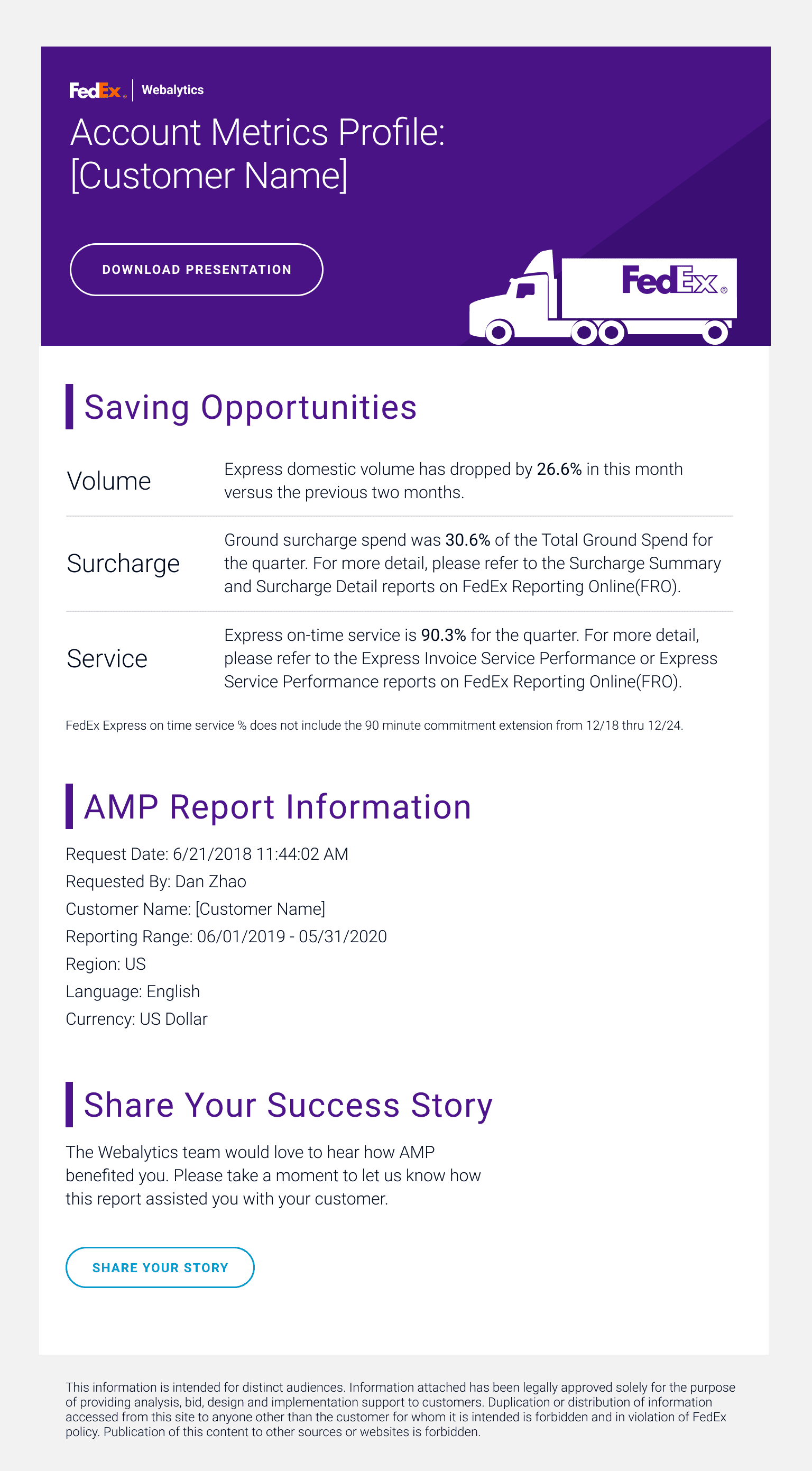
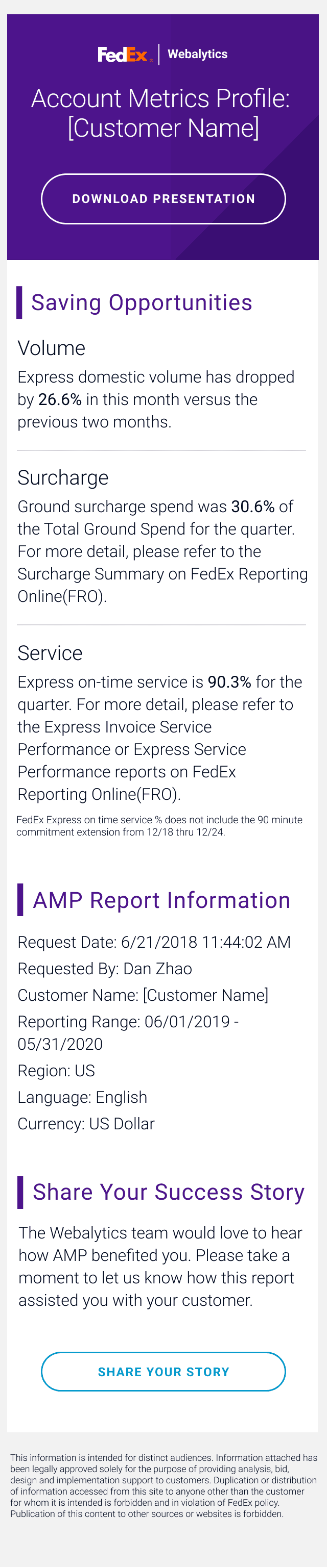
All Webalytics reports are delivered via email, making it a crucial touchpoint for a cohesive user experience. The email format needed a refresh to include cost-saving insights for Sales and to ensure readability on mobile devices.
Measuring success
1.5 Million Requests
In the first year, the total number of requests increased by 150%, up from the previous 1M.
4,500+
Number of total users per day
83%
Users combining reports using the new Presentation Builder