
Unified FedEx CRM
A comprehensive view for global sales to track performance and customer health
The Challenge
Globally, over 10,000 FedEx Sales Account Executives make more than 375,000 sales calls each week. However, identifying the right customers for growth and retention is done manually by pulling reports and relying on intuition.
Two key reports in the FedEx CRM process similar data but with different views and capabilities. Sales professionals must download these reports into Excel, then manually filter and compute the data to extract insights.
Moreover, the current "one size fits all" solution does not accommodate the varying needs of different Sales segments, offering no room for customization.
The Objective
Sales need a customizable reporting tool that consolidates data from multiple reports and integrates seamlessly with the FedEx Salesforce CRM, so they could take immediate action within their primary selling platform.
Role
Lead UX designer
Duration
4 months from initial design to implementation
Team
6 project team members including designer, product owner, engineers, and data analyst
Opportunity Statement
How Might We deliver relevant and actionable insights in the FedEx CRM, so Sales can efficiently attain their goals and monitor customer health?
Understanding current experience
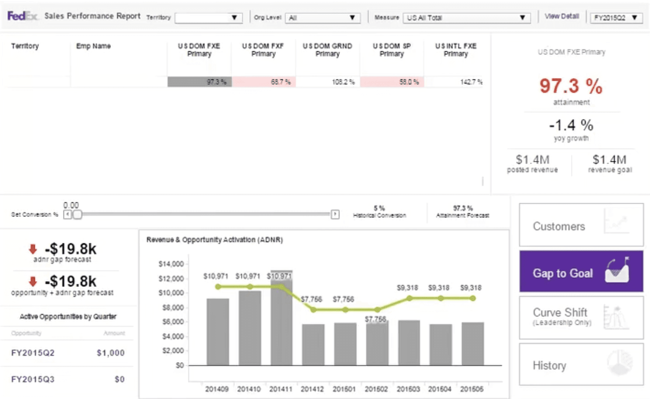
Sales users face challenges in using existing reports due to their complex nature. The lack of integration among multiple systems, slow load times, and the need for extensive training further hinder their effectiveness. Additionally, the reports are not customized for specific Sales segments, leading to wasted selling time spent on research and analysis.

User research
What are the unique needs of different user groups?

Business/Telephone Sales

Field Sales - Market Development

Field Sales - Strategic Development
What are the key metrics Sales monitor for customer health?
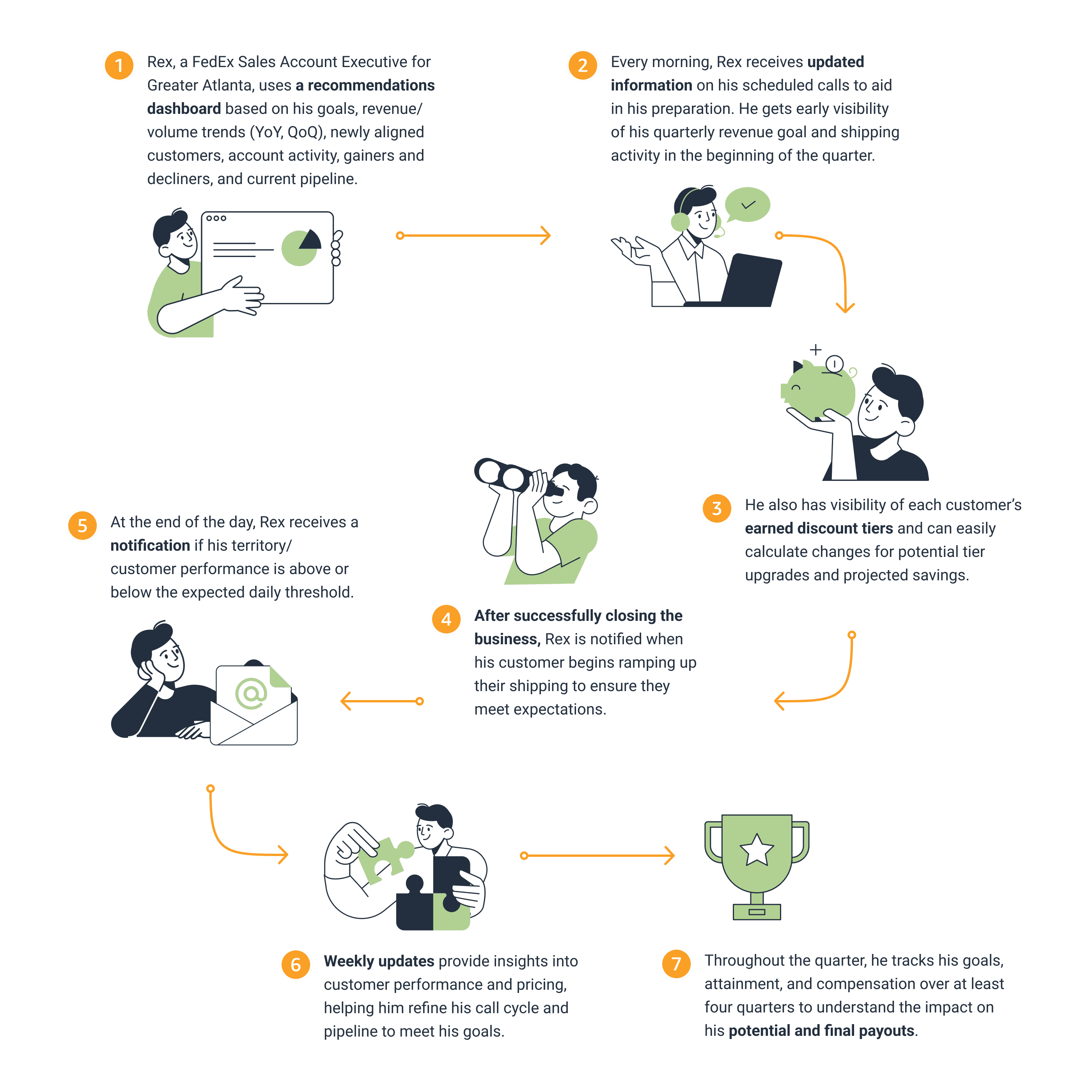
What does an ideal journey look like?
Design ideation
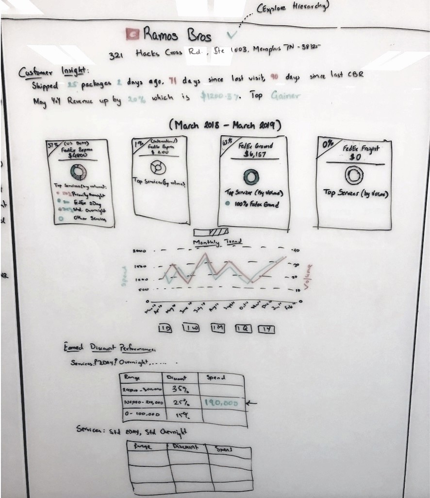
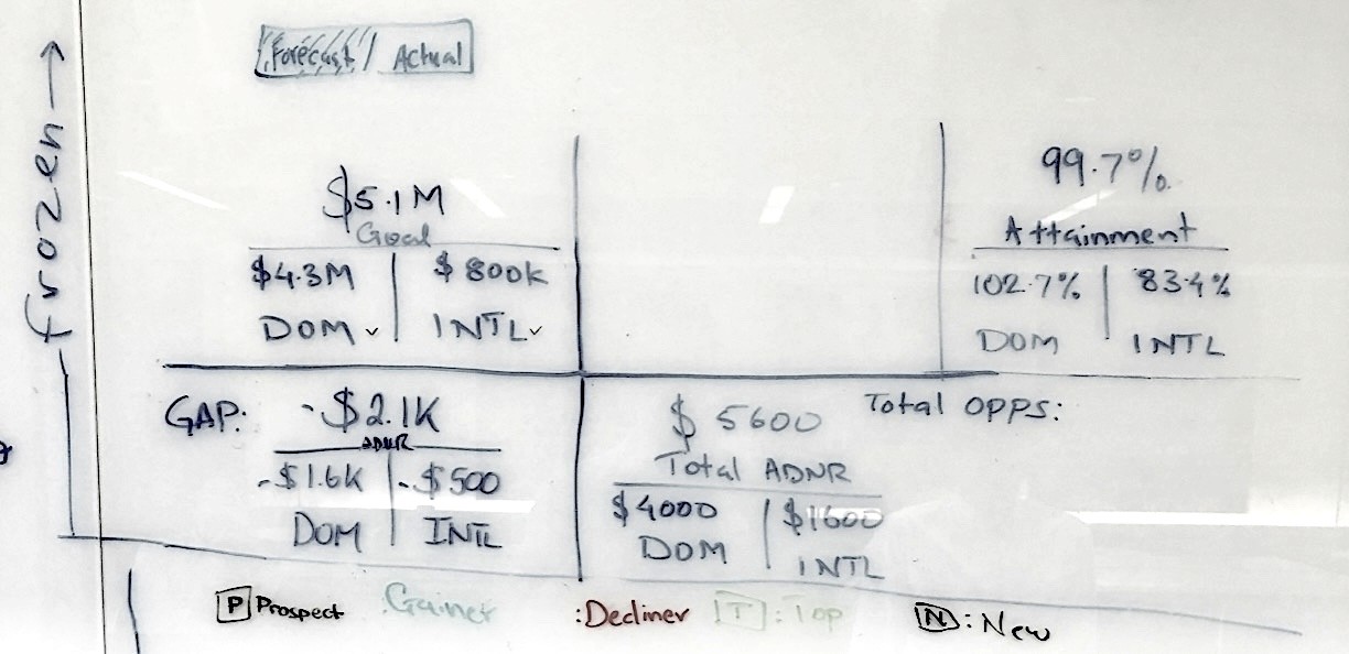
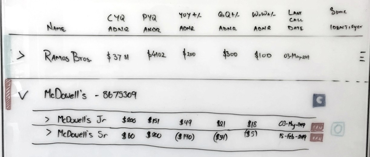
Inspired by the spreadsheet users created for managing top customers, I initiated brainstorming sessions on the whiteboard with users and the team. This collaborative approach allowed us to openly discuss various options and identify any unresolved questions.
Continuous design iterations
The whiteboard wireframes were later transformed into more polished design concepts for reviewing with the larger team and testing with users.
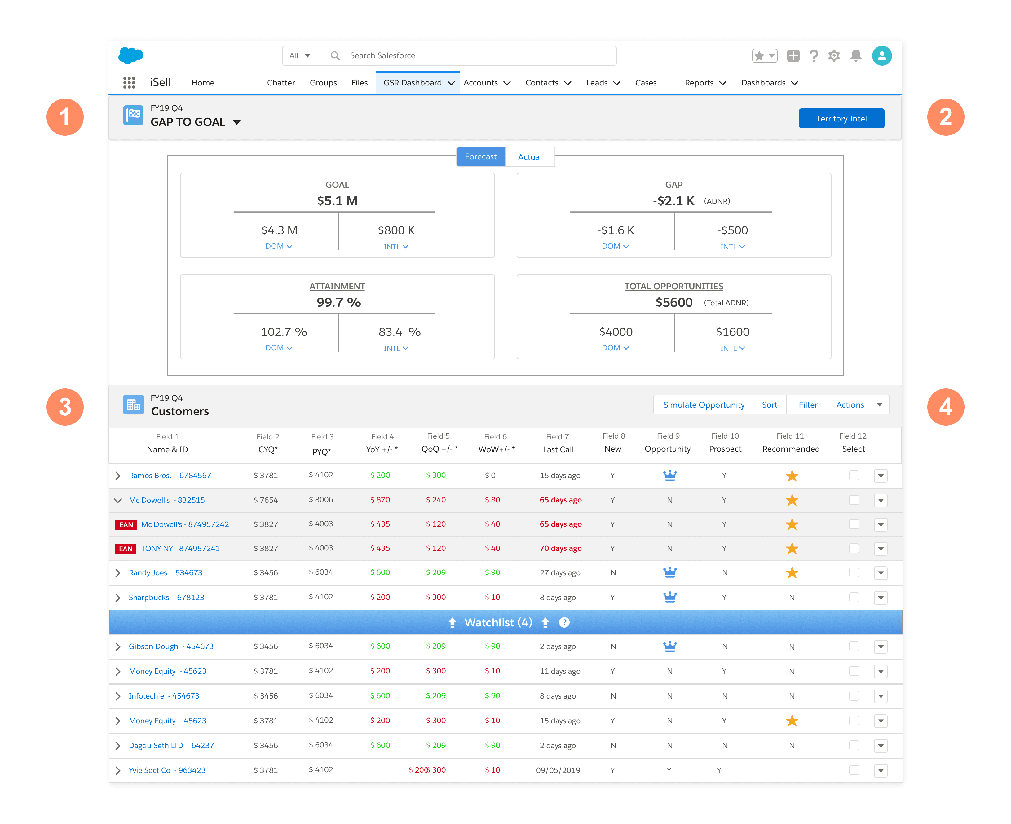
❶ Gap to goal: Users can view their goals, the gap towards achieving these goals, and current attainment. This section also provides insights into "Forecast" counts and "Actual" numbers.
❷ Territory Intel: This customizable section offers users the best insights into their territory's performance.
❸ Customers: This dynamic section allows users to curate a "Watchlist" of top customers to focus on throughout the quarter.
❹ Actions: Users can move customers to/from their "Watchlist", or schedule calls with them.
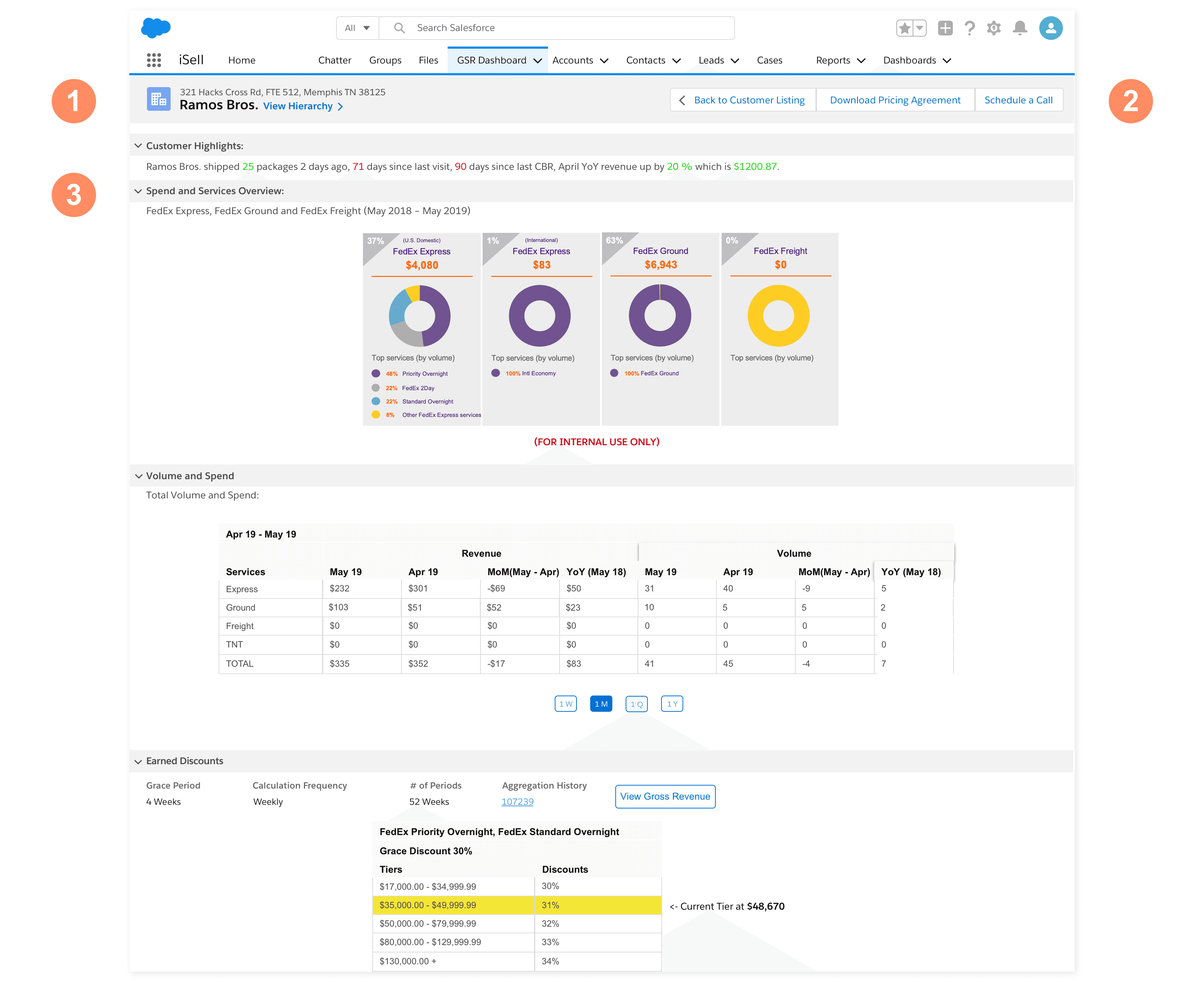
❶ On the Customer Details page, users can view the customer's address and account hierarchy.
❷ Users can add the customer to their Watchlist, or schedule a call.
❸ This section gives users the most needed intel such as customer highlights, overview of spend, volume and services, and Earned Discounts.
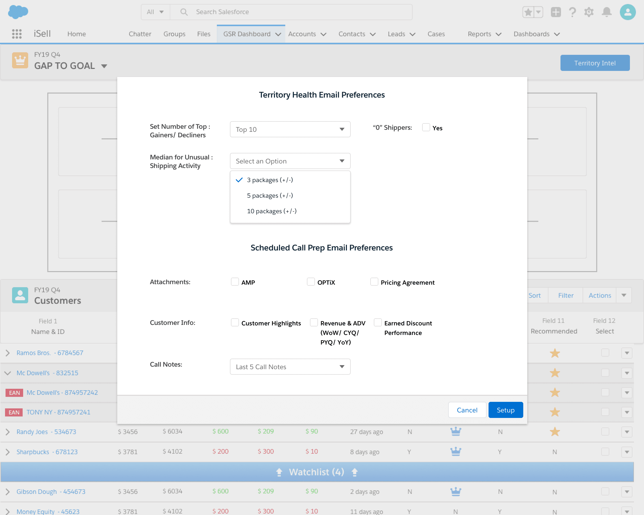
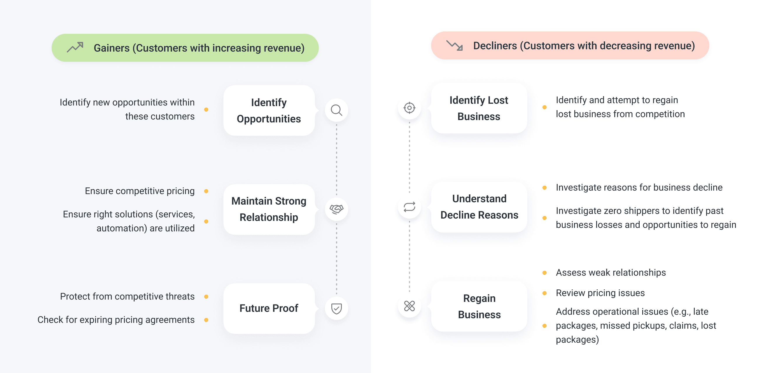
⬆️ Through Territory Intel, Sales can identify their top gainers, top decliners, and zero shippers. On the morning of scheduled calls, Territory Intel sends users relevant information compiled from multiple internal systems. Users can customize the information they receive to better prepare for their calls.
Embracing Einstein Analytics for streamlined data-driven design
During the design iteration, FedEx acquired an enterprise license for Einstein Analytics, a native Salesforce BI and data visualization tool. Given our product's data-driven nature, the team and leadership decided to adopt Einstein Analytics.
However, the original design concepts were based on the Salesforce Lightning System. Einstein Analytics was new to the team, and we were unfamiliar with its capabilities. Additionally, it lacked design guidelines and a design library.
To ensure project progress, I quickly learned the system through training and self-experimentation. It was also crucial to balance desirability, feasibility, and profitability to meet user needs and business objectives.
With meticulous attention to detail, I redesigned the dashboard with a simplified data structure and more engaging visualizations.
🌟 Design handoff
Just as I was preparing to wrap up the project, there were major changes to the sales compensation structure. Instead of measuring at domestic and international levels, the new structure required detailed measurement at the service level (FedEx Express, Ground, Freight, etc.). The design needed to be flexible to accommodate these changes.
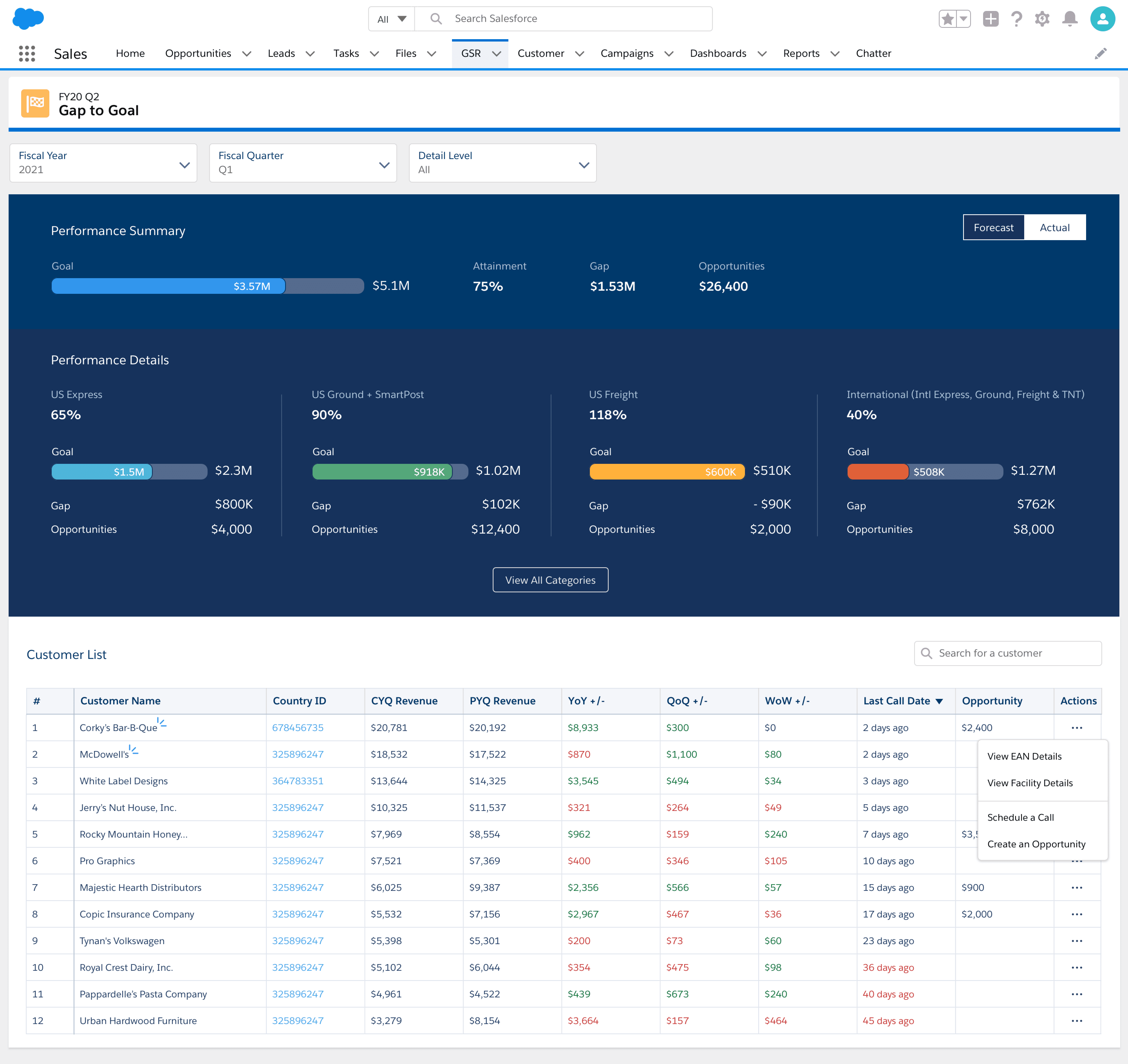
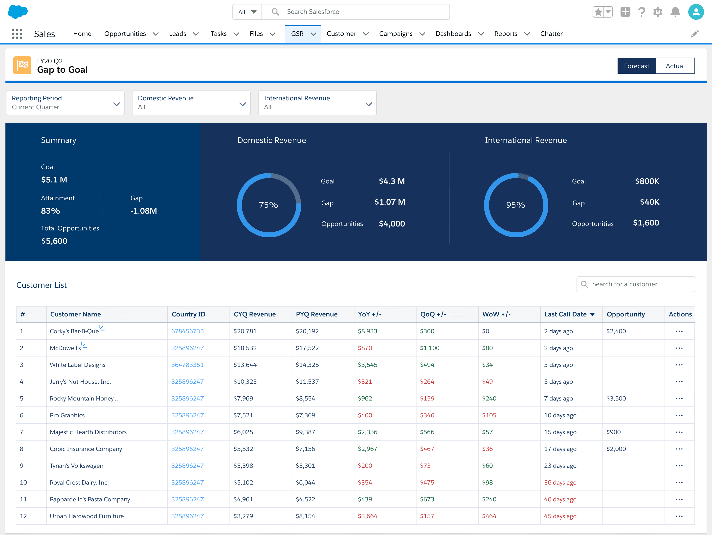
The "Gap to Goal" page
The final iteration offers intuitive data visualization of sales compensation categories. Users can select reporting periods (Forecast vs. Actual) for comparing current and historical data. This allows them to:
- Quickly assess progress towards quarterly goals
- Identify revenue gaps by category
- Leverage closed/won opportunities to close these gaps.
The Customer List provides a quick snapshot of customer information, empowering Sales to prioritize selling activities and focus on high-priority customers. They can also take swift actions like scheduling calls and creating opportunities.
The Customer Details page
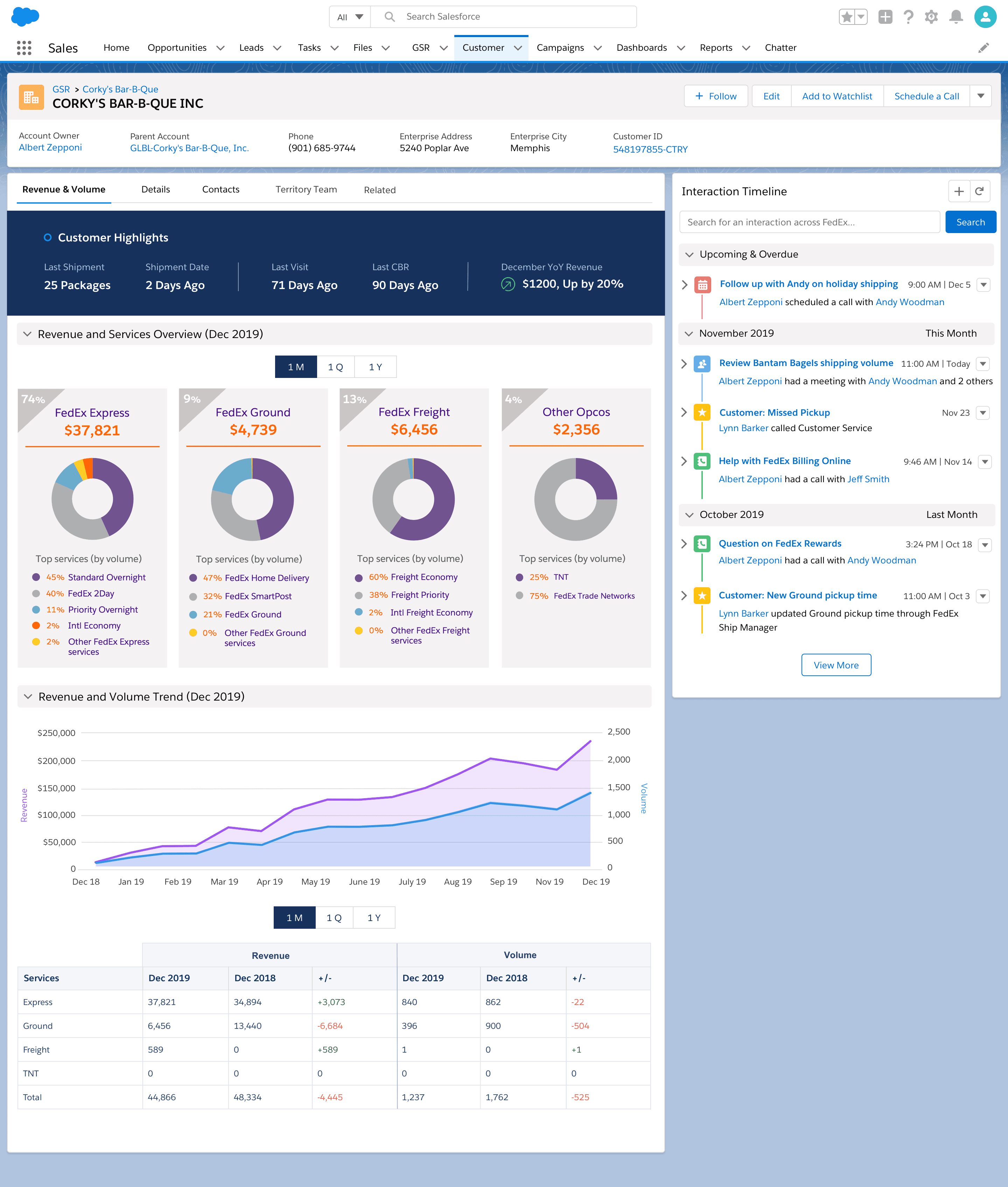
The customer details page is especially beneficial for Field Sales users, who deal with complex customer structures requiring thorough research. Users can customize the reporting period (month, quarter, or year), allowing them to focus on current customer information or gain insights from historical revenue data.
Key features include:
- Customer Highlights: Provides essential information such as shipping activity, last visit details, customer business reviews, and revenue status.
- Spend & Services Overview: Shows how extensively the customer uses FedEx services like Express, Ground, and Freight.
- Volume & Spend Trend: Displays trends in customer shipping activity over time, facilitating year-over-year comparisons to assess performance relative to previous periods.
Measuring success
Average unique users per day
112K
Total users per month
Time saved on rendering reports
In their own words

Christie
Field Sales in US
This Dashboard will absolutely and definitely help me prepare for the call!!! I like being able to compare Revenue and Volume in one. I like the breakdown of services as well. One customer I looked at had express freight volume and I didn’t know they ship express freight!

Samuel
Business Sales
This dashboard will help me determine my focus for the week. This includes my gainers/decliners, etc. without me doing any extra work!

Maisa
Field Sales in Canada
A great tool to use for a quick check before we go into sales calls or for quick business reviews. It provides a good insight as well if we are covering for another Account Executive so we can quickly have a better shipping profile.

Nick
Field Sales in UK
The dashboard in itself is very good so great work to all involved – it's this type of feature that really makes the CRM better and more efficient for Sales, so thank you.