Commenting experience in Amazon Communities

A core usability area that enables users to get the full value from community engagements
WYWA-banner-image

The Challenge

Post discussions are a hallmark of Amazon Global Communities, an online forum that fosters networking, knowledge-sharing, and feedback mechanisms among strategic partners within Amazon's supply chain, including Amazon Freight Partners and Delivery Service Partners.

However, it is challenging to follow the flow of highly active discussions. This leads to members either spending excessive time trying to understand the conversation, or disengaging due to the effort required. Poor commenting experience consistently ranks among the top usability issues highlighted by users.

The Objective

Empower members to maximize the value of community engagement by making it easier to read and participate in post discussions.

Role

Lead UX designer

Duration

2 months from initial research to design handoff

Team

4 project team members including designer, product owner, engineer, and data analyst

Opportunity Statement

How Might We empower members to maximize the value of community engagement by making it easier to read and participate in post discussions?

What insights do we have about customers?

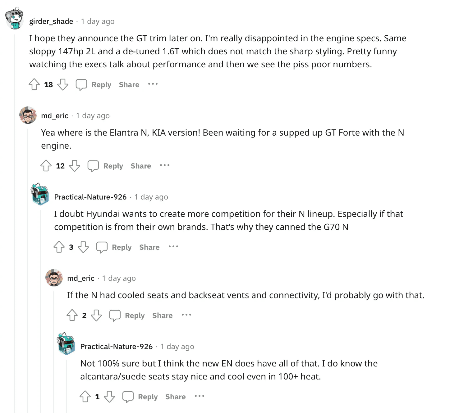
The Comments section currently uses a flat visual framework while functionally simulating an infinite nested structure via the "show replies" feature. While power users can learn the hybrid structure, it takes time to comb through a long series of cascading replies, leading to frustration for many users.

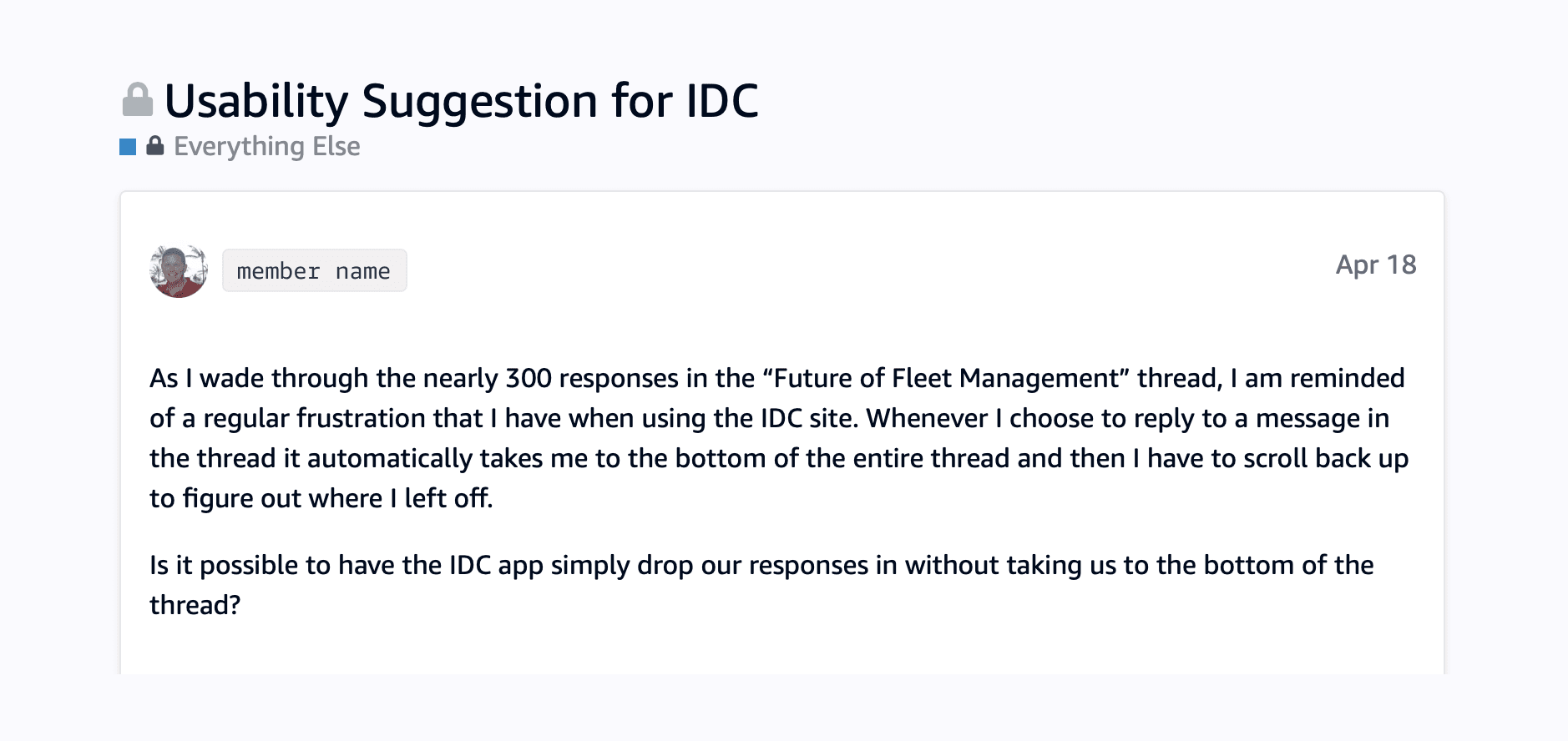
Additionally, there are several usability issues with the current experience. For instance, when a user replies to a comment, the system automatically scrolls to the bottom of the thread, causing them to lose their place in the conversation.

Below: Community member expressing frustration about usability issues
Below: Real footage of a user struggling with the navigation in comments

Identifying patterns in structured discussions

According to the Jacob's Law, users spend most of their time on other sites. This means users expect a site to work the same way as all the other sites they already know.

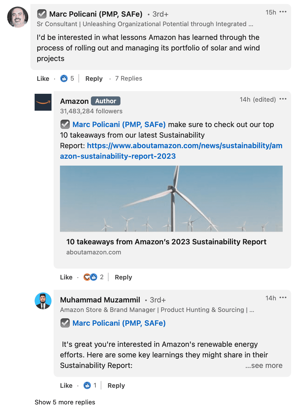
To identify best practices for discussion structures in online forums, I collaborated with the Product Manager on a comprehensive benchmarking and competitive analysis. Although Amazon Communities are unique compared to most public forums, the dynamics and challenges of commenting remain fairly consistent across different subjects, industries, and platforms.

We examined how discussions are structured at the comment and reply level across various platforms. We identified four primary structures and meticulously compared their pros and cons.

According to the Jacob's Law, users spend most of their time on other sites. This means users expect a site to work the same way as all the other sites they already know.

To identify best practices for discussion structures in online forums, I collaborated with the Product Manager on a comprehensive benchmarking and competitive analysis. Although Amazon Communities are unique compared to most public forums, the dynamics and challenges of commenting remain fairly consistent across different subjects, industries, and platforms.

We examined how discussions are structured at the comment and reply level across various platforms. We identified four primary structures and meticulously compared their pros and cons.

According to the Jacob's Law, users spend most of their time on other sites. This means users expect a site to work the same way as all the other sites they already know.

To identify best practices for discussion structures in online forums, I collaborated with the Product Manager on a comprehensive benchmarking and competitive analysis. Although Amazon Communities are unique compared to most public forums, the dynamics and challenges of commenting remain fairly consistent across different subjects, industries, and platforms.

We examined how discussions are structured at the comment and reply level across various platforms. We identified four primary structures and meticulously compared their pros and cons.

Flat structured

It features a single discussion level, with every comment and reply aligned along the same left-justified vertical reference point.

👍 This hierarchy makes navigation easy and prevents content from being pushed off the screen.

👎 It lacks visual cues to help readers understand the context, making it harder to follow an unfolding discussion.

It features a single discussion level, with every comment and reply aligned along the same left-justified vertical reference point.

👍 This hierarchy makes navigation easy and prevents content from being pushed off the screen.

👎 It lacks visual cues to help readers understand the context, making it harder to follow an unfolding discussion.

It features a single discussion level, with every comment and reply aligned along the same left-justified vertical reference point.

👍 This hierarchy makes navigation easy and prevents content from being pushed off the screen.

👎 It lacks visual cues to help readers understand the context, making it harder to follow an unfolding discussion.

Infinite threaded

This structure is the opposite of flat, allowing replies to nest infinitely.

👍 Each reply can spawn a new thread, providing visual context and enabling deep side conversations. This makes it easy to direct replies to any comment.

👎 It can be difficult to navigate, push content off-screen (especially on mobile), and make it hard to find new conversations.

This structure is the opposite of flat, allowing replies to nest infinitely.

👍 Each reply can spawn a new thread, providing visual context and enabling deep side conversations. This makes it easy to direct replies to any comment.

👎 It can be difficult to navigate, push content off-screen (especially on mobile), and make it hard to find new conversations.

This structure is the opposite of flat, allowing replies to nest infinitely.

👍 Each reply can spawn a new thread, providing visual context and enabling deep side conversations. This makes it easy to direct replies to any comment.

👎 It can be difficult to navigate, push content off-screen (especially on mobile), and make it hard to find new conversations.

Capped threaded

Comments and replies are limited to two levels. Comments are visually prioritized, while replies are deprioritized.

👍 This maintains visual context without pushing content off-screen.

👎 It deemphasizes replies and removes their relationships, making it difficult to engage with and follow the discussion.

Comments and replies are limited to two levels. Comments are visually prioritized, while replies are deprioritized.

👍 This maintains visual context without pushing content off-screen.

👎 It deemphasizes replies and removes their relationships, making it difficult to engage with and follow the discussion.

Comments and replies are limited to two levels. Comments are visually prioritized, while replies are deprioritized.

👍 This maintains visual context without pushing content off-screen.

👎 It deemphasizes replies and removes their relationships, making it difficult to engage with and follow the discussion.

Teased capped threaded

Comments and replies are capped at two levels. Replies are partially shown (teased), and users can expand to view all second-level replies under a first-level comment.

👍 This provides broad discussion context, lowers cognitive load due to the simplified hierarchy, and allows users to quickly navigate in and out of comments and their replies.

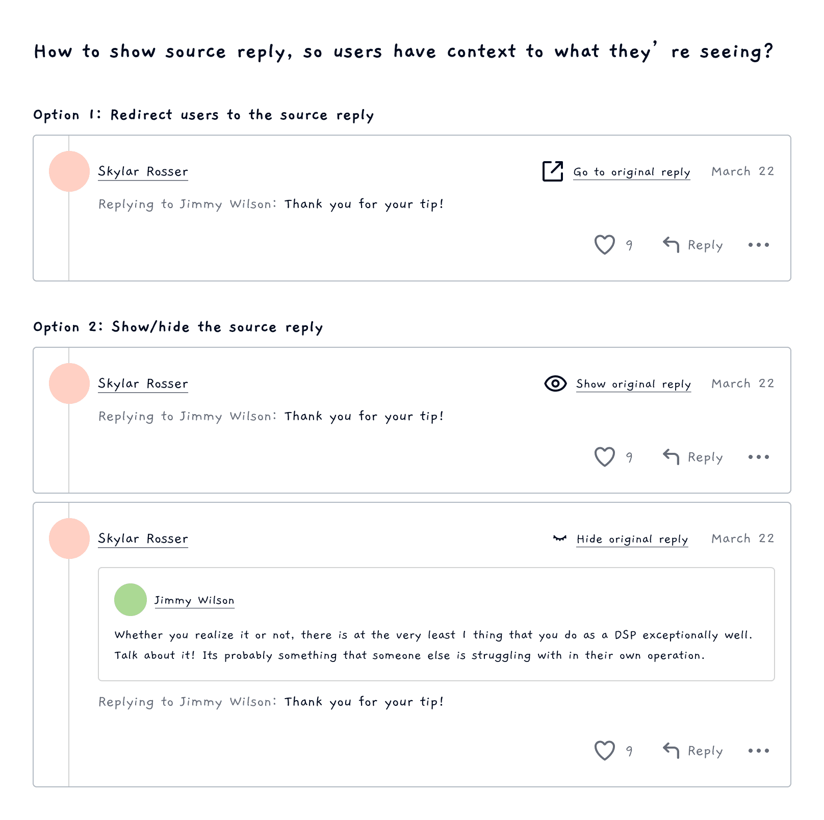
👎 If replies become numerous and complex, context can be challenging to discern. This can be mitigated by providing inline context of the source reply.

Comments and replies are capped at two levels. Replies are partially shown (teased), and users can expand to view all second-level replies under a first-level comment.

👍 This provides broad discussion context, lowers cognitive load due to the simplified hierarchy, and allows users to quickly navigate in and out of comments and their replies.

👎 If replies become numerous and complex, context can be challenging to discern. This can be mitigated by providing inline context of the source reply.

Comments and replies are capped at two levels. Replies are partially shown (teased), and users can expand to view all second-level replies under a first-level comment.

👍 This provides broad discussion context, lowers cognitive load due to the simplified hierarchy, and allows users to quickly navigate in and out of comments and their replies.

👎 If replies become numerous and complex, context can be challenging to discern. This can be mitigated by providing inline context of the source reply.

Design ideation

Based on the benchmarking analysis and our community use cases, we settled on a teased threaded structure, because it would:

1. Improve users' ability to quickly understand conversation flow by providing a clear structure with first-level comments guiding second-level replies.

2. Offer the necessary nuance and complexity through nesting limits and partially hidden replies.

3. Provide the quickest tech implementation compared to alternative options.

4. Allow for future expansion to desired frameworks like infinitely nested comments, up/downvote, and Q/A.

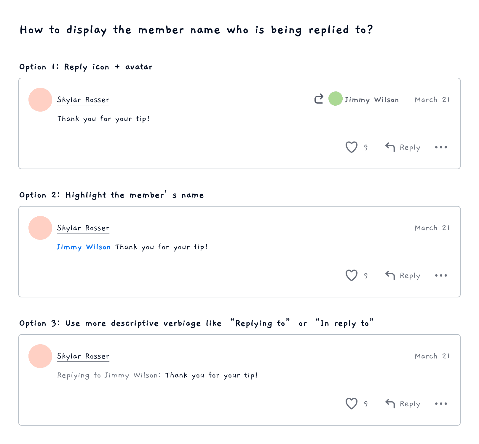
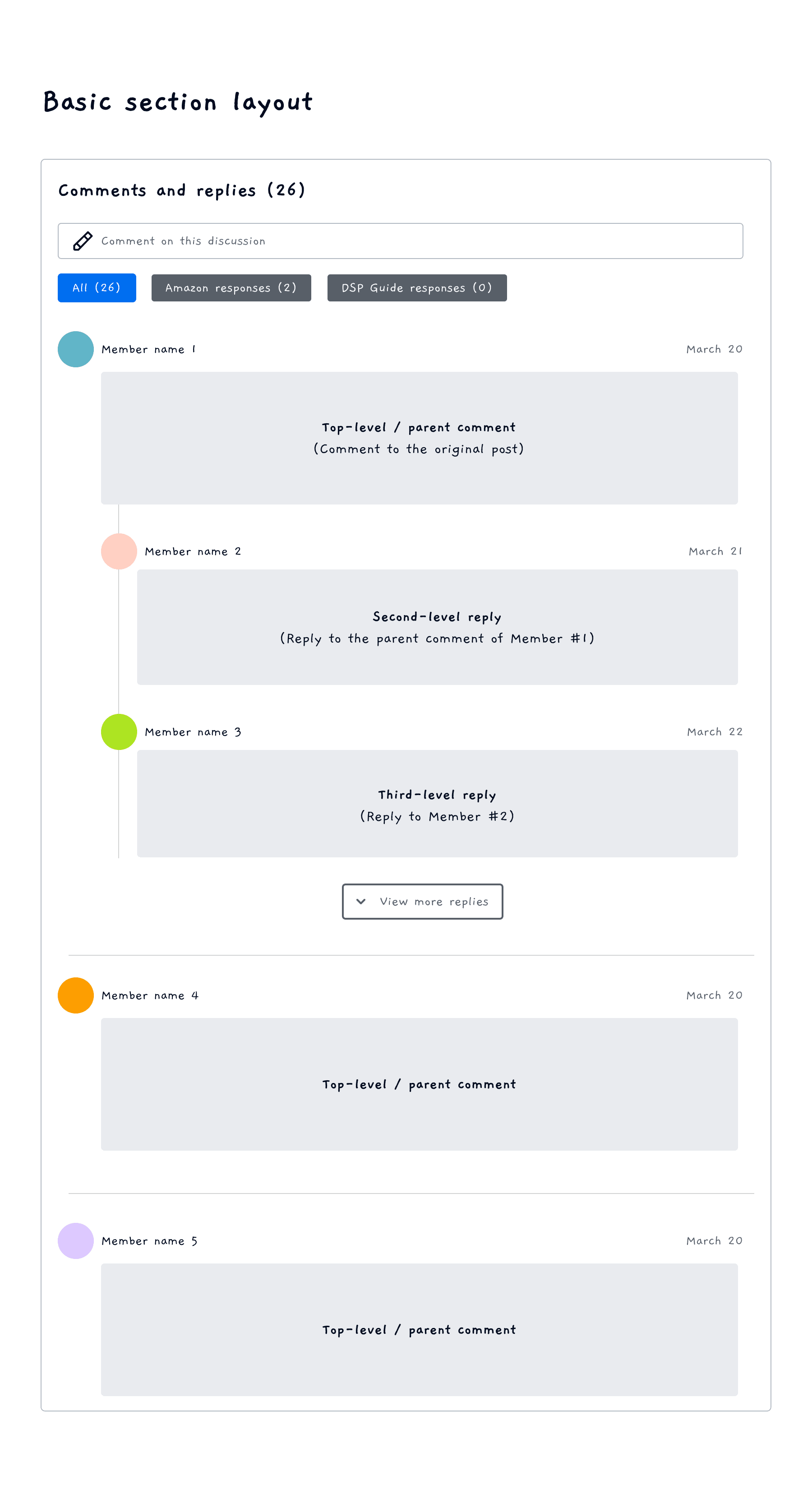
I began the design ideation by mapping out the high-level structure and section layout. Then, I focused on refined design decisions, such as visual indicators to clearly distinguish between comments, @mentions, replies, and quotes.

Below: Low-fidelity wireframes for basic layout and design options
🌟 Design handoff

Just as I was preparing to wrap up the project, there were major changes to the sales compensation structure. Instead of measuring at domestic and international levels, the new structure required detailed measurement at the service level (FedEx Express, Ground, Freight, etc.). The design needed to be flexible to accommodate these changes.

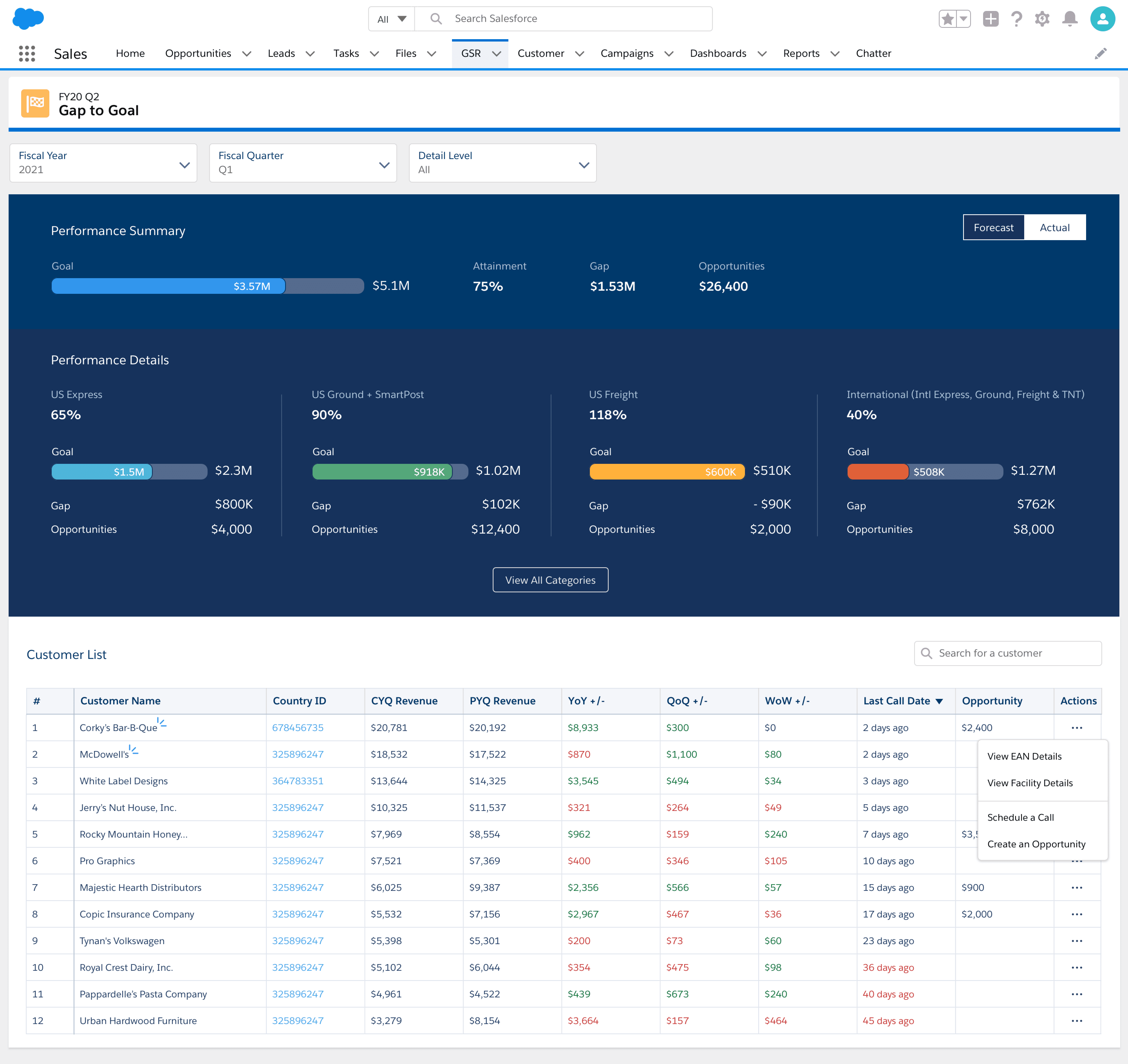
The "Gap to Goal" page

The final iteration offers intuitive data visualization of sales compensation categories. Users can select reporting periods (Forecast vs. Actual) for comparing current and historical data. This allows them to:
- Quickly assess progress towards quarterly goals
- Identify revenue gaps by category
- Leverage closed/won opportunities to close these gaps.

The Customer List provides a quick snapshot of customer information, empowering Sales to prioritize selling activities and focus on high-priority customers. They can also take swift actions like scheduling calls and creating opportunities.

Measuring success

3.6K

3.6K

3.6K

Average unique users per day

112K

Total users per month

85%

85%

85%

Time saved on rendering reports

In their own words

Christie

Field Sales in US

This Dashboard will absolutely and definitely help me prepare for the call!!! I like being able to compare Revenue and Volume in one. I like the breakdown of services as well. One customer I looked at had express freight volume and I didn’t know they ship express freight!

Samuel

Business Sales

This dashboard will help me determine my focus for the week. This includes my gainers/decliners, etc. without me doing any extra work!

Maisa

Field Sales in Canada

A great tool to use for a quick check before we go into sales calls or for quick business reviews. It provides a good insight as well if we are covering for another Account Executive so we can quickly have a better shipping profile.

Nick

Field Sales in UK

The dashboard in itself is very good so great work to all involved – it's this type of feature that really makes the CRM better and more efficient for Sales, so thank you.