
Elevating notification experience
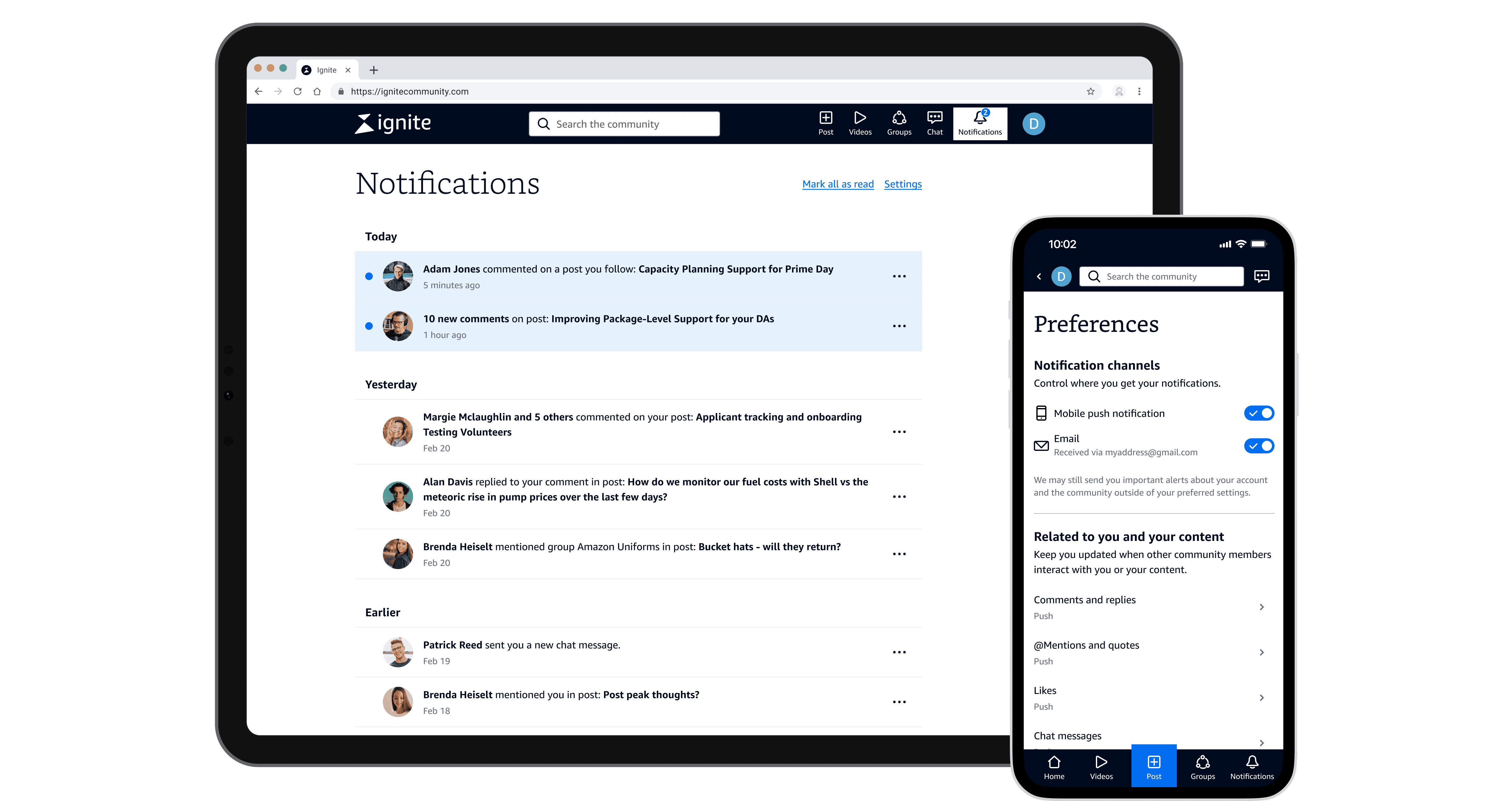
Notifications are often an afterthought—until they fall short. Now, Amazon transportation partners can stay informed with ease.
The Challenge
Transportation partners at Amazon Global Communities would like to stay updated on posts they've previously viewed or commented on. Clickstream data shows that top posts attract an average of 10 views per unique user, suggesting that users repetitively revisit posts of interest, often related to community-wide escalations and Amazon's responses.
However, completing this task requires manual effort and workarounds. Additionally, the notifications lack necessary context, making it difficult for users to understand the messages.
The Objective
Build an elevated notification experience that enables community members to keep up with important discussions effortlessly.
Role
Lead UX designer
Duration
6 months
(initial design to implementation)
Team
6 project team members including designer, product managers, developers, and data analyst
Opportunity Statement
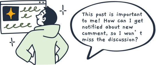
How might we help community members track activity in posts they are interested in, so they could hear how the topics evolve over time and discover business-impacting information?
What are Amazon Global Communities?
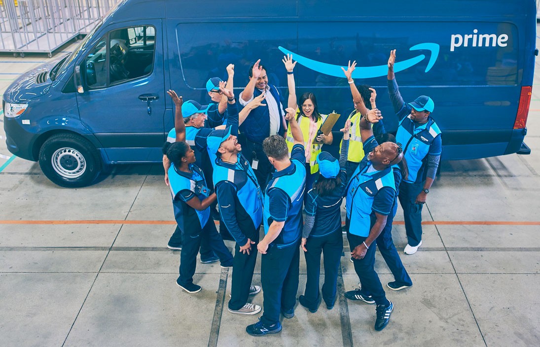
Think of the community as Amazon's own version of LinkedIn or Reddit for strategic supply chain partners. Community engagement not only creates a closed-loop feedback mechanism for Amazon that leads to policy changes and new technology deployments, but also fosters trustworthy and durable partnerships.
Currently, there’re two community instances - Upshift for Amazon Freight Partners (AFPs), and Ignite for the Delivery Service Partners (DSPs). AFPs move Amazon freight between sites, such as warehouses and delivery stations, within the Amazon Middle Mile network. After shipments arrive at delivery stations, DSPs handle the Last Mile package delivery in their local communities.


What insights do we have about customers?
Community members frequently follow up on evolving topics
This project originated from one of my research findings, which opened the door for a complete overhaul of notifications, a core usability area of our product.
In a research study, community members vocalized the need for an easier way to track new activities in posts they’ve previously viewed or commented on, so they could follow the evolution of topics over time.
I always like to follow up on posts if I’ve commented on them. Because that means it pertains to me, and I have some sort of interest in it. Maybe I'm dealing with the same issue (with the post author) or looking for a similar answer from Amazon.

Skylar
DSP research participant
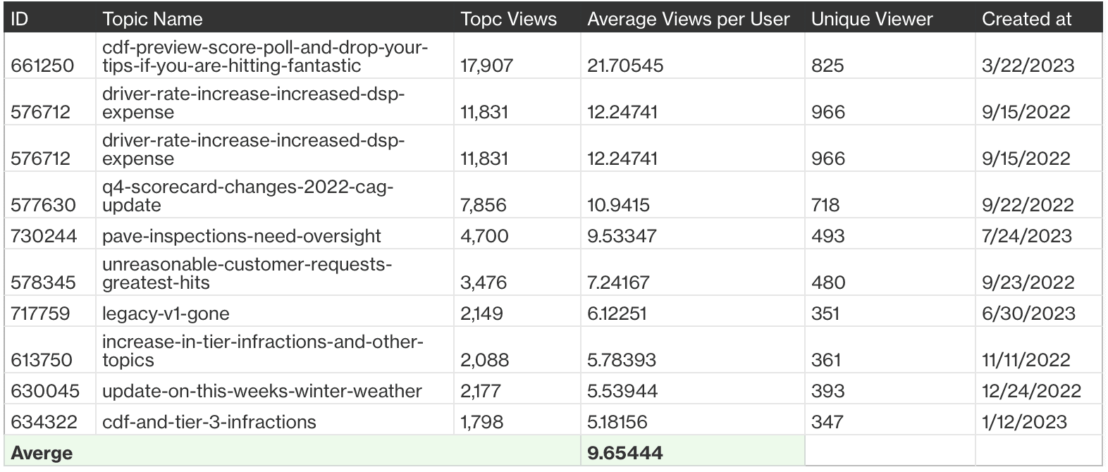
This finding inspired me to seek quantitative data for validation. Clickstream data revealed that the top 10 most popular posts attracted around 10 views per unique user. This means community members repetitively revisit posts of interest, often related to community-wide escalations and Amazon's responses.
Inefficient process hinders user experience
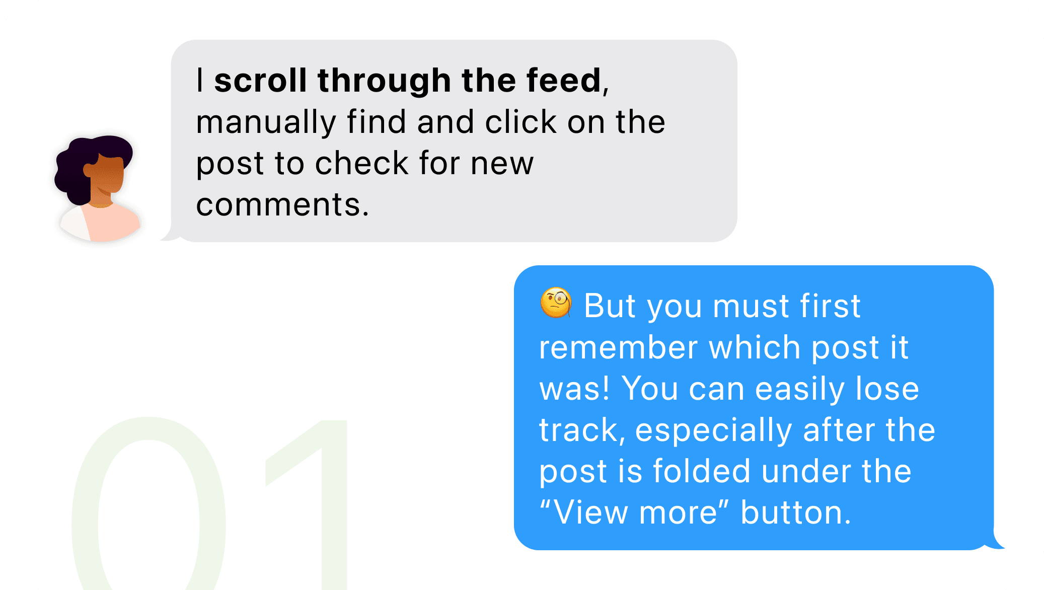
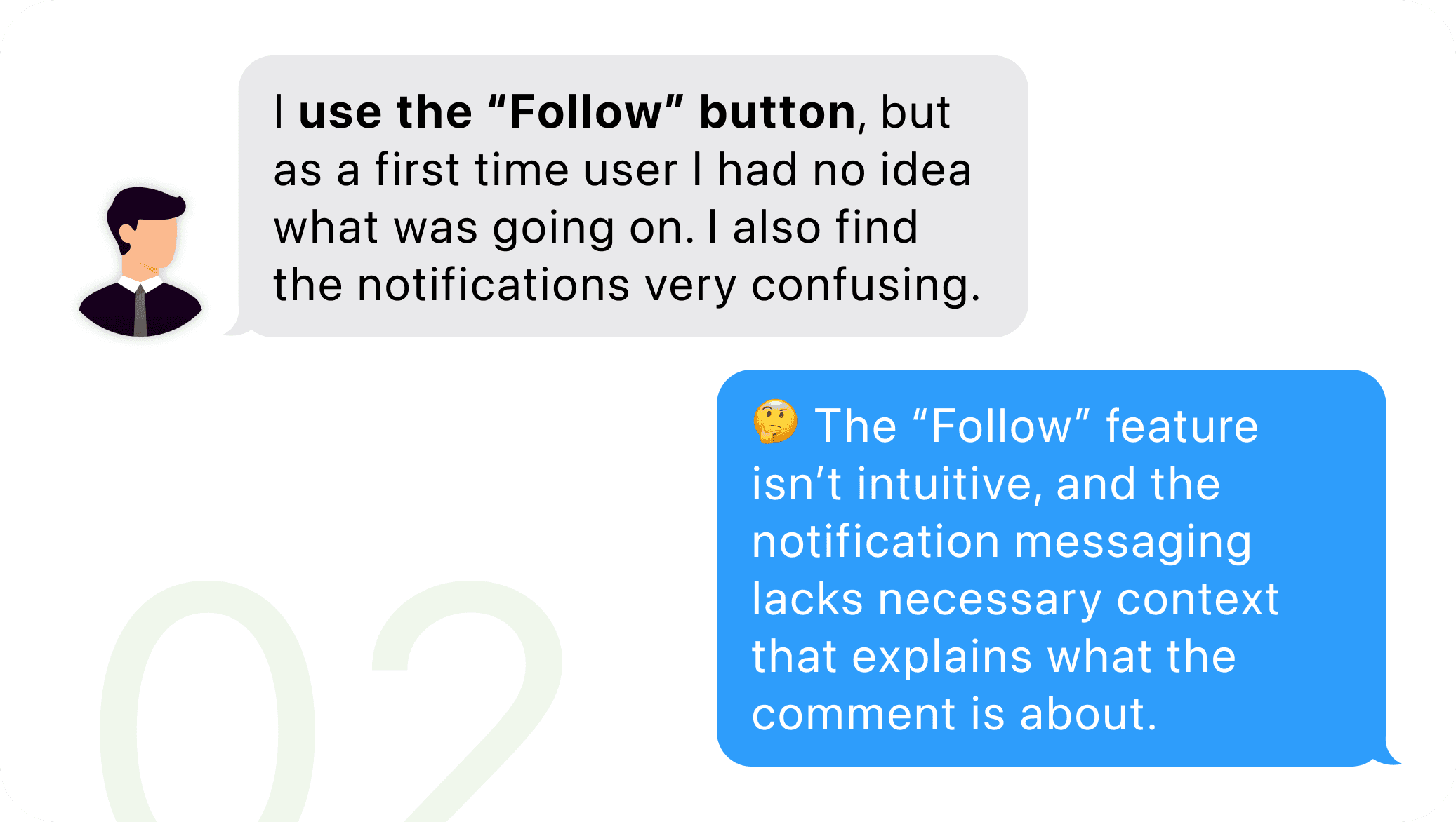
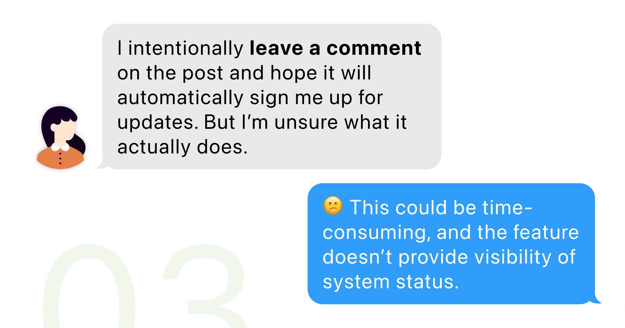
However, despite their desire for revisiting these impactful posts, the current process was inefficient and required manual effort and workarounds. Additionally, the notifications lacked necessary context, making it difficult for users to understand what the comment is about.
Benchmarking & current experience analysis
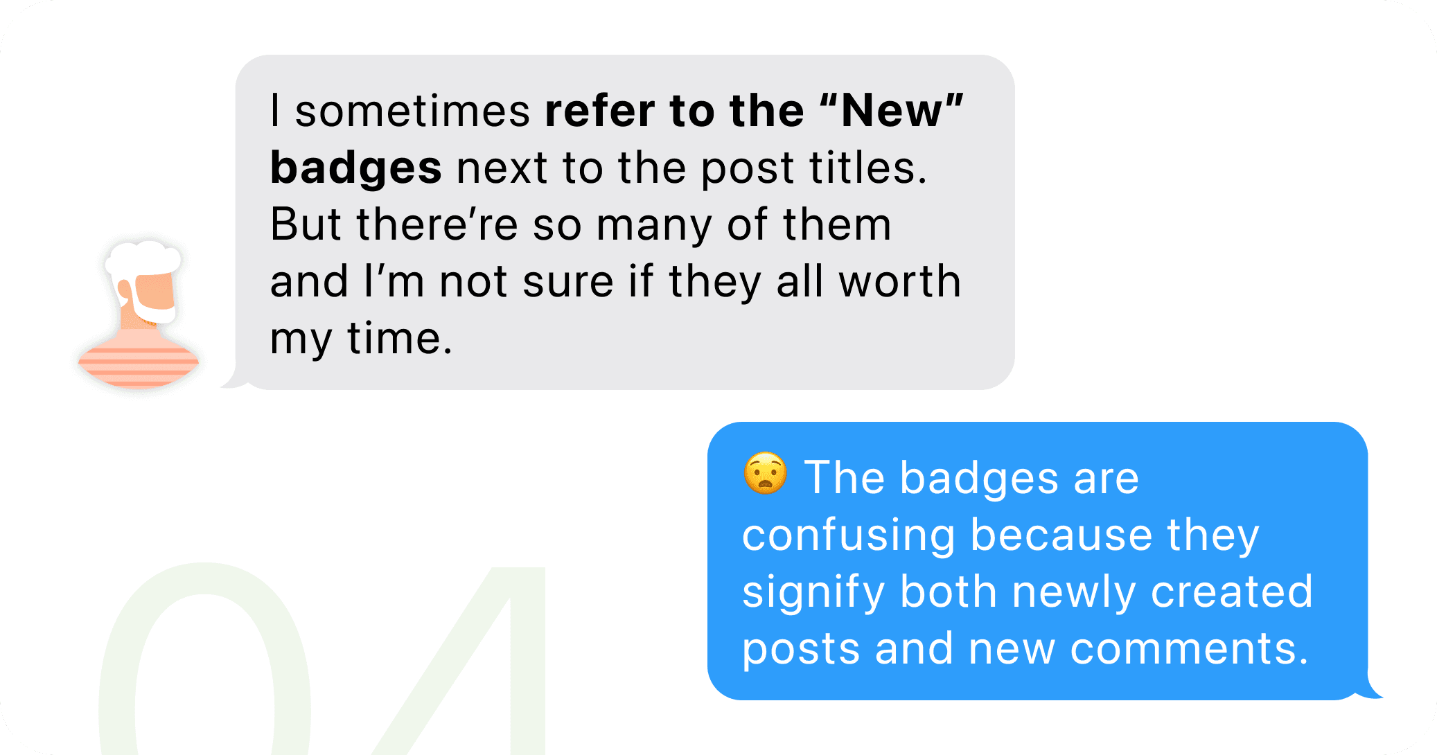
Although the ability to "follow" a post already existed, it was difficult to use due to many usability issues. Poor notification experience also contributed to its underutilization.
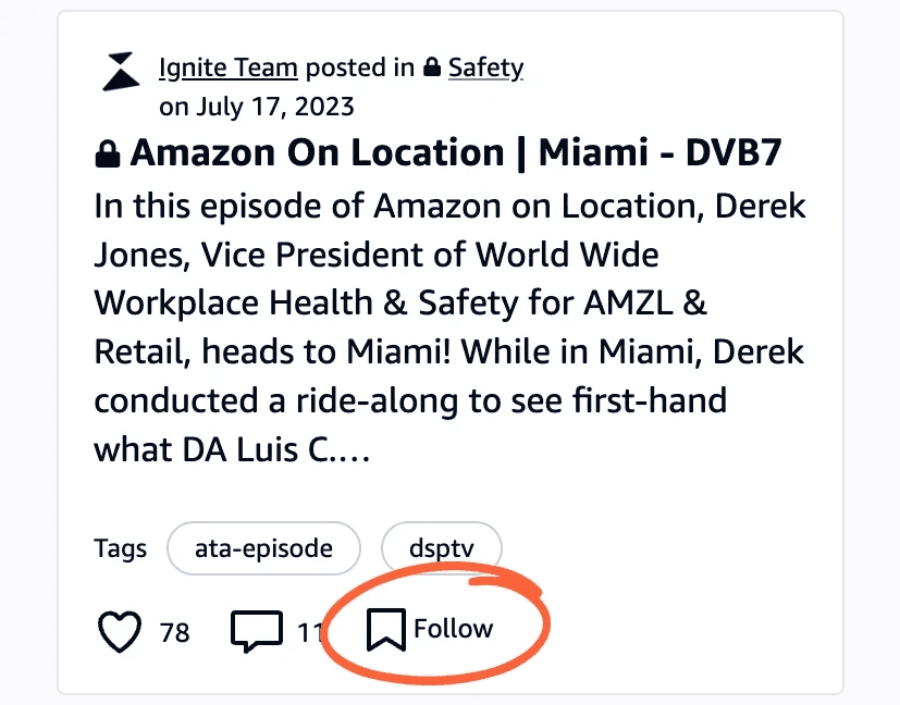
Confusing iconography
Although the button label said "Follow", the icon next to it was commonly recognized as a bookmark.
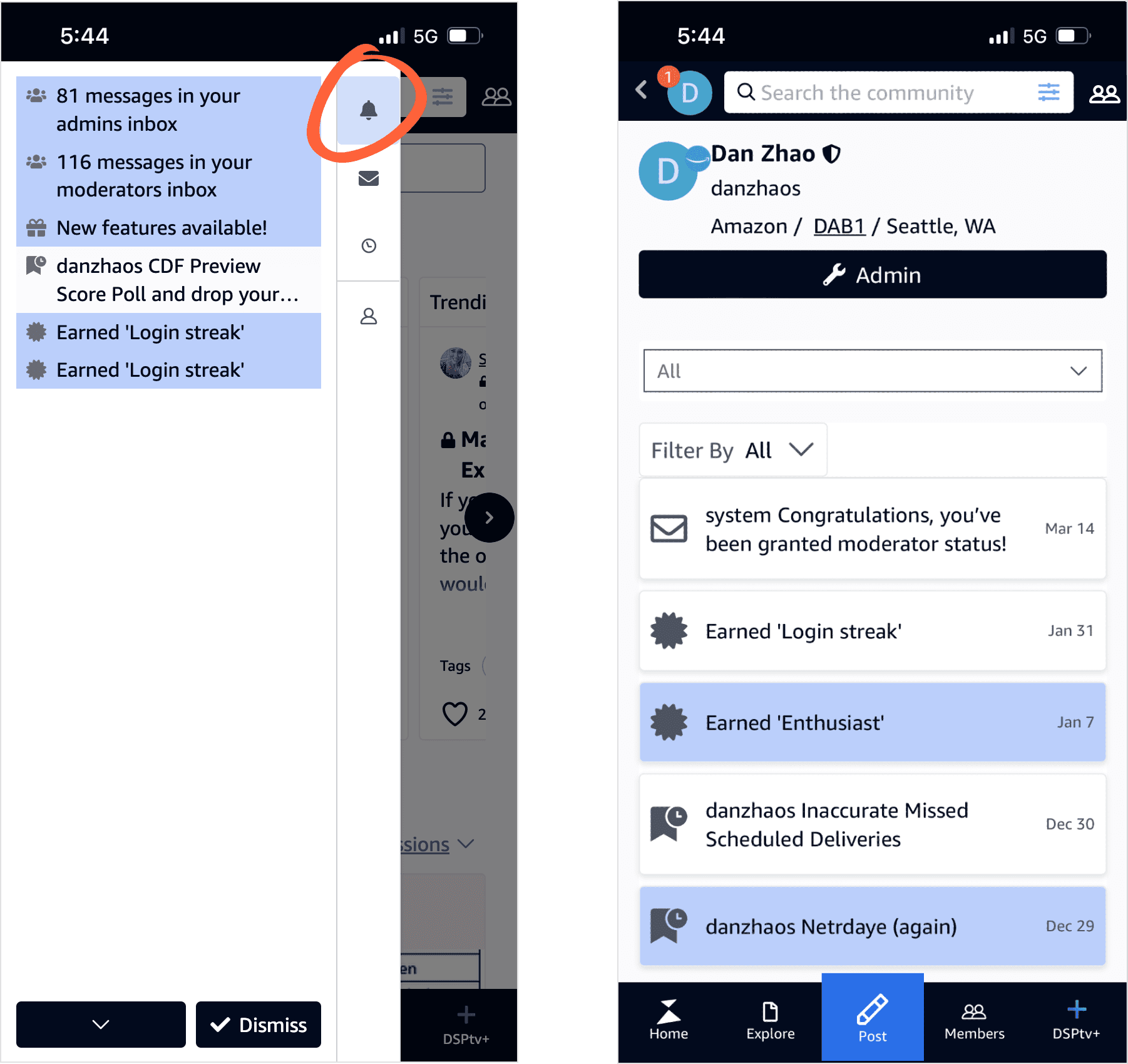
Complicated navigation and lack of clarity in notifications
There wasn't a dedicated page for notifications, so they were randomly placed within the user profile, requiring several clicks to access and an unintuitive path.
Additionally, the notification messages were poorly written, lacking the necessary context for users to understand the updates.
Poorly organized notification settings
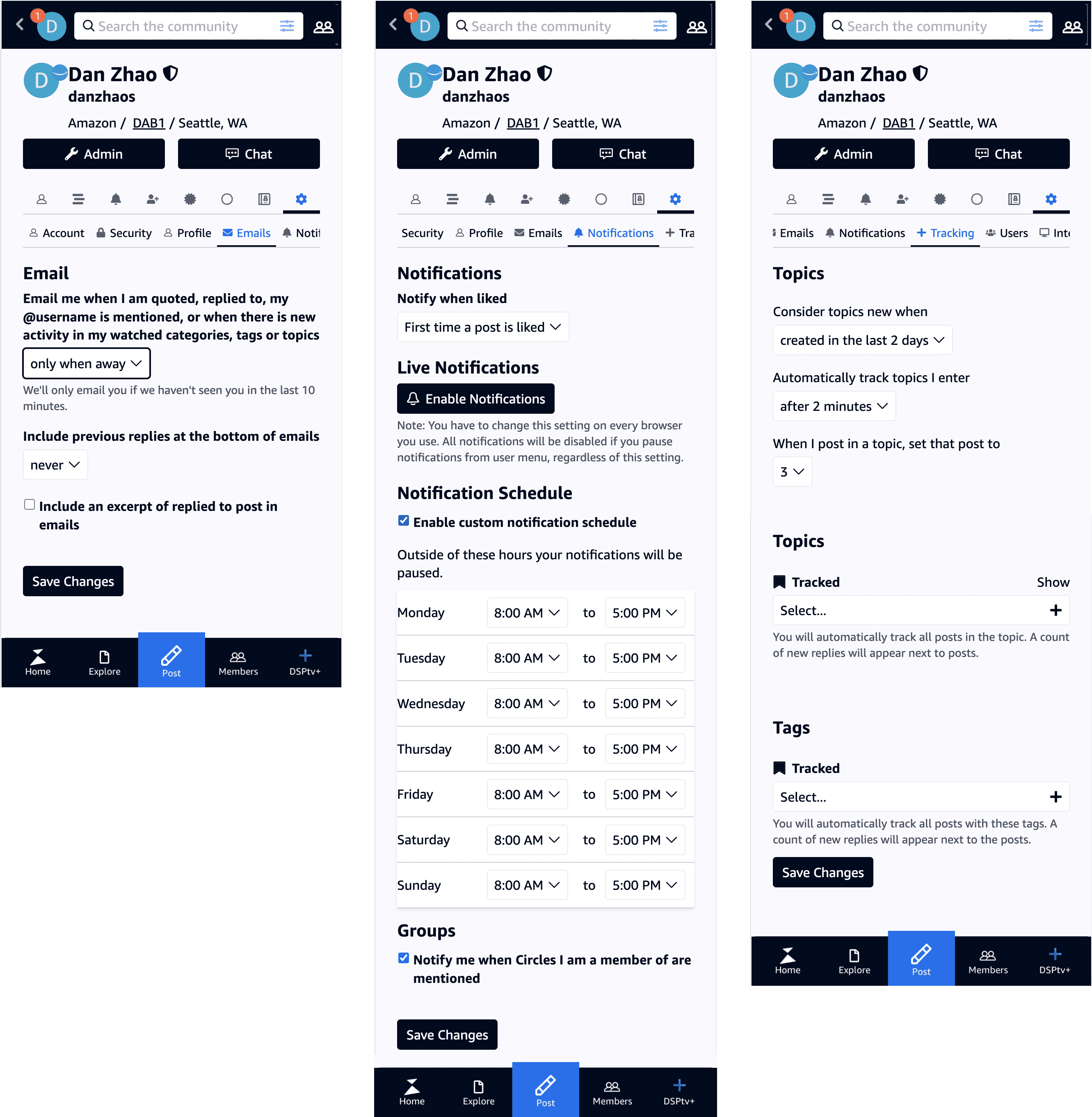
Notification settings were scattered across three different tabs without proper organization or prioritization.
The options were also confusing, making it nearly impossible for users to customize their in-app experience.
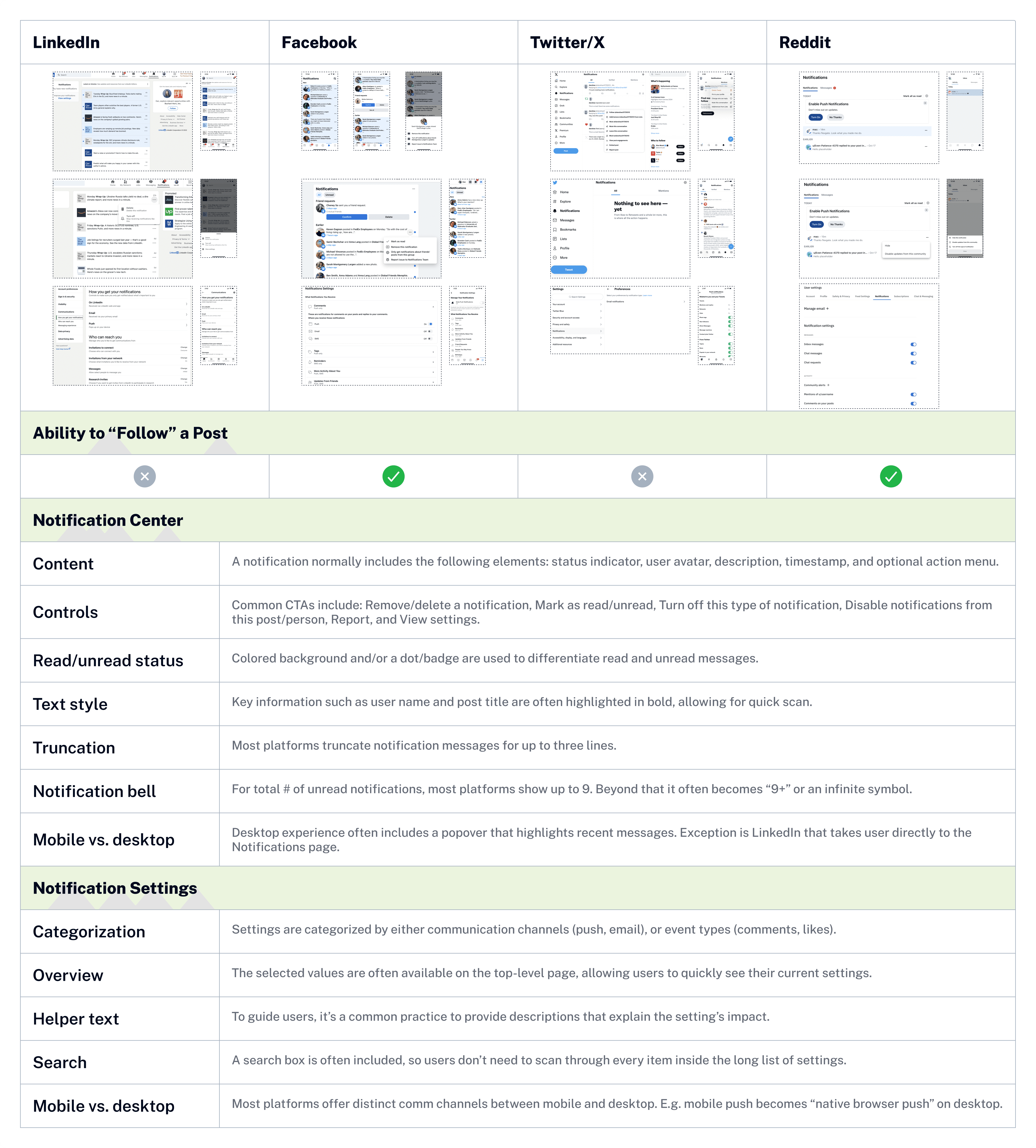
Competitive analysis
I conducted extensive competitive analysis to benchmark with similar social networking platforms, and extract valuable insights that can elevate my design approach.
Design ideation
Crafting a comprehensive notification strategy
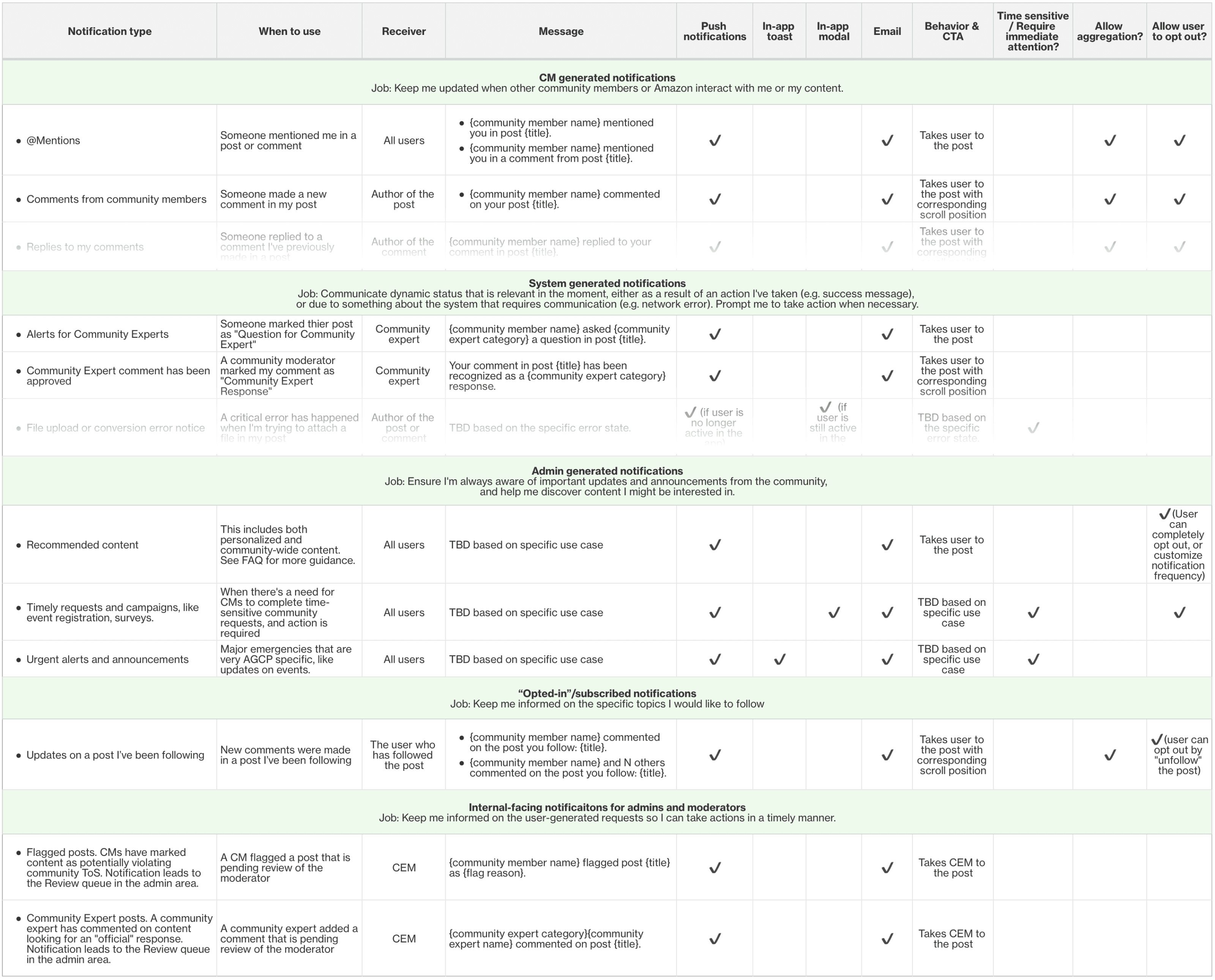
For a highly strategic project like this, the design effort extended beyond creating visual wireframes. I collaborated with Engineering team to map out all existing notification types, and gathered feedback from internal and external users to identify gaps in our current notification system and determine if additional types were needed.
Below: Notifications are categorized with clearly defined jobs and default mechanisms.
The anatomy of notification card
To better communicate the design rationale, I deconstructed the notification card into elements that collectively contribute to an effective notification experience.
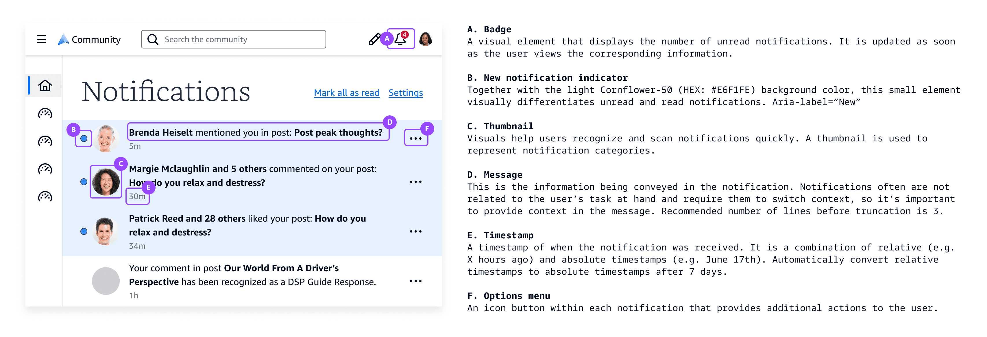
Optimizing in-app navigation
To address the users' pain points regarding complicated navigation paths, I proposed a redesign of the in-app navigation. A significant change in user experience always garners scrutiny, so I used quantitative insights and design principles to secure stakeholder buy-in.
Below: The before & after of how users access notifications.
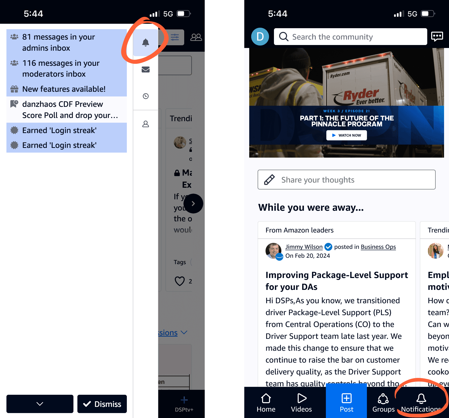
🌟 Final design handoff
The design encompasses the end-to-end user journey of receiving, viewing, and managing notifications. As a critical part of the design handoff, I documented a comprehensive notification strategy, detailing the mechanism of various notification types, such as:
What types of notifications are available in the community?
What triggers a notification?
Who will receive the notification?
What is the message being communicated in the notification?
Where and how will the notification appear?
What happens after the user clicks on the notification?
How will similar notifications be aggregated?
How will users customize their notification experience?
Additionally, I provided high-fidelity wireframes to visually illustrate these concepts.

Never miss out
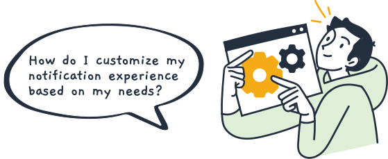
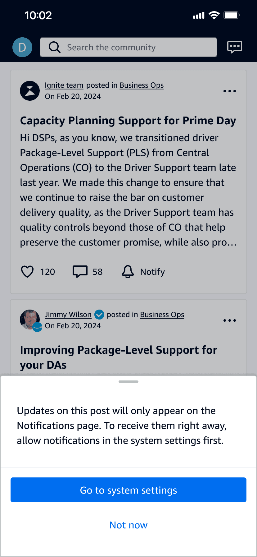
The previous "follow" button has been redesigned with a new label and icon. Users can now proactively opt in for notifications to stay updated on discussions.
Timely notifications
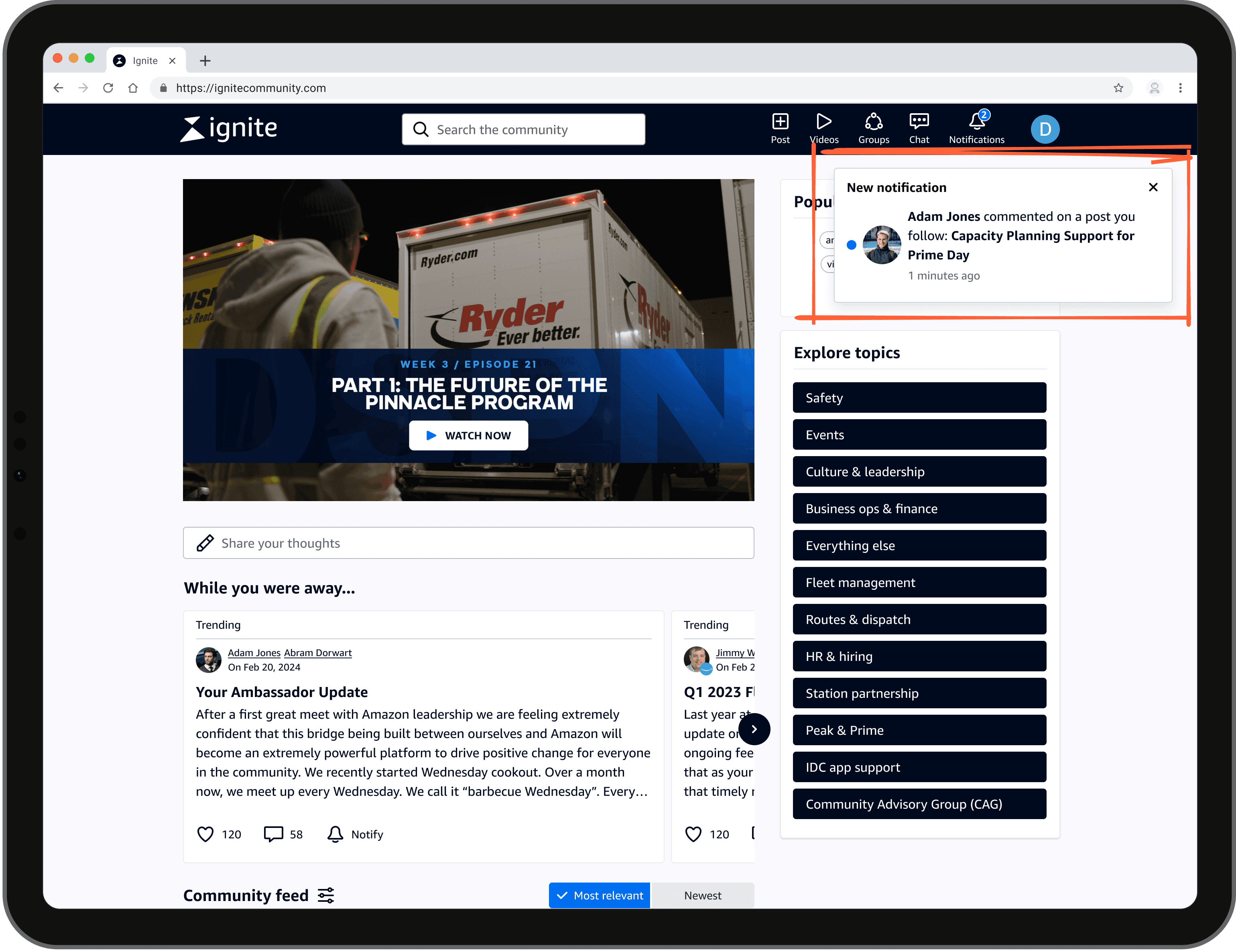
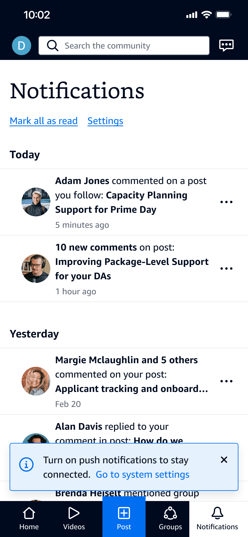
To ensure users receive the right amount of notifications at the right times, notifications are aggregated and delivered seamlessly across both desktop and mobile platforms.

Front and center
As one of the most frequently used features, Notifications has been relocated to the main navigation, making it easily accessible from anywhere in the app or website.
Users can now directly manage specific notifications, giving them more control over the amount of communication they receive.
Streamlined settings
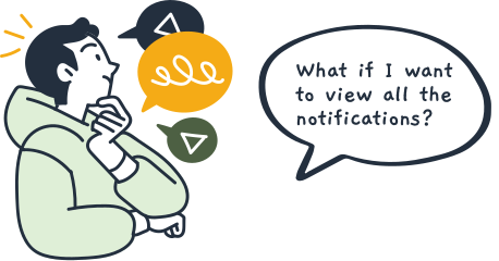
Settings are often overlooked until something goes wrong. To address this, the Preferences page has been thoughtfully redesigned with well-organized, predictable options, making it easy to browse and understand. Users can now:
- Choose what they want to be notified about, and where they receive these notifications.
- Search for specific settings without scanning through every item.
- Set email frequency based on their preferred communication cadence.
To accommodate different screen sizes, the page layout is highly flexible.
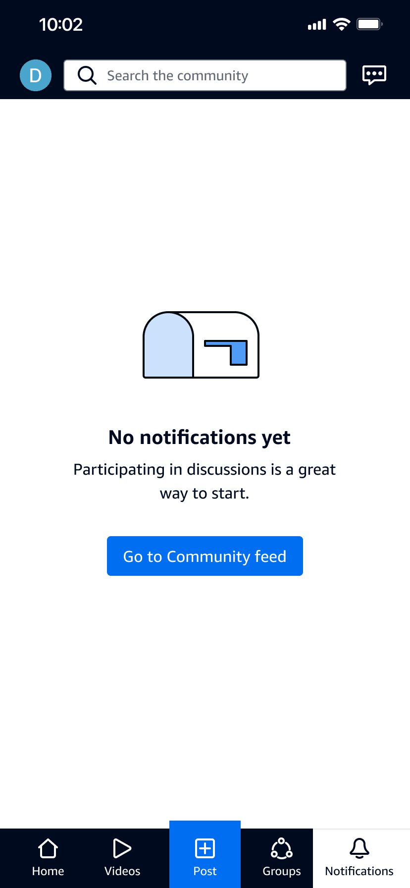
Thoughtful design for all use cases
Localization
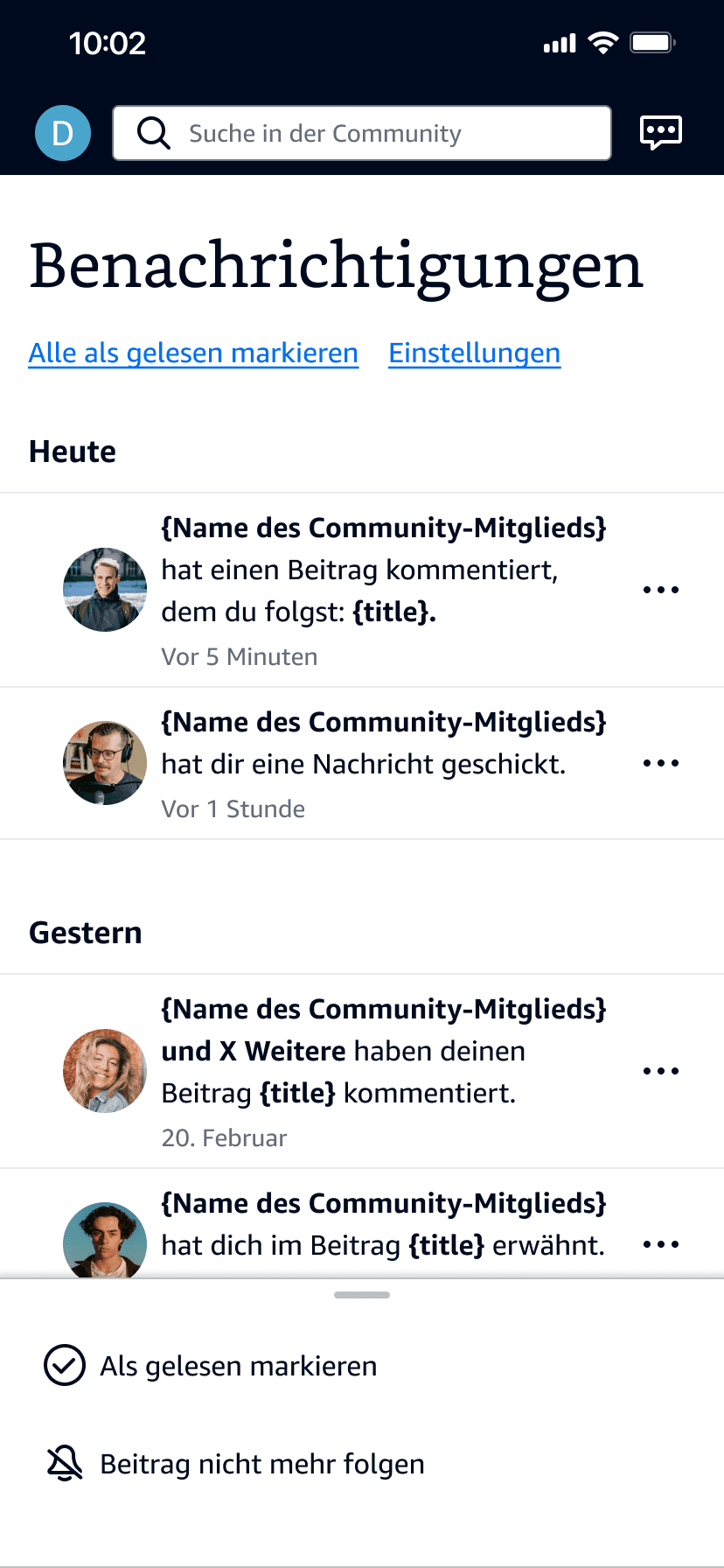
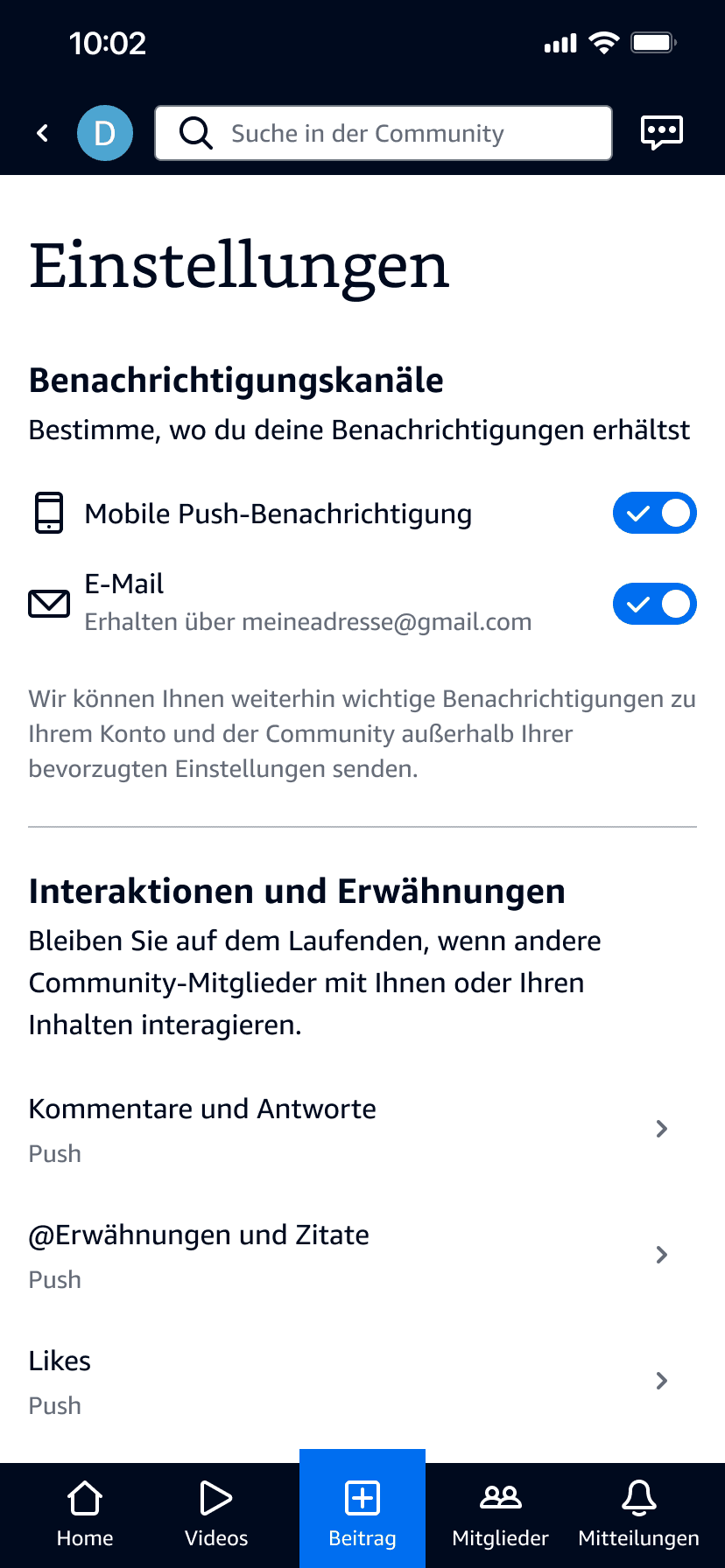
The design is also flexible, supporting the global community by accommodating multiple languages. (German language is hard! 🇩🇪)
Email notification redesign
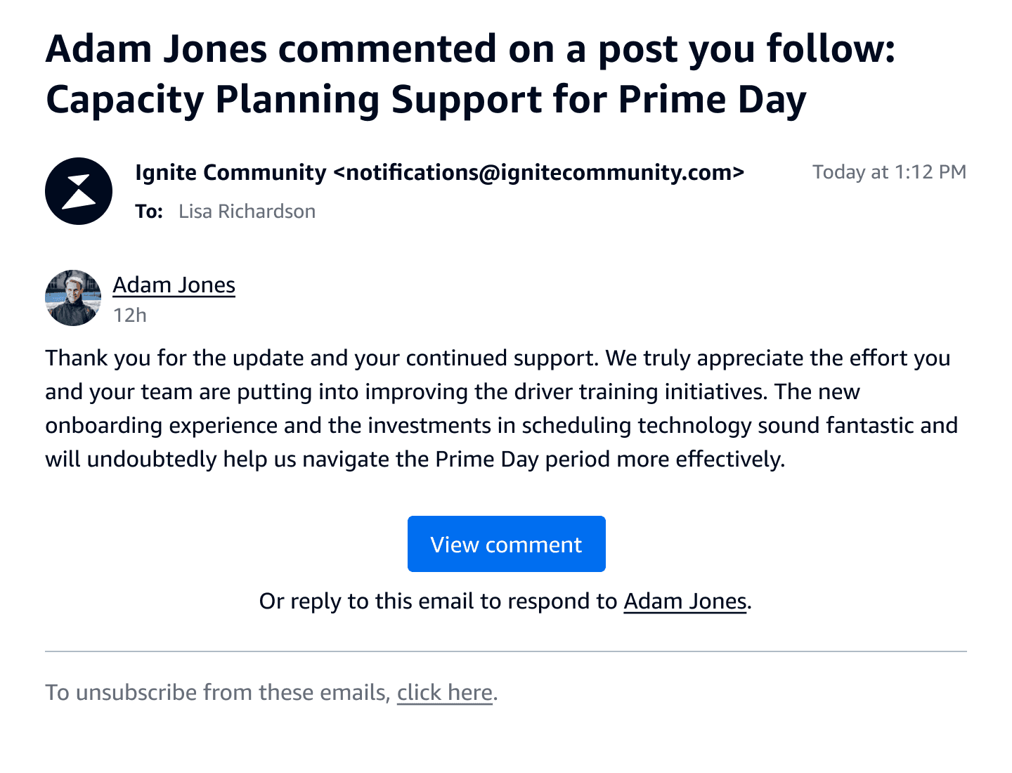
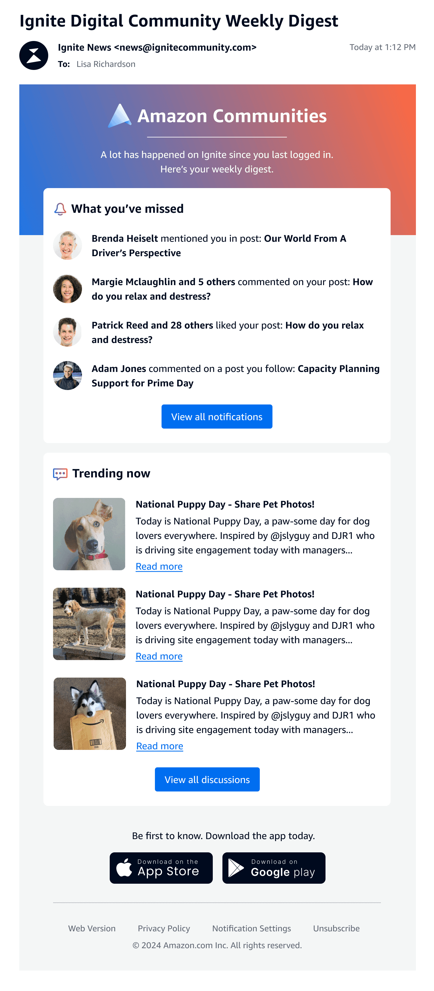
To ensure a seamless experience across all notification channels, I created templates for the individual email notifications and the weekly digests. These emails inform community members of their unread notifications, and help them catch up on trending topics they may have missed.

Measuring success
This project was a milestone for the team, showcasing the impact of user research on the product roadmap. It was also the first time we evaluated the end-to-end notification experience, addressing one of the most fundamental and challenging usability areas.
Four weeks post-launch, we observed strong adoption of the "Notify" (formerly "Follow") feature, with average monthly clicks increasing from only 40 to over 300. Traffic to the Notifications page and the Preferences page increased by 187% and 54% respectively.
The intuitive experience also led to a 30% increase in users enabling notifications in their app preferences, which lays the groundwork for more efficient community engagement and Amazon announcements.

Matthew
DSP community member
Staying informed has never been easier! Now, I receive timely updates on posts I care about without having to dig through endless conversations. I also like that the notifications are clear and relevant.

Timika
DSP community member
The new design is intuitive, and I love that I can customize what alerts I receive and how often. It's made a huge difference in my overall experience and engagement with the community.