
Enhancing content discoverability
Features that make community content more accessible for Amazon transportation partners
The Challenge
Amazon Global Communities is a platform that informs, inspires, and connects strategic partners within Amazon’s supply chain, including Amazon Freight Partners and Delivery Service Partners.
Partners often have limited time to engage with community content. Currently, they express frustration over the disorganization of their news feed and a subpar search experience, which hinders their ability to find timely and relevant content. Poor content discoverability consistently ranks among the top usability issues highlighted by users.
The Objective
Enhance content discoverability across various aspects of the community experience.
Role
Design lead
Duration
5 months
(initial design to implementation)
Team
7 project team members including designer, product managers, developers, and data analyst
Opportunity Statement
How might we provide users easy access to relevant content, so they can efficiently navigate across high volume of information and make the most of their community visits?
What insights do we have about customers?
As busy entrepreneurs, AFPs and DSPs have limited time to engage with digital communities. According to an Ignite Voice of the User report, 24% of the open text feedback from 1,859 DSPs cited a lack of available time as a primary reason for their low engagement.
I’m a busy guy, I not only run Amazon – I’ve got two or three other companies I'm running. I need quick and easy access to pertinent information that impacts my business directly. Get in, get out. Currently the navigation is too cumbersome. Can’t really find answers to problems as quickly as I’d like to.

Alex, DSP owner
Infrequent user of Ignite
It's critical to optimize the short time window we have with users, and expose content in the most impactful way. To better understand their usage pattern, I conducted five 1:1 interviews and a comprehensive analysis of clickstream data.
Content discoverability is driven by home feed and search

It is hard to find recent topics. Hard to find anything, really, I feel I'm seeing random posts when I go there. Some are old, some are newer, hard to have any pointed direction on there.
Qualitative insights indicate that content discoverability is primarily driven by Search, but this is not reflected in the clickstream data.
Usability studies show that users heavily rely on Search to find specific content and solve problems. However, only 1% of post views come from Search. Users aren't getting the desired experience from Search, leading them to abandon it and manually scan pages for content.
Honestly, it is not user friendly at all. I don't know how to search for information on there at all. It takes time to go through everything.
Targeting infrequent users
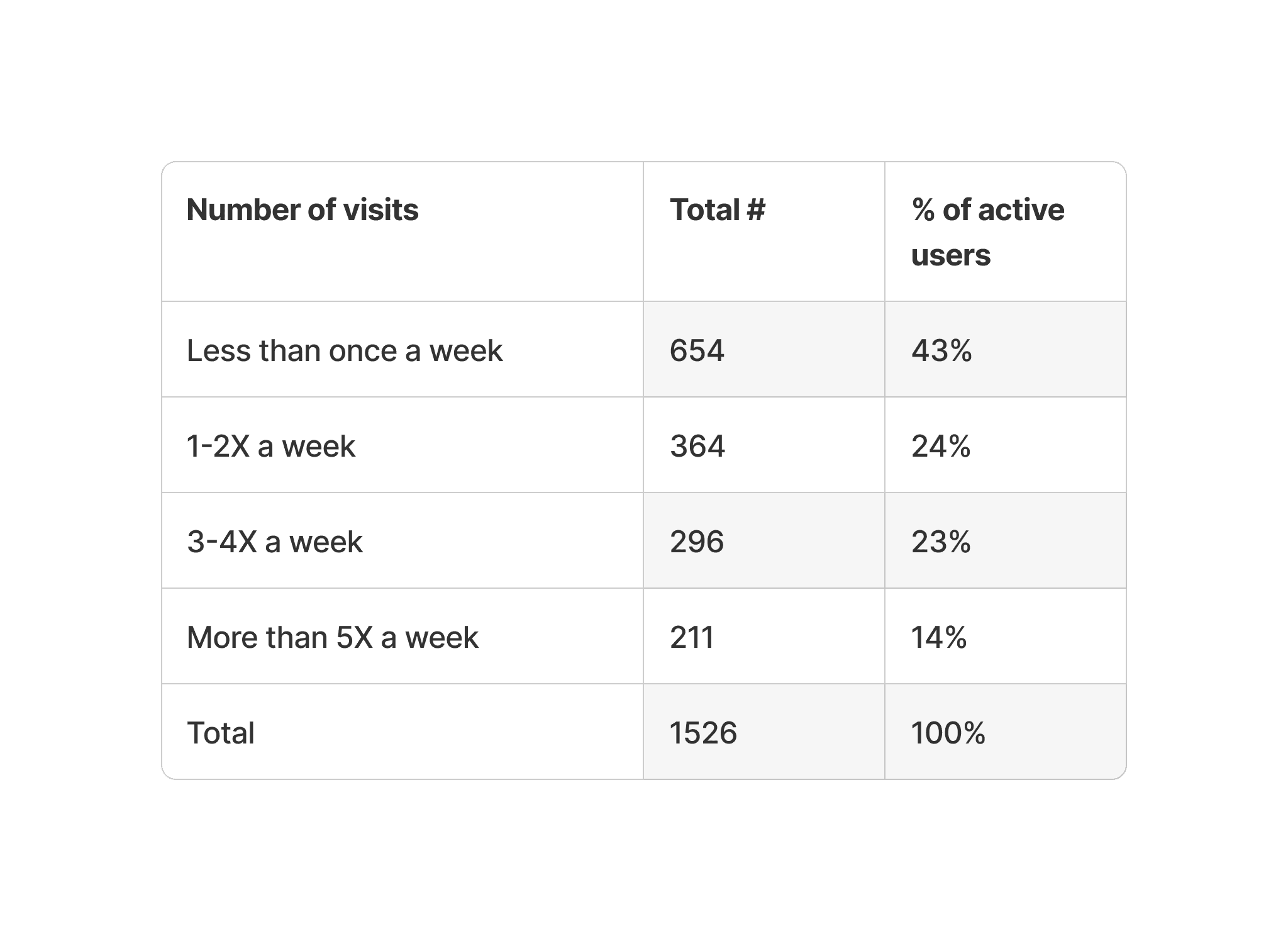
User login data revealed that nearly half (43%) of active users visited the community less than once a week, despite Amazon's weekly outreach via push notifications. Additionally, 21% visited only once a month.
For users who were active in Q1 2021 but not in Q1 2022, 84% of them were infrequent, unengaged visitors who visited Ignite less than 3 times in Q1 2021. This signals a dangerous risk:
If content discoverability remains an issue, infrequent visitors will eventually abandon the community for good.

Design ideation
Research findings guided the team to pinpoint the customer problem, but our reliance on Discourse, our technology provider, limited our options. Implementing advanced tech solutions like a personalized home feed algorithm that ranks posts by user interests, wasn't feasible due to their constraints.
Given this limitation, I must seek alternative solutions that are both feasible and impactful in addressing user pain points.
"While You Were Away"
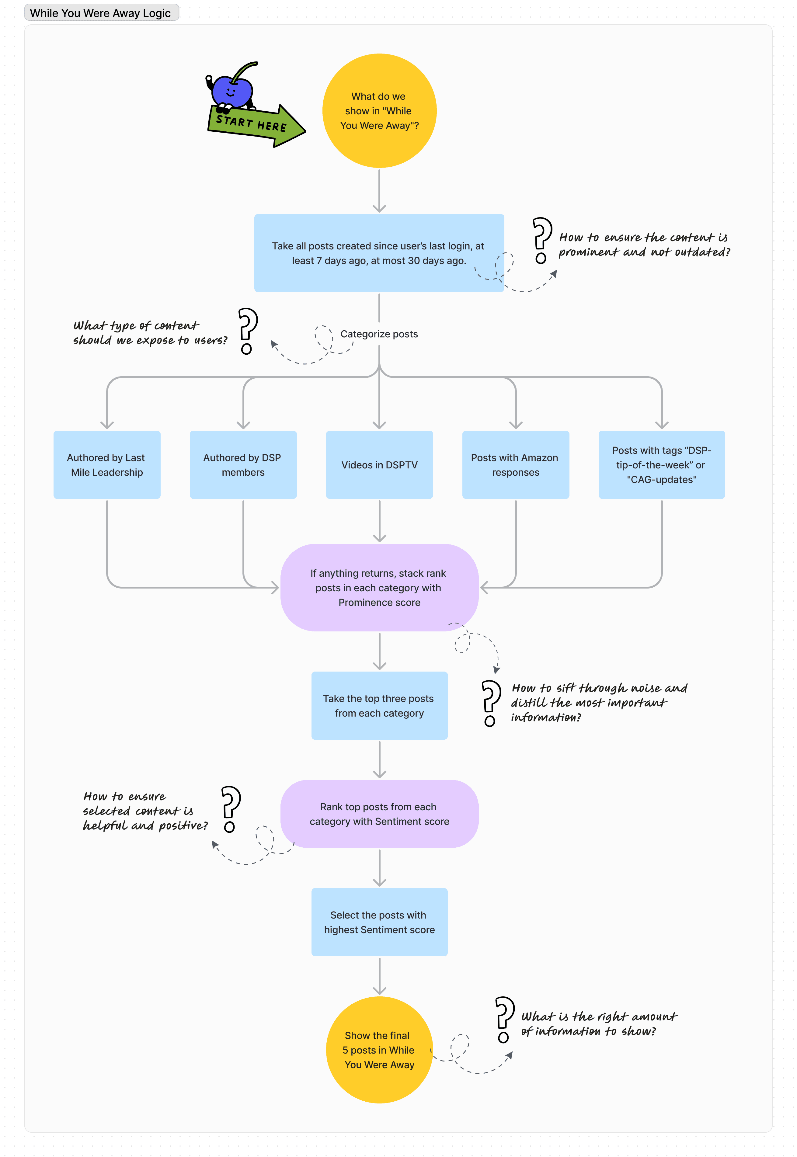
Prior to wireframing, I focused on establishing the content curation logic to ensure we surface only up-to-date and appropriately prioritized content.
Below: Brainstorming on the behind-the-scenes content selection workflow
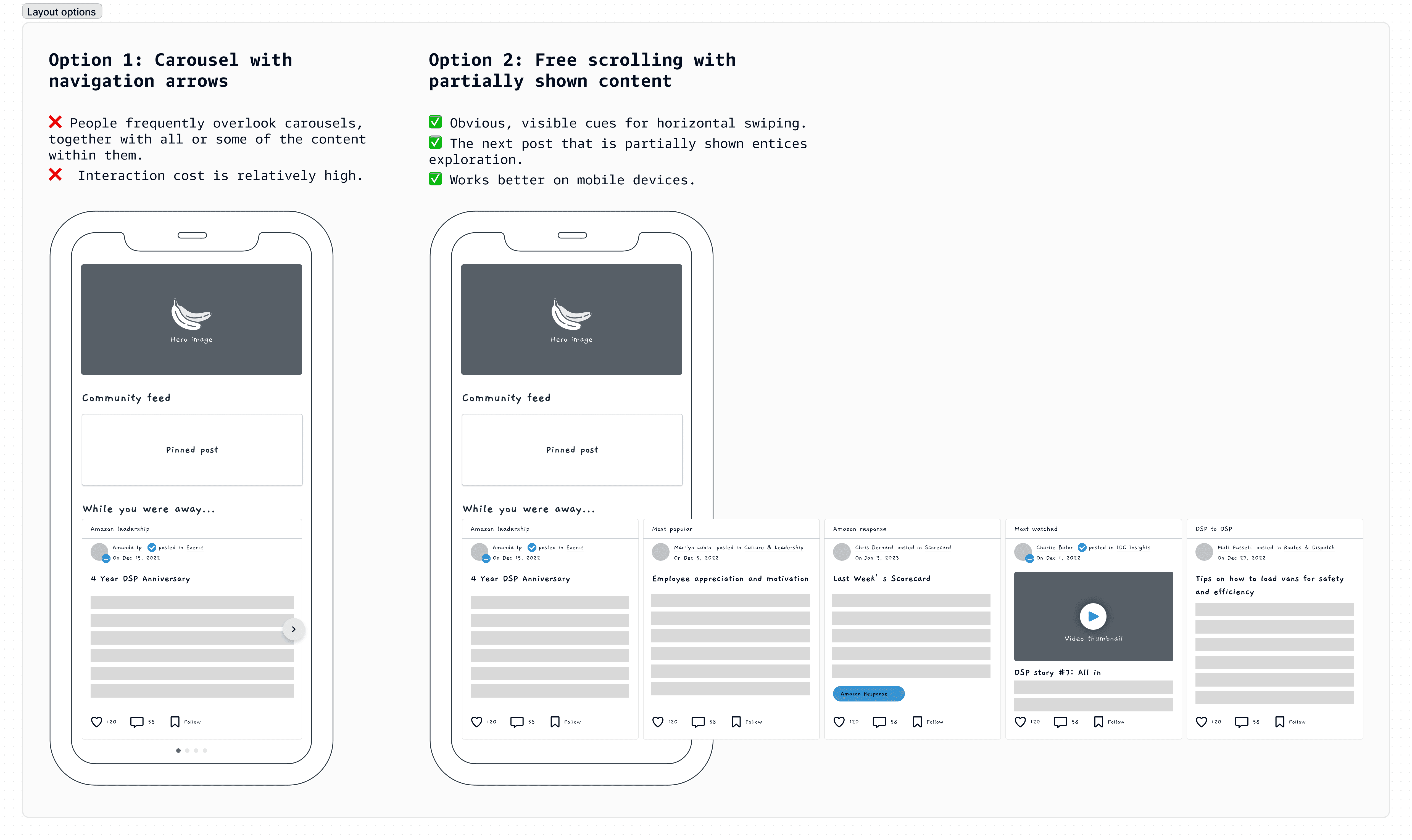
Below: Design iteration with low-fidelity wireframes
Analysis of current search experience
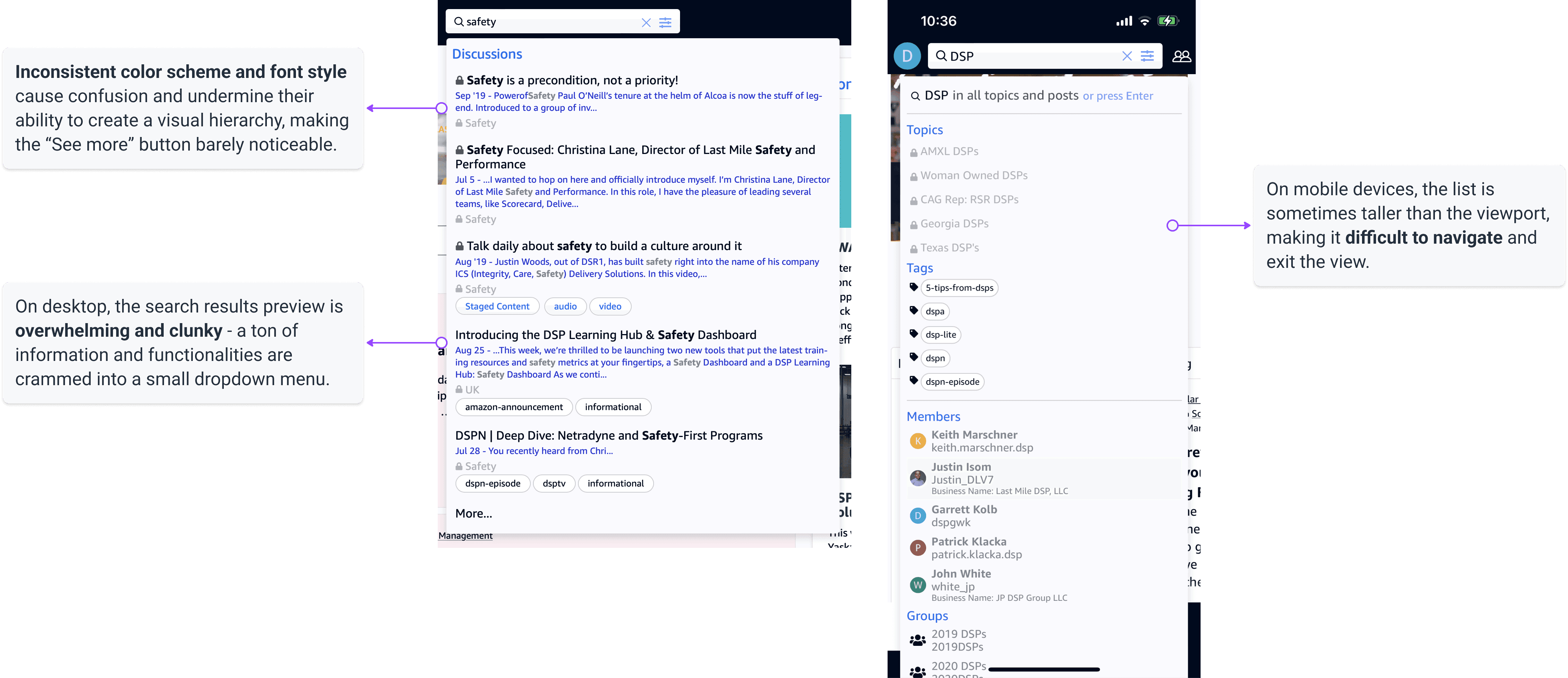
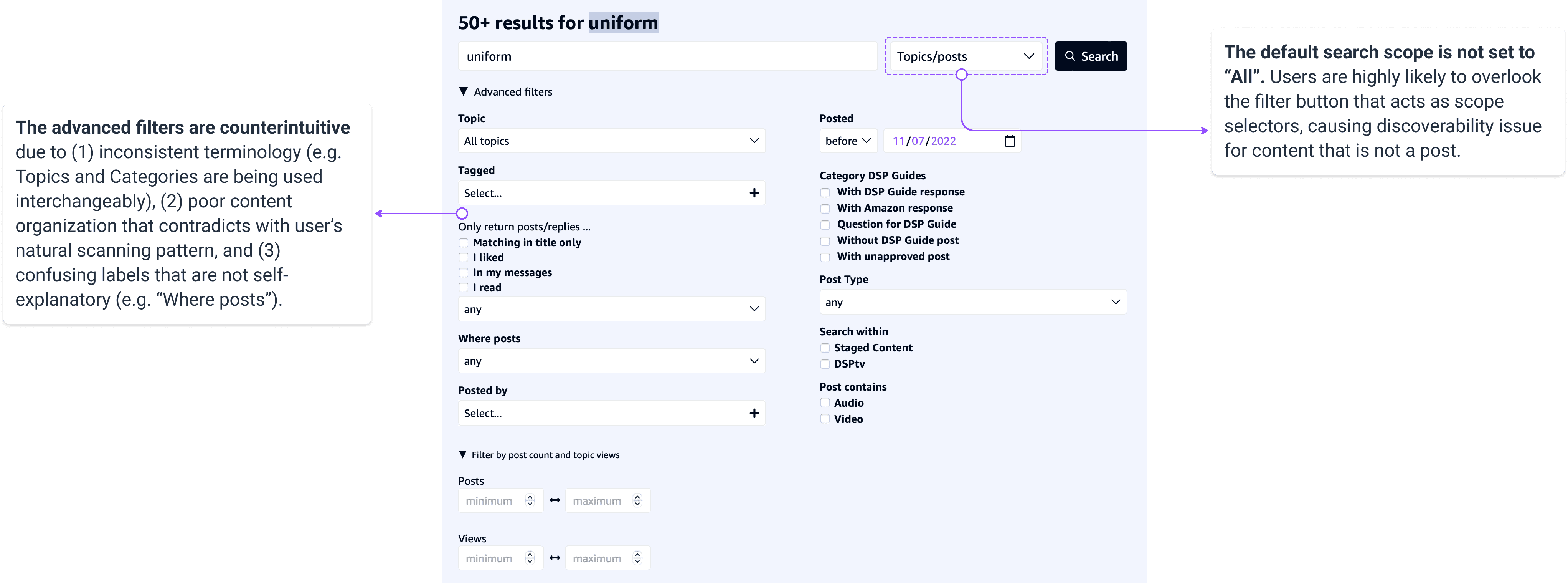
Search is a challenging usability area, and it can quickly get very complicated. I began the design process with an extensive assessment of current experience, identifying the most critical issues that needed to be fixed.
Below: The preview of search results
Below: Full results page and advanced filtering
Understanding search relevance
Besides poor usability, the chaotic ranking of search results hindered efficiency. For example, top search terms like "Ignite Live" and "Scorecard" returned outdated results from 2 years ago.
To address this, I delved into the complexities of Information Retrieval. By studying the book Introduction to Information Retrieval, I learned techniques like term weighting that mathematically optimize relevance scores. I also incorporated business metrics, such as engagement levels and content freshness, into the ranking algorithm.
Information Retrieval is too complex for anyone to fully grasp in a short time. However, these learnings enabled me to represent UX in a room full of engineers. I was able to make an immediate impact on the product vision, paving the way for the evolution of the search feature with successive milestones.
Usability testing and continuous iteration
I conducted separate usability testing studies for the two features with a total of 15 users across communities, and was able to fine tune the design details based on their feedback.
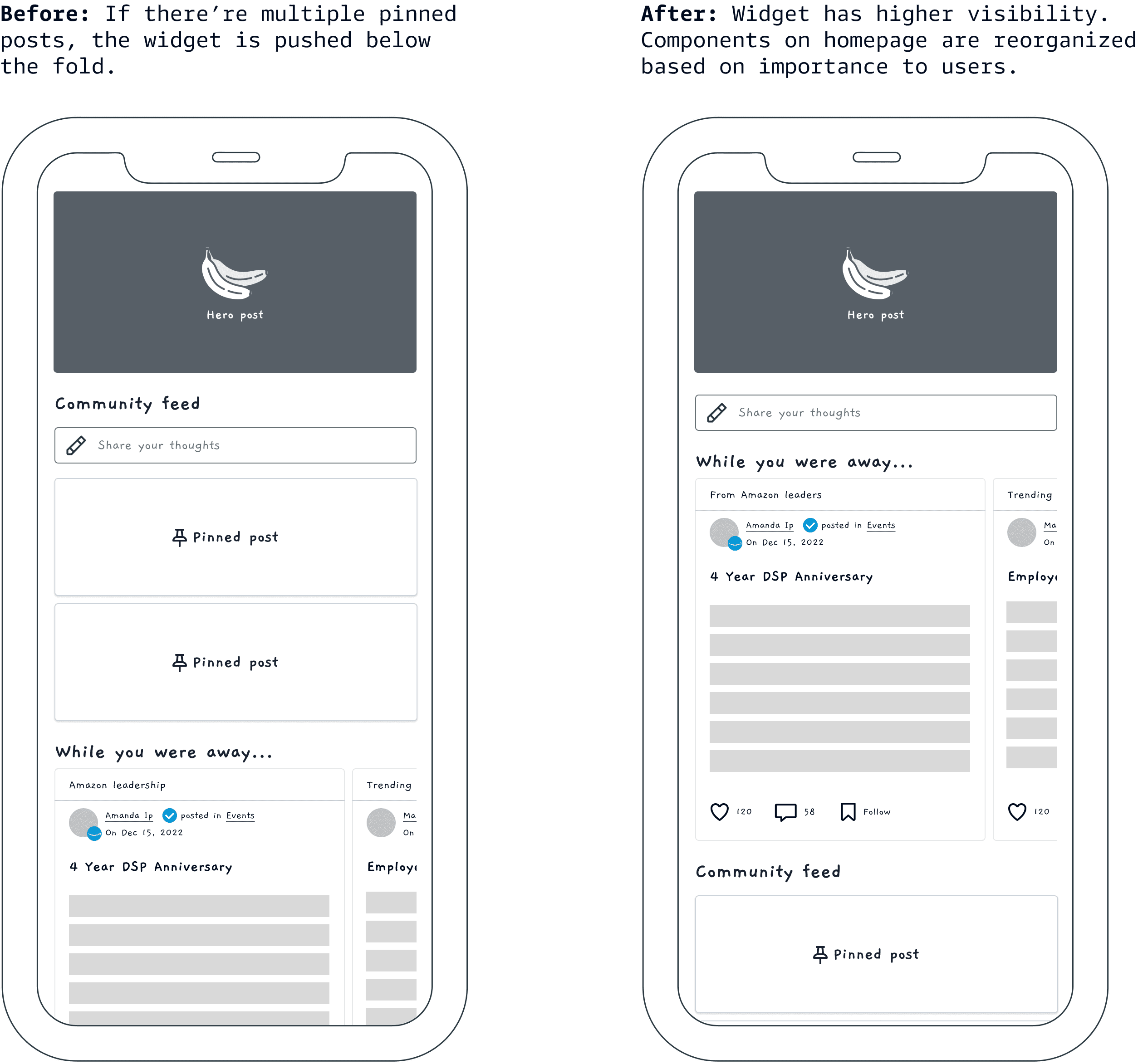
🌟 Final design handoff
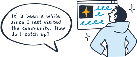

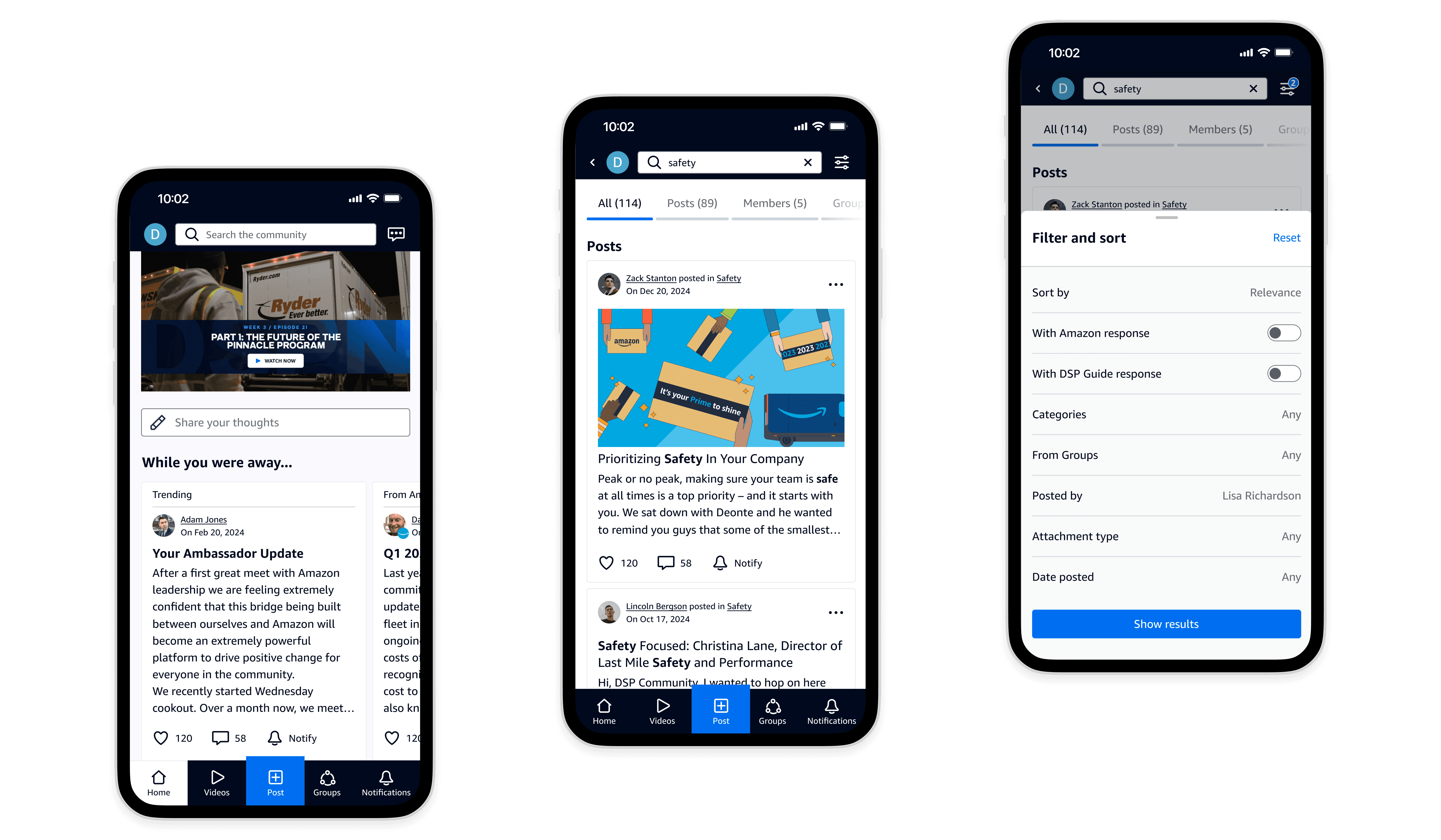
Catch up in a snap
Discover what you missed with the "While You Were Away" widget.
This feature connects busy transportation partners to the most important content they may have missed since their last visit, eliminating the need to manually scroll through the feed.
Thoughtful content curation
Behind the scenes, the content curation logic is meticulously designed to ensure the selected posts are relevant and up-to-date.
It considers all edge cases, such as posts belonging to multiple categories, to ensure a seamless user experience.

Pre-search insights
Before typing, users can view recent searches and a curated list of popular terms that retrieve useful, relevant results.
Smart suggestions for faster, accurate searches
As users type, they can select from search suggestions to speed up data entry, reduce typos, and choose appropriate terms for better results.
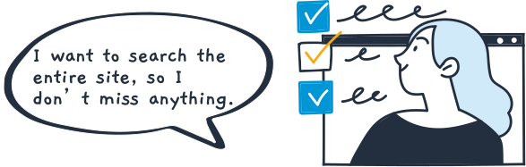
Comprehensive search scope
The default search scope is set to "All", making sure all content types are discoverable.
Streamlined navigation
Search results are neatly categorized into logically ordered tabs, minimizing the clicks needed to find content.
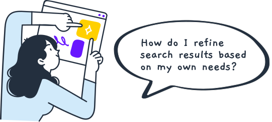
Fine-tune search results with ease
Users can make decisions about how to refine their search after they’ve seen the initial result list. They are more likely to change the search scope in retrospect than during their first search attempt.
Enhanced search precision
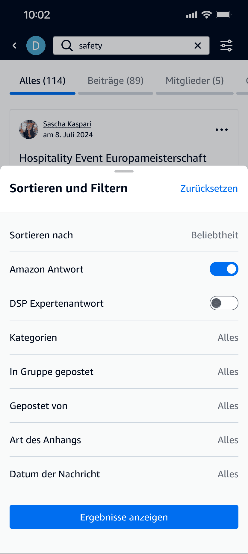
The filtering options have been reorganized and rephrased to ensure they are intuitive and easy to use.
New filtering capabilities have been added based on feedback from internal and external users, such as the ability to search for posts created within a specific time period, and the option to filter by attachment type.
The experience transforms seamlessly between desktop and mobile.
"No results" page
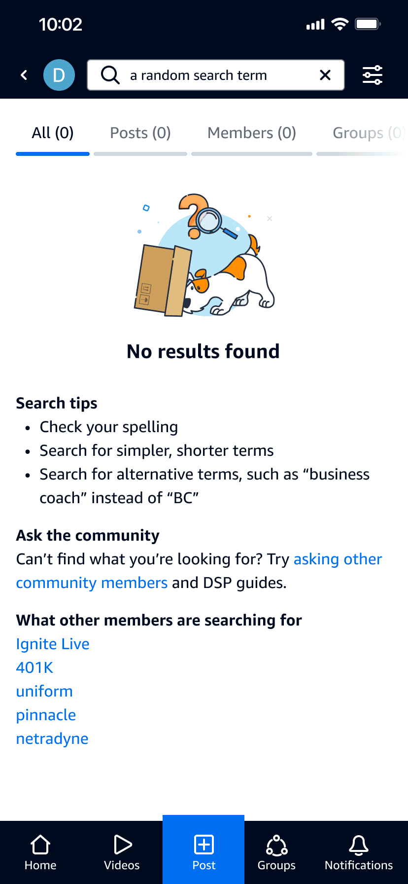
Turning frustration into opportunity
No results for a query can cause frustration and increase the risk of site abandonment.
However, by paying attention to design details, it has the potential to turn this setback into an opportunity for content discovery.
The "no results" page provides tips for modifying the query and offers suggestions for next steps. Users are encouraged to seek advice from the community, or explore popular search terms.
Error handling
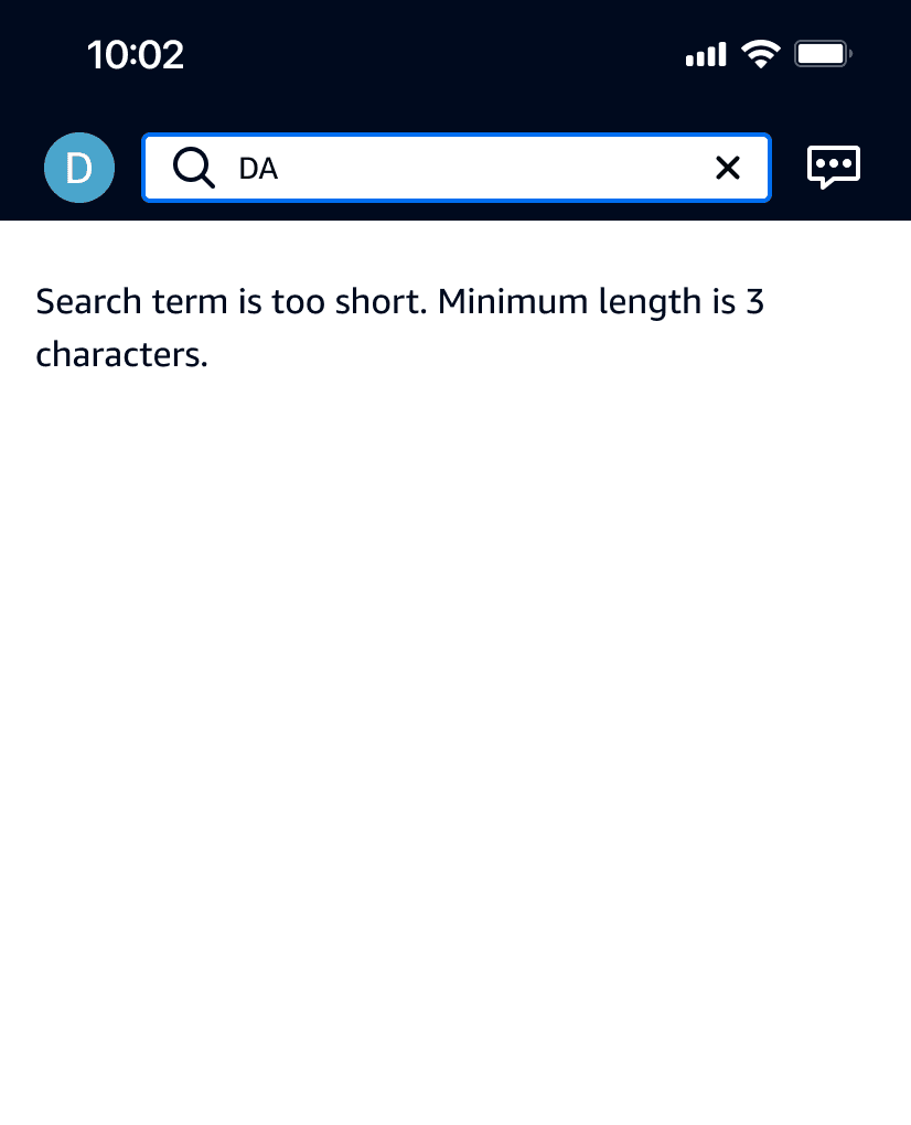
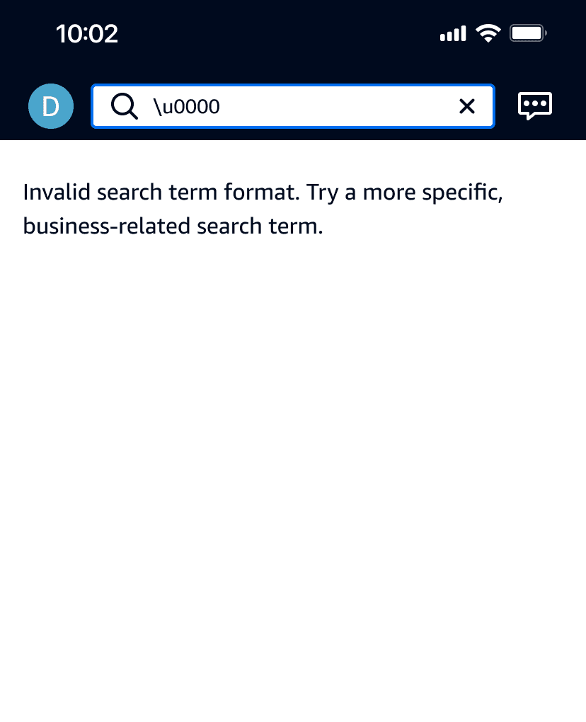
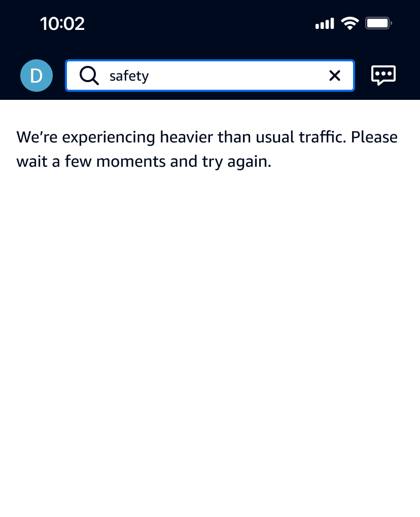
Through collaboration with the Engineering team, I identified common error scenarios and crafted helpful messages to assist users in recovering from these errors.
Localization
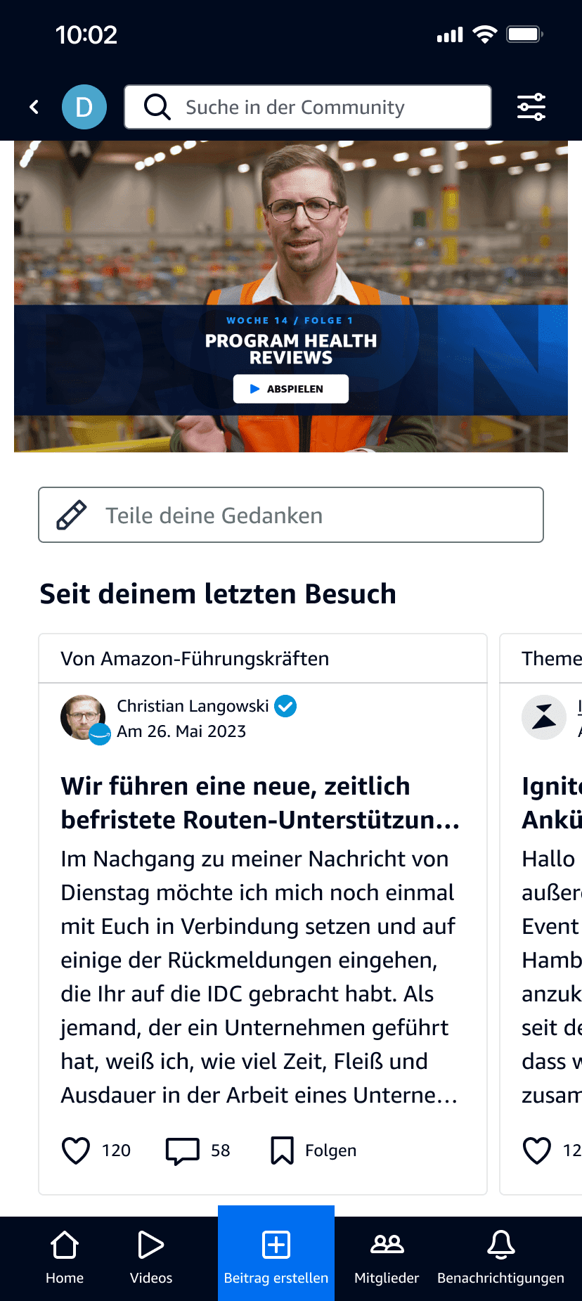
The design is also flexible, supporting the global community by accommodating multiple languages.
Measuring success
"While you were away"
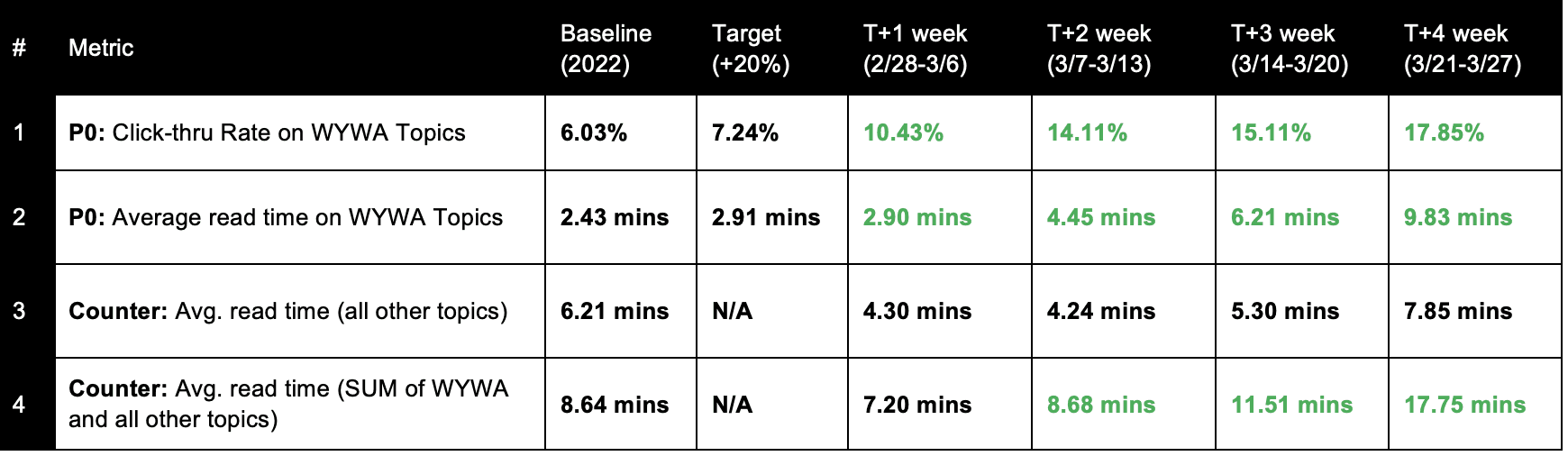
"While You Were Away" was first launched in Ignite North America, and quickly became one of the most successful features we ever introduced. Building on this success, we expanded "While You Were Away" to the Upshift and Ignite EU communities.
It attracted DSPs with an impressive 17.85% click-through rate, surpassing the target by 250%.
Featured posts achieved a remarkable read time of 9.83 minutes, exceeding the target by 338%.
It significantly increased DSPs' engagement with community content, doubling the average read time to 17.75 minutes from the previous year's 8.64 minutes.
Search
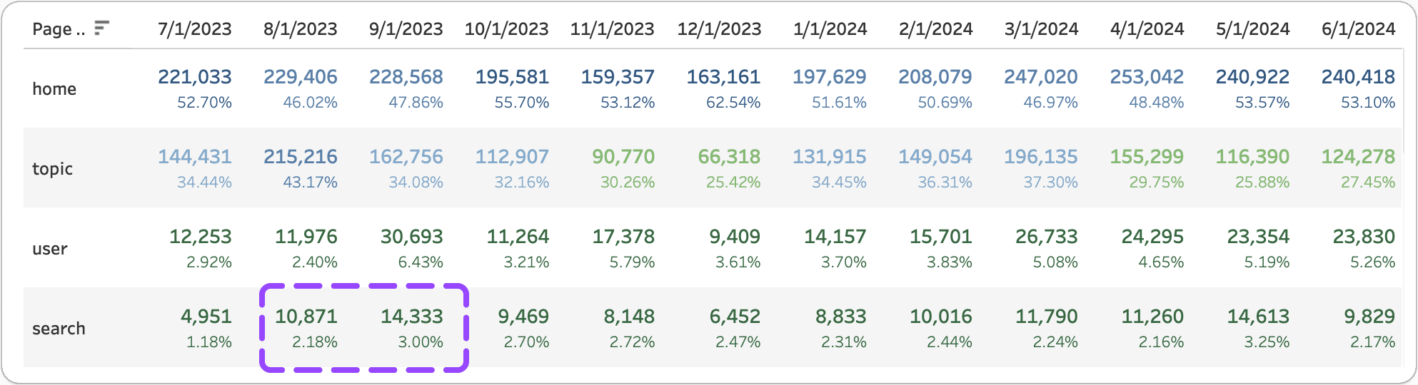
Within 4 weeks of launch, total clicks on the redesigned Search feature increased by 220%, and continued to rise by 290% in the following month, making it #4 in all site traffic.
Average monthly search sessions increased by 23%, from over 3,300 to over 4,100, and the number of unique users conducting searches rose from over 850 to over 1,100.
The bounce rate decreased by 25%, indicating that fewer post view sessions end within 10 seconds. The fetched results are more relevant, and users are spending more time engaging with the content.

Matthew
DSP in Salt Lake City, UT
While You Were Away is an easy way to see those popular posts, saves me a lot of time when I log onto Ignite, and I can quickly delve into those trending topics.

Timika
DSP in Richmond, VA
This is the ‘bite size’ news we all need!

Terry
DSP in Tucson, AZ
The new Search not only saved me hours of digging through irrelevant content, but also made me feel more confident in using the community as a valuable resource for my business.